by Roy Bernardi
Peter Clapham Sheppard had lain in an unmarked grave for over fifty years in Toronto’s Mount Pleasant Cemetery until 2018 when his name and dates were finally inscribed on a headstone. The arc of his story is a narrative of time and the persistence of art to survive it.
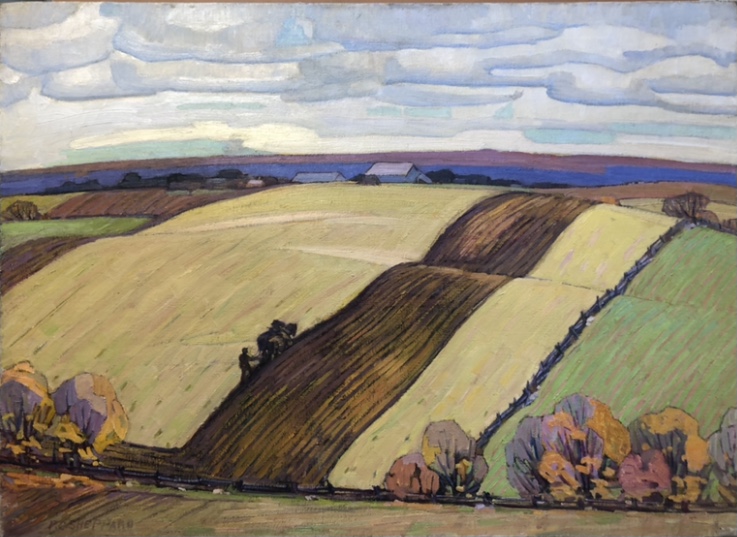
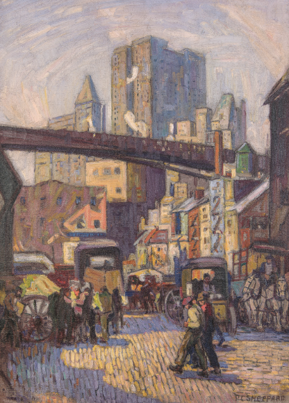
Unlike his more famous Canadian contemporaries, the Group of Seven, renowned for their dramatic landscapes of Ontario’s northern hinterland, Sheppard painted the great urban centres of Toronto, New York, and Montreal. Early 20th century modernism in Toronto was a variant of European Impressionism and Post-Impressionism applied to the Canadian experience. While his aforementioned peers drew inspiration from the too familiar landscapes of the Scandinavian avant-grade, inspired by a trip to the Albright-Knox exhibition of 1912, Sheppard aligned himself with the collective in New York City known as The Eight (later The Ashcan School) during the 1910s. As in the second-half of the 19th century in Paris, modernism was essentially an urban experience and Sheppard’s powerful canvases of docks, rail yards, bridge building, circuses, rural settings etc. reflected the dynamic growth and industrial expansion in Toronto at the start of the new century. It is not certain how long Sheppard’s sojourn lasted in New York City but his work there clearly attests to a relationship with painters like John Sloan, George Bellows, Edward Hopper known as the Ashcan School. As well brief encounters with American artist Julius Rolshoven.
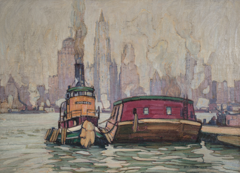
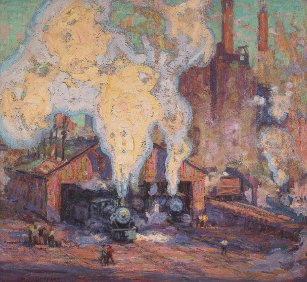
Sheppard’s monumental composition, The Waterfront (New York City) 1922, (above) for example, is a boldly painted canvas that evokes the smell of the sea along the New York dockside, with the city scapes behind. His Engine Home of 1919, (below) a work of bravura color, was unlike any work being created in Toronto at the time and to the eyes of a conservative, reactionary public it would have been considered hardcore Impressionism.
But here is where destiny and a compelling human narrative reclaim Sheppard from an undeserved obscurity. It is the story of three lives and of three different generations beautifully intersecting one another through art over the span of three centuries – a rich and “embroidered ribbon” that unspools artfully as a novel or a work of cinema with “wonder and woe, glory and grief”. It is both a reflection on the forgotten as well as the ecstatic recovery of lost treasures beginning with Peter Clapham Sheppard whose life at age sixty unfolds into a new destiny when he meets Bernice Fenwick Martin in 1941. She, in turn, meets Louis Gagliardi in the last chapters of her own life to transform all three lives, completely, with joy, purpose, and resolution. A synopsis would go like this:
In 1941, at the funeral of artist and teacher, J. W. Beatty, the aging Peter Sheppard met Bernice Martin, also a former student of Beatty’s and a painter herself who is a generation younger. The two would spend the next twenty-four years inextricably bound by a shared commitment to art at their very cores, companionship, and love. At the end of his life, Sheppard is placed in the care of the Salvation Army Lodge with the added consolation that, he was literally only steps away, that is, across the street from the home for which Bernice his last friend and support, lived in. When Sheppard died, he left Bernice the only asset he had: all his artworks, a lifetime of his artistic legacy, wherever they might be found.
In 1987, Louis Gagliardi saw a painting in a gallery which he purchased. “It just spoke to him” as the saying goes. A name and address on the back impelled him to get into his car to meet the artist. It led him to a Salvation Army Lodge and to Bernice Fenwick Martin. She was a petite woman in her eighties who carried herself with an old-world dignity. Gagliardi could not know it then, but this countenance belied her tragic ruin and fall from “riches to rags”. Having been defrauded and dispossessed of her home, her wealth, and all her possessions years before, she was now given charitable shelter. The poignant irony to this chapter is that, located in the very small bedroom to which her world had now been confined, a window looked out to the very house and happy life she once knew and lost, a cruel and painful daily reminder, there across the street.
This is a story of humanity and kindred friendship, despite the many years that separated Bernice and Louis in age. They shared a bond of the highest and rarest kind— the love of art: one having lived the active life of creativity; the other committed to the pursuit of knowledge. Over time, as Bernice recounted the dispossession of all her property and life savings years before, she told Louis how she wept most despairingly for all of the Sheppard paintings once entrusted to her safekeeping. She was powerless to stop those strange men, the movers ordered by the bank, whose job it was to load trucks of the great stacks of canvases that were all that remained of one man’s prolific life.
Sheppard and Bernice’s loss inspired a purpose that would occupy the rest of their lives. Bernice and Louis set about to reclaim whatever artworks by Sheppard they could locate, although hundreds of sketchbooks, oil panels, and canvases had been lost, stolen, and sold off in bulk containers at garage-sale prices. It was at one location, on such a quest of her direction, that their hopes were initially dashed until, by dint of physical exertion on the part of Gagliardi, a cache of wondrous artworks by Sheppard revealed themselves in the dank and dingy darkness of a common storage space. The expression of speechless joy on Bernice Martin’s face when they looked at each other by the light of a handheld flashlight will be one of Louis’ imperishable memories. In that instant Bernice was reunited, not only with the man she loved and admired, but with the legacy he had left her, out of love and friendship and gratitude. It was as though all the preceding years of waste and loss were suddenly redeemed and fresh hope restored. Bernice Fenwick Martin passed away on September 15, 1999, just months before seeing the new millennium and two years shy of reaching her hundredth birthday.
Gagliardi continues his quest to honour the memories of Peter Clapham Sheppard and Bernice Martin. In 2018, he published a monograph, Peter Clapham Sheppard: His Life and Work and had the artist’s name inscribed on a stone by a resting place long forgotten.