by Steve Rockwell
In broad strokes, civilizations have been defined by their metals; from stone to bronze and iron. The best ages were “golden ages.” The story of the “Bronze Age Collapse,” as told by Eric Cline, tells of collapsing empires through the rupture of supply chains, and a forced innovation. While more difficult, blacksmiths had turned to iron making, setting the stage for the emergence of classical Greece. Bronze Age kingdoms had come to an abrupt end; Minoans, Mycenaeans, Trojans, Hittites, and Babylonians – gone.
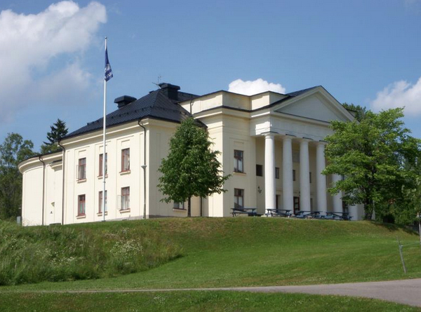
By 1952-53, My father’s employment had drifted from SKF ball bearings to mining iron in Grängesberg, Sweden. British financier, Sir Ernest Cassel, had cast a distinct shadow over the town in the form of his 1900 “donation.” For a while, it became a local theater, where I went to see films, such as Luis Bunel’s 1954 Robinson Crusoe. The Cassels building was designed by architect Agi Lindegren, the facade with its neoclassical columns inspired by the Bank of England building in London.
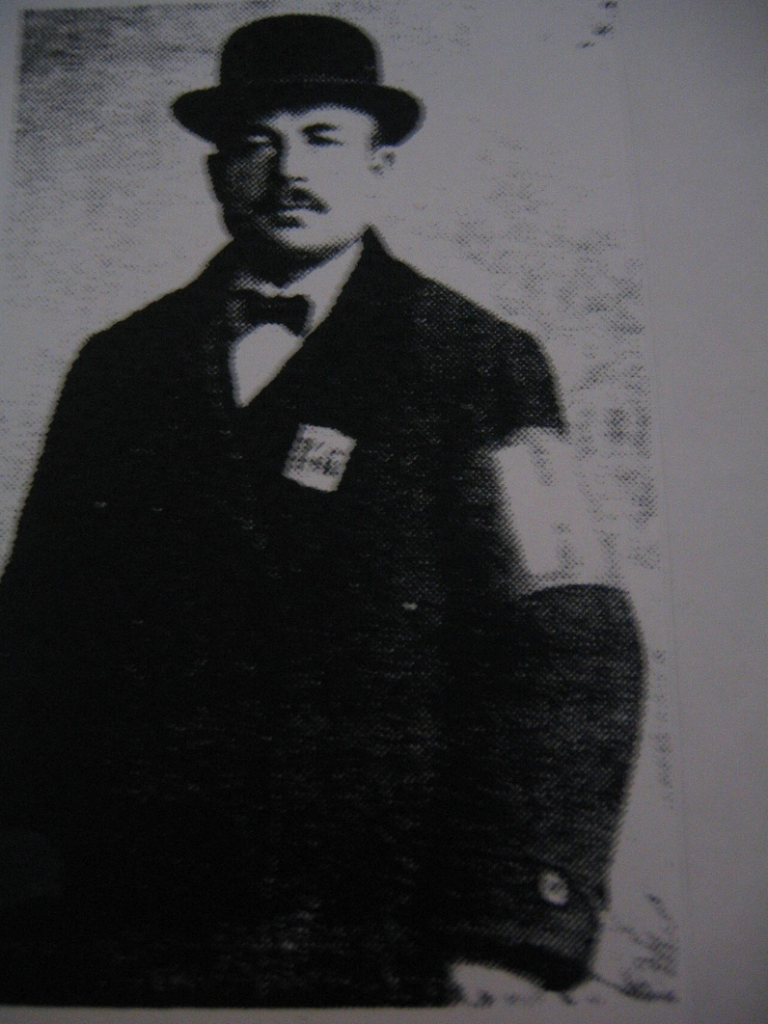
By coincidence, the Bank of England was founded during the lifetime of Daniel Defoe, the writer of Robinson Crusoe. Prussian-born Ernest Cassel had arrived “penniless” in Liverpool in 1869 with a penchant for mining, infrastructure and heavy industry. His portfolio soon extended to Sweden, the US, South America, South Africa, and Egypt, where he was among the financiers of the Aswan Dam. His daughter Amilia Mary Maud Cassel married Wilfrid Ashley, giving birth to Edwina in 1901, who married Lord Lois Mountbatten in 1922.
By 1957, with our transit to Canada, the metal of the moment became gold near the town of South Porcupine, Ontario. I enrolled at Golden Avenue Public School, its naming a blatant re-gilding of Yellow Brick Road. The mining buzz at the time, however, was uranium, and the wizards of ounce here were, Joseph Hirshhorn and prospector Franc Joubin. Elliot Lake had been birthed on a drafting table of an engineering firm in Toronto, triggered by a 1953 uranium discovery that built the “Uranium Capital of the World.” Forget the Cassels “theater,” this was a whole community, meticulously planned. We lived here at the peak of its boom, and then its “bust.”
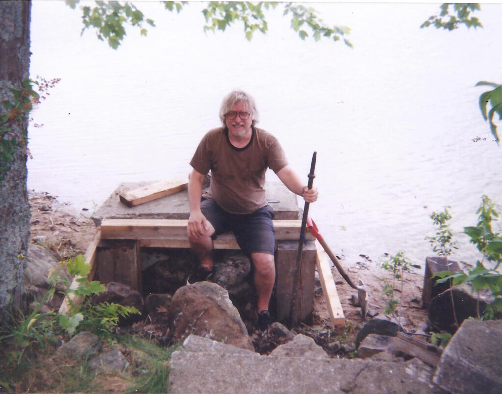
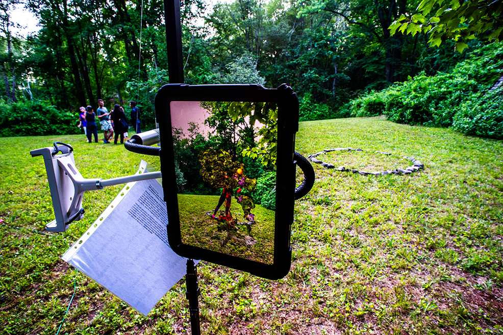
Franc Joubin had convinced Hirshhorn to finance a proper drilling, not just a surface test. When confirmed, they put together a secret “Backdoor Staking Bee.” Claims totalling 1,400 over 56,000 acres were made in a “Big Z” pattern, a uranium belt running through the Blind River, Elliot Lake region. The photo of myself holding the used mining drill on the Granary Lake shoreline is almost precisely in the center of that Z, the lake situated halfway between Blind River and Elliot Lake. I was on the verge here of a “staking expedition” of my own.
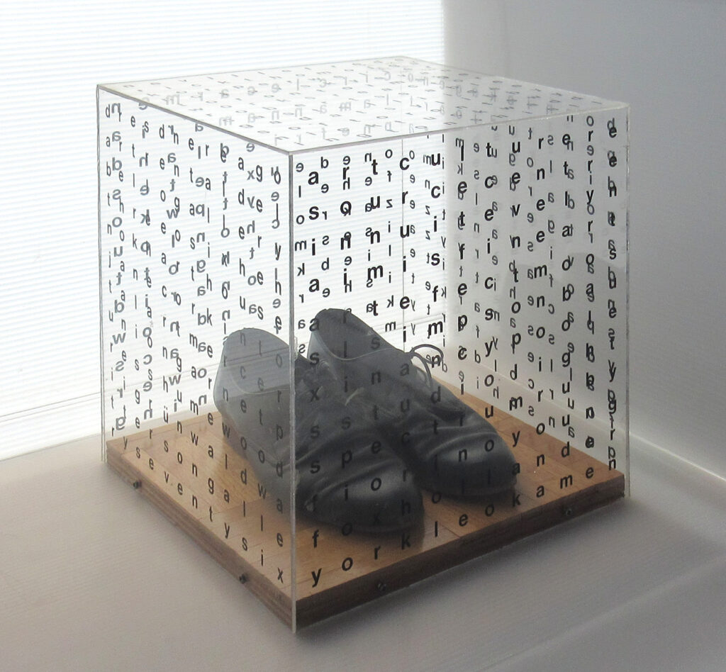
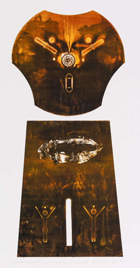
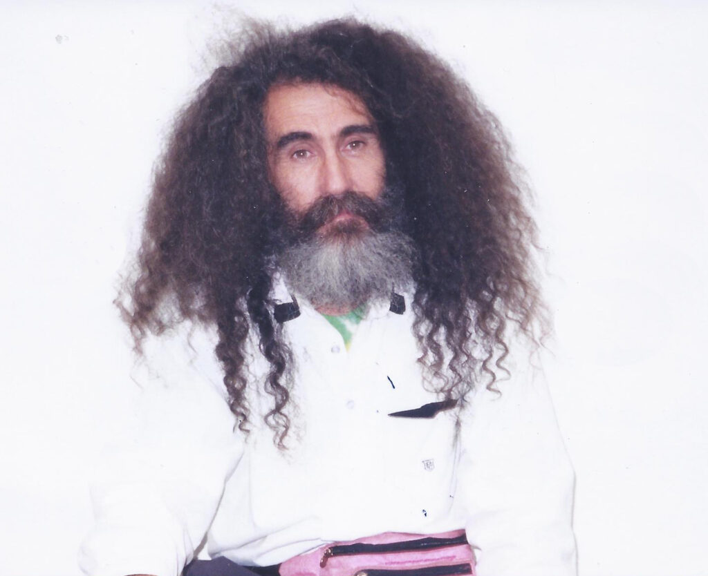
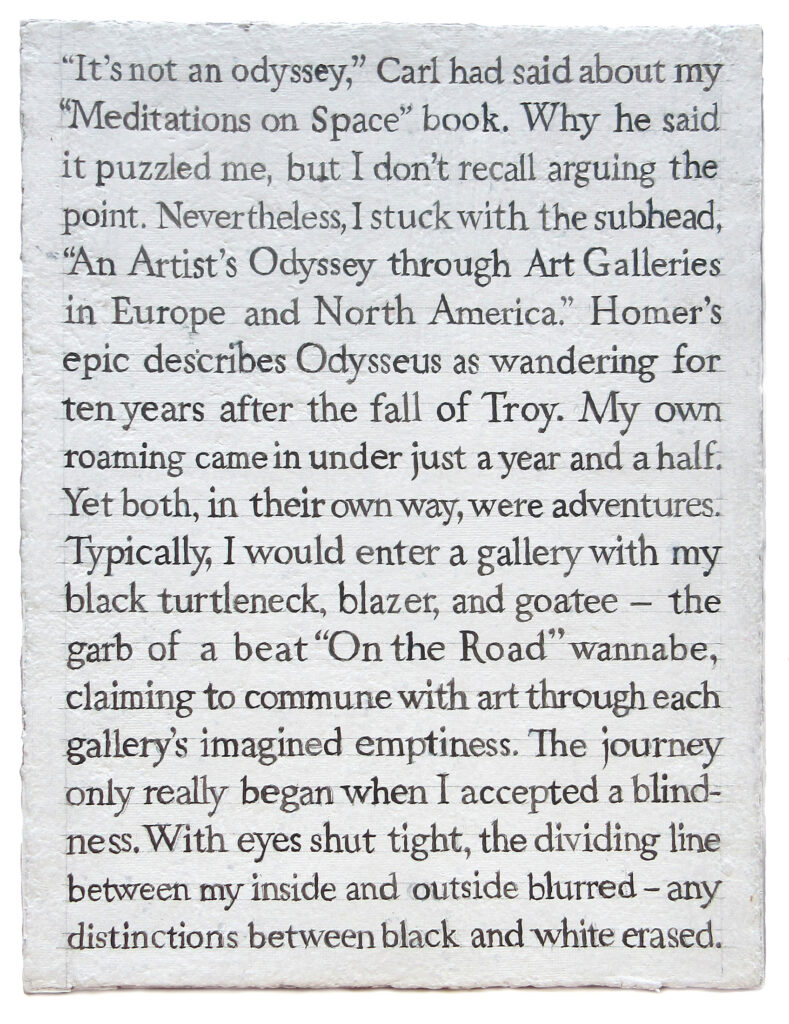
Just a few weeks after photo was taken, I was at the Bruno Bischofberger Gallery in Zürich, Switzerland, the first stop of 175 “meditations” on gallery spaces in Europe and North America. On September 20, 1995, I bought Peter Halley’s Collected Essays 1981-87 for twenty francs from Evelyn at the counter. I still “mine” it for information from time to time. After Paris, New York, and Toronto, the final stop of my “odyssey” was the Zero One Gallery in Los Angeles on January 23, 1997. There, I spoke with artist Kyle Lind, who unwittingly supplied a punctuation to my meditations. To my question regarding zero and one, he had said, “The space between the zero and one is the creative act.”
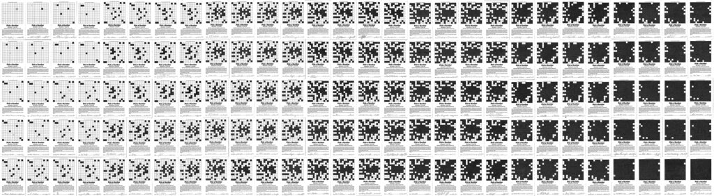
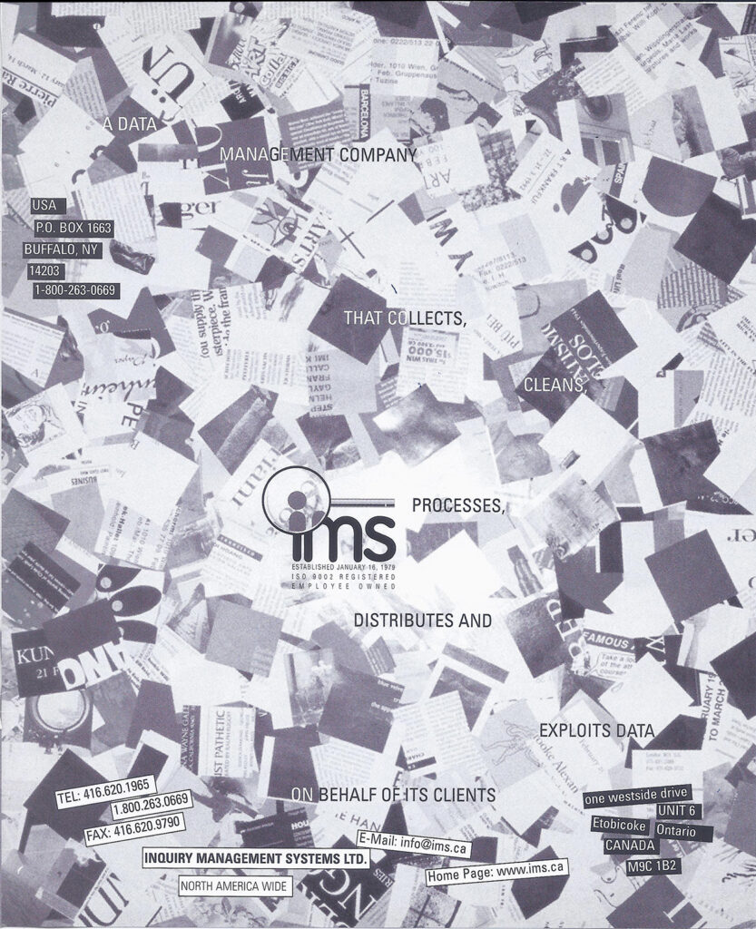
The 1996-97 Meditations on Space book work had set the stage for a new venture. When I launched the premier edition of dArt International in January 1998, I had the advertiser support of the company, IMS (Inquiry Management Systems), also creating a “data mining” ad campaign for my fledgling dArt. Over a chopped-up and scattered copy of Artforum magazine, I laid out the fragmented sentence, “A data management company that collects, cleans, processes, distributes and exploits data on behalf of its clients.”
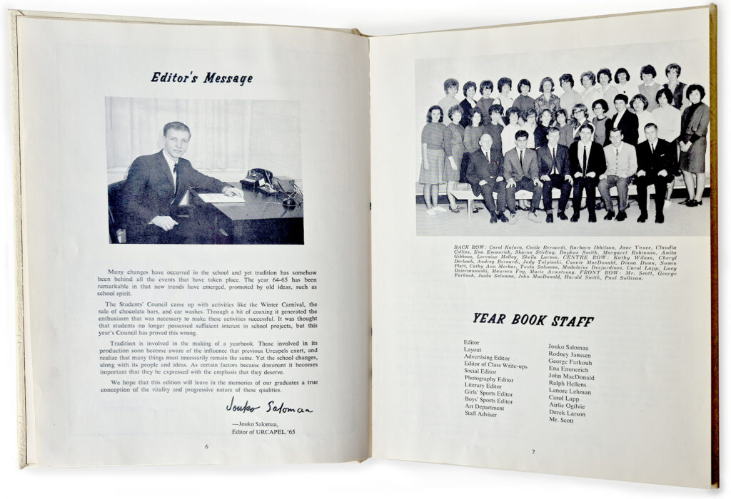
Before moving to Toronto and enrolling at Ontario College of Art in 1965, I had been editor of Urcapel, the Elliot Lake secondary School year book. On the Year Book Staff as Advertising Editor had been George Farkouh, who came to be Mayor of Elliot Lake from 1988 to 2006. After a period of impending ghost town status, he is credited with saving Elliot Lake as its uranium mines were being shut down. The town faced absolute economic collapse, the province even suggesting its abandonment. He staged, instead, a “Retired Living” Miracle, the city buying up hundreds of vacant, high-quality mining homes and turning them into “Elliot Lake Retirement Living.” This masterclass transition blueprint is still being studied globally.
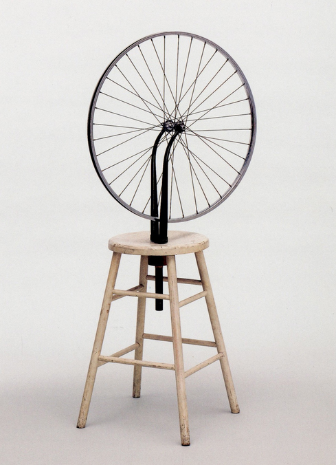
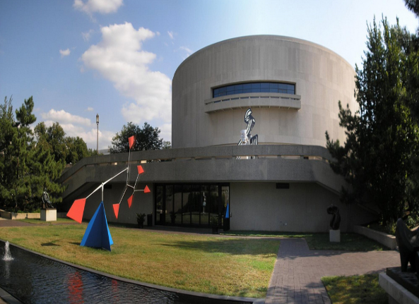
Since the early 1960s, Joseph Hirshhorn had agressively assembled one of the world’s finest collections of modern art. Much of the fortune that had made this possible came from mining ventures, especially the “big Z” uranium discoveries in the Elliot Lake region with geologist Franc Joubin. The Smithsonian Institution had long sought a national museum devoted to modern art. Its secretary S. Dillon Ripley saw Hirshhorn’s collection as a possible fulfillment. With the personal intervention of Lyndon. B. Johnson more than 6,000 of the paintings, sculptures, drawings, and prints collected by Hirshhorn became the foundation of the Hirshhorn Museum and Sculpture Garden in Washington, D.C.
(to be continued)