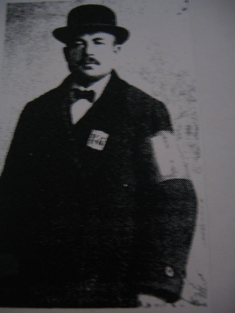
I travelled with my family to Gothenburg, Sweden in 1951, leaving Espoo, Finland, which had been home to my father’s side of the family for at least four generations. My grandfather had been part of a movement to adopt Finnish names, legally shedding his Kristiansson identity for Salomaa. When I adopted Rockwell for Salomaa, it had been done for purely creative reasons. My mother held the opinion that Salomaa was entirely the outcome of the 1918 conflict between the Bolshevik Reds and White Finns, where Johan Nestor Kristiansson defected to the Whites. “He rammed his rifle barrel into ground at the base of a tree, and bolted,” my mother recounted.
Kuusta Rovio, the Helsinki police chief, figures into the story here. Rovio not only sheltered Vladimir Lenin in his Helsinki apartment in August of 1917, but supplied him with Russian newspapers and passed on secret deliveries to his party comrades.
Kuusta Rovio, served as Helisinki chief of police during the 1918 revolutionary war
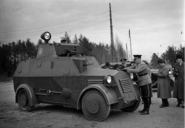
The anti-socialist forces under Carl Gustaf Mannerheim prevailed with a White victory in May 1918. Rovio fled to Soviet Russia, becoming a Communist Party official. A victim of Joseph Stalin’s Great Purge, he was arrested in 1937, and executed the following year. Meanwhile in Helsinki, the police department had been bleached of its Reds sympathizers and released the Sisu “Black Maria.” After the war in 1945, my father had a job painting “Black Marias” at the Helsinki Police Department. He would have familiar with the armored Sisu since it had been service until 1951, when we left for Sweden.
In the dArtles column of the Winter 1999 edition of dArt magazine, I wrote, “At the preview bash of Charles Ray’s mid-career retro at MOCA in Los Angeles, Charles himself stood on the patio roof looking down over the party. He didn’t cut through the party vortex and into the show until artist and teacher Roland Brenner arrived.” From that point in my article it became a list of “who’s who” of the LA art world. Some credit for Ray’s success has to go to the Los Angeles art dealer Burnett Miller, who passed away in 2001.
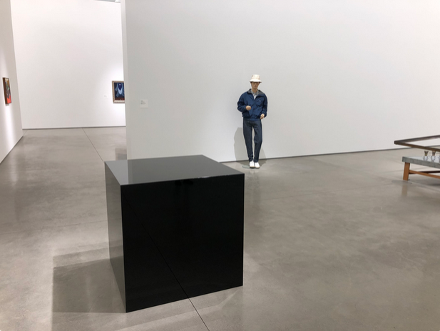
In her December 13, 2001 obituary for the LA Times, Suzanne Muchnic wrote, “An energetic and insightful entrepreneur who had an eye for quality and a finger on the pulse of contemporary art, Miller is credited with introducing the work of young artists who later achieved international renown. Sculptor Charles Ray – whose travelling retrospective exhibition appeared at Los Angeles’ Museum of Contemporary Art in 1998 – made a breakthrough at Miller’s gallery in 1987 with Ink Box, a giant black-lacquered metal cube filled with 200 gallons of black printer’s ink.”
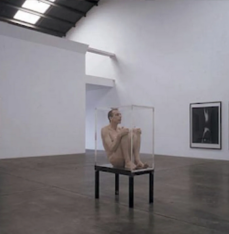
Charles Ray installation view of his 1986 Ink Box at the Irvine Museum, Orange County
Muchnic quotes the Times art critic Christopher Knight, who wrote of its 1990 showing at Newport Harbor Art Museum, “The quivering meniscus of ink that is the top plane of this menacing black cube forms a threatening surface just begging to be touched, even in the face of disaster.”
In his 1995, performance at the Burnett Miller gallery, artist Skip Arnold delivers an obvious homage to Ray’s Ink Cube by replacing its “quivering meniscus of ink” with his own quivering flesh. The image featured here was used in an article by Craig Stephens in the Fall 2002 edition of dArt International titled Pollock to Punk: A Conversation with Skip Arnold.
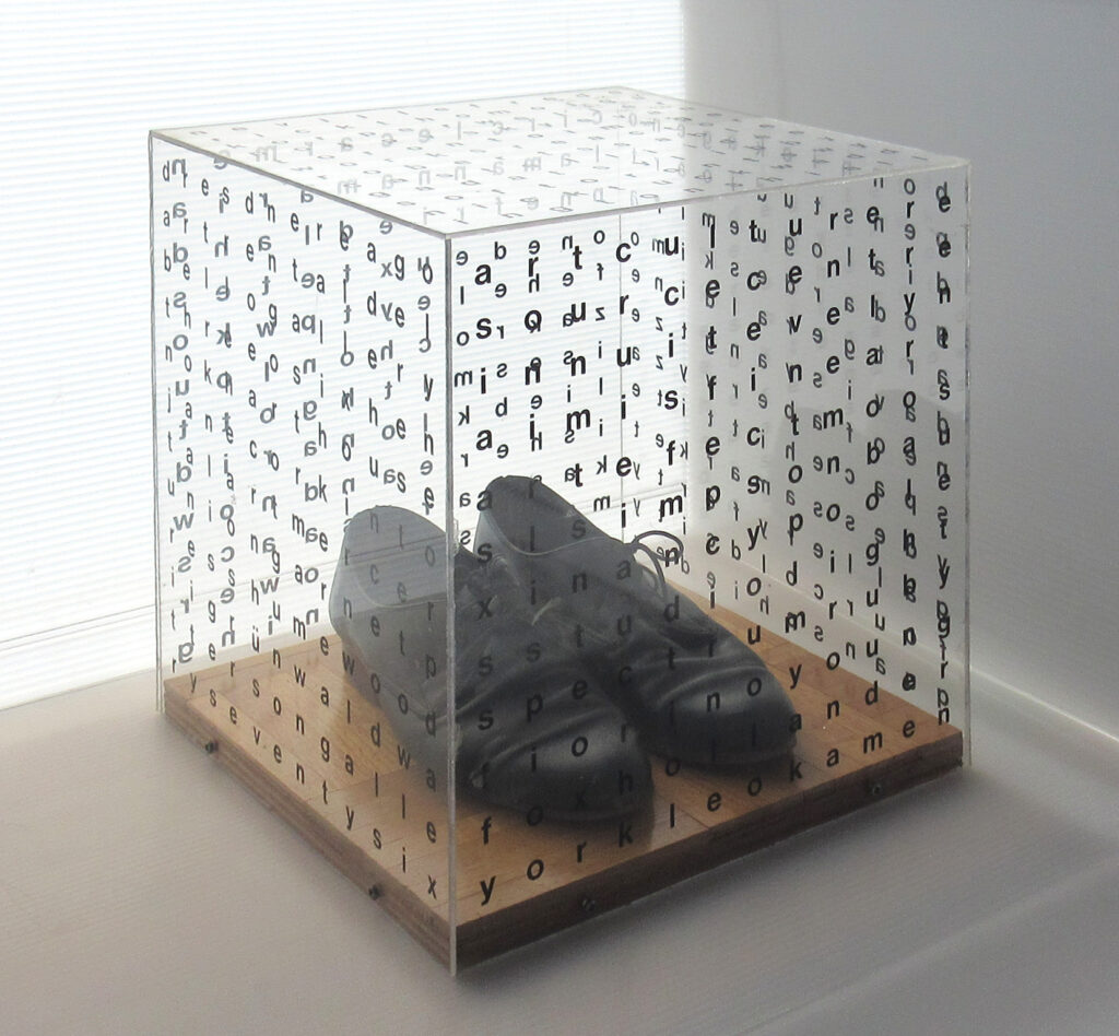
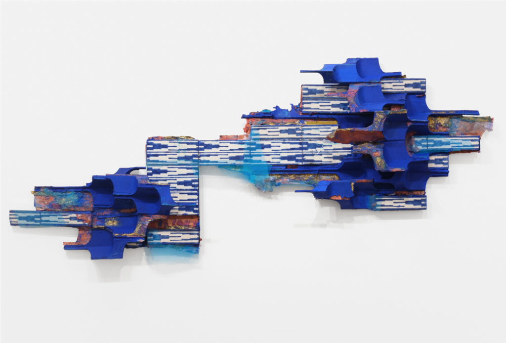
Skip Arnold, On Display, 1995, performed at Burnett Miller Gallery in Santa MonicaSteve Rockwell, Gallery Space (Shoes), 1988, acrylic, wood floor, shoes, 14 x 14 x 15 inches
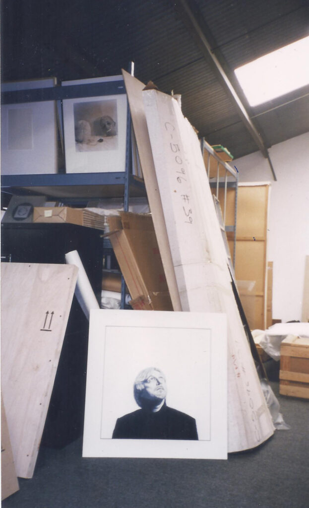
My own synthesis of Ray’s Ink Cube and Arnold’s 1995 On Display piece is the sculpture Shoes. It was made in 1988, a year after the Burnett Miller exhibition of Ray’s ground-breaking piece. With the Shoes, Ray’s ink and Arnold’s body evaporate, leaving the residual imprint of black shoes overlaid by black print on plexiglass. In 1997 Burnett Miller consented to have a part in my Storage exhibition. A unique feature of the gallery’s Bergamot Station building in Santa Monica was its spectacularly convenient second floor skylight, clearly visible in the top left-hand corner of the Skip Arnold photo, and neatly matched in the top right-hand of Steve Rockwell’s Storage photo.
Steve Rockwell, Storage, Burnett Miller, Bergamot Station, Santa Monica, 1997, photo by Steve Rockwell
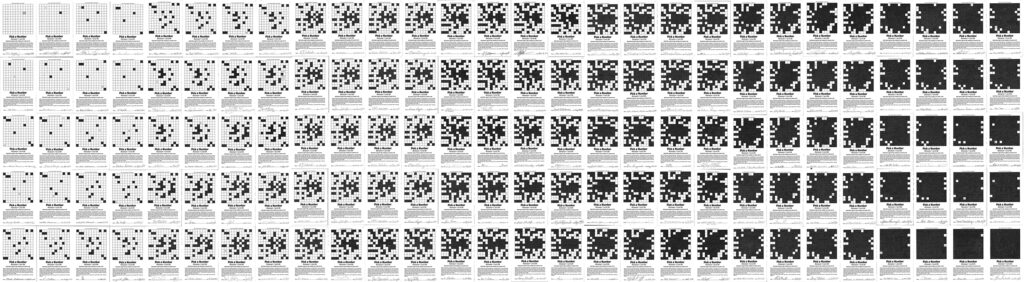
Completely unaware of the Charles Ray Ink Cube until a couple of decades ago, I had produced the progressive “inking” of a six-by-six-inch square in 1987, the year Ray displayed his “inky cube” at Burnett Miller. My square was subsequently cubed as the Shoes sculpture the following year in 1988. It took a hundred and thirty-nine people over a period of nine months to complete the “inky” square, the Pick a Number project eventually leading to the publication of dArt International magazine in 1998.
Steve Rockwell, Pick a Number between 1 and 99, 1987, ink on printed bond paper, 42.5 inches x 12 feet 10 inches
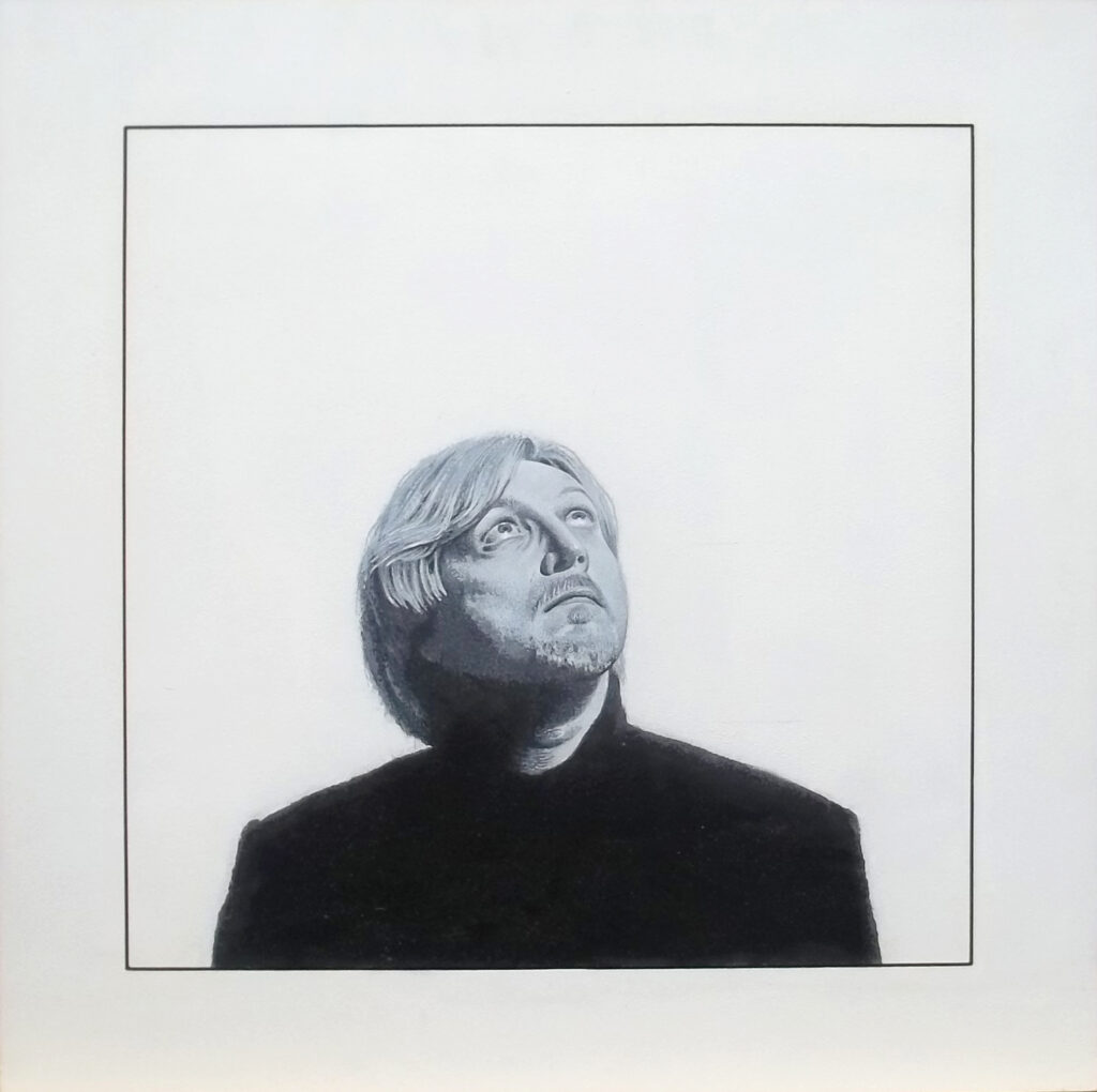
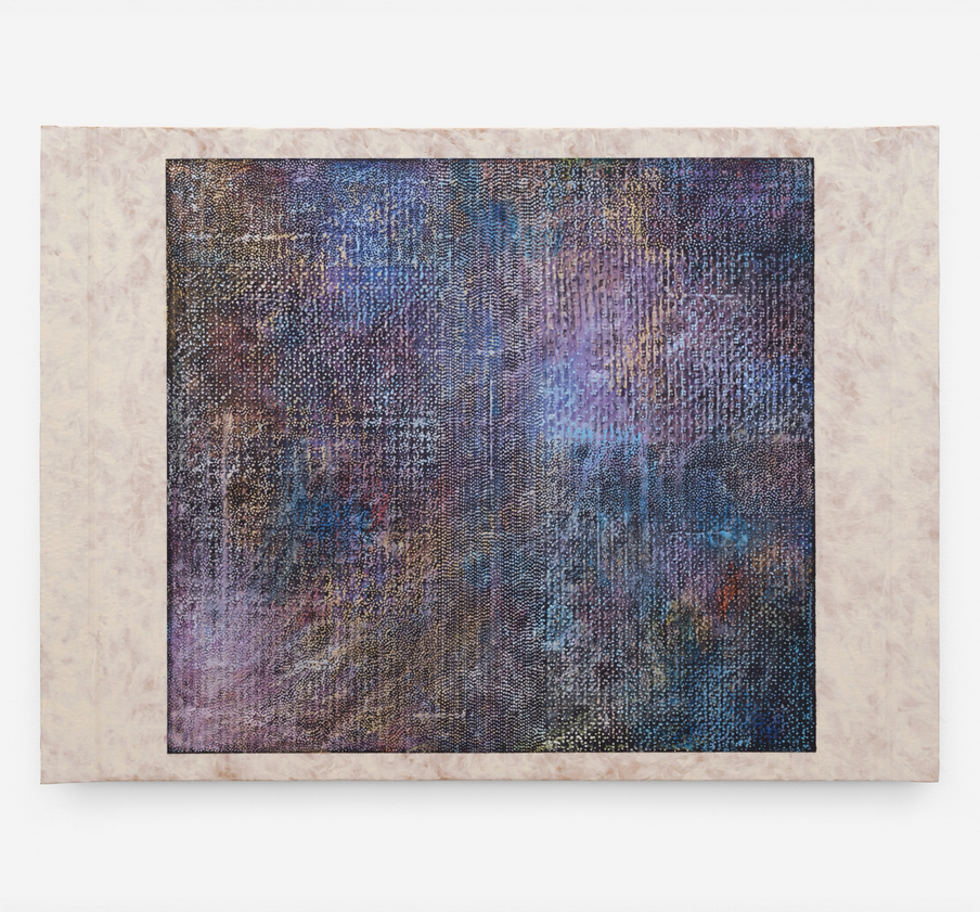
As part of the Meditations on Space project on December 1, 1995, my 36th gallery stop was Mary Boone, then in Soho. The account in the published book work read, “Someone must have been adjusting the lights or changing them. An enormous yellow step ladder rose toward the skylight in the center of the gallery. It made me think of the white ladder in Paris at Galerie Lucien Durand. Ron was busy at the desk by the door wielding a letter opener.” My black and white acrylic portrait staring up at the light suggested layered and cocooned gallery spaces from Paris, New York, and finally Los Angeles.
Steve Rockwell, Meditations on Space (Mary Boone Gallery, New York), 1996, acrylic on panel painting, 32 x 32 inches
Only much later, having reflected on the sources of my inspiration, did it land on a “dream vision” that I had in 1970. In it, an angel appeared with a shining solidity that shattered my flesh self to the extent that I presumed it to be the “Angel of Death,” were it not for its kind radiant beauty. Having not received spiritual grounding of any kind in my family, I was open to its interpretation. In form and perfection, it exceeded anything by Raphael. To a Catholic, it could clearly have been Mary. Then suitably combined with the definition of “boon,” it transformed into a timely benefit, blessing, or something that is incredibly helpful and advantageous.
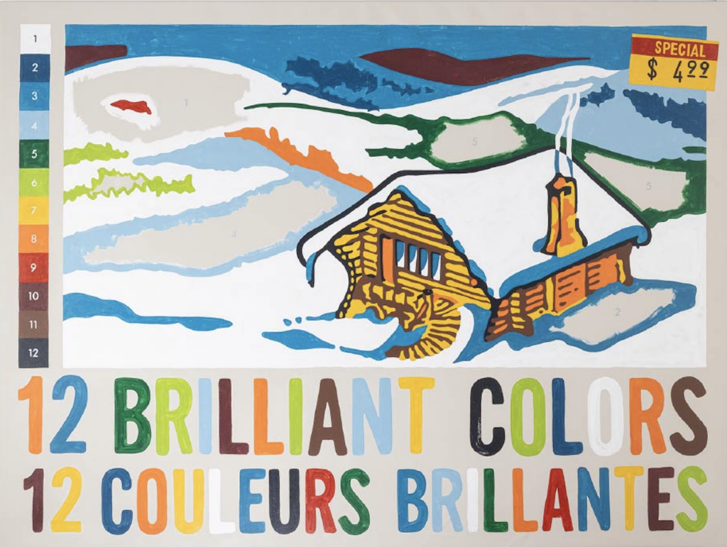
Christopher Rouleau, 2026, 12 Brilliant Colors, Latex, acrylic and enamel on canvas, 54″ × 72″
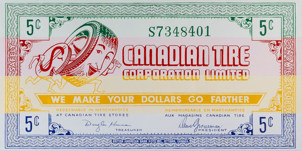
The message in Christopher Rouleau’s “12 Brilliant Colors” exhibition is direct. If you don’t get the picture, he spells it out in two languages, each ‘brilliant color’ numbered from one to twelve. The charm of the artist’s work at the Red Head Gallery in Toronto is the absence of ambiguity. Rouleau’s ego never gets in the way of his painted intent. By not wearing his angry, tormented artist tuque, the “Selling of Canada” paintings strike us directly where we live – a “double-double” caffeine-induced sugar rush from a Tim Hortons cup of coffee.
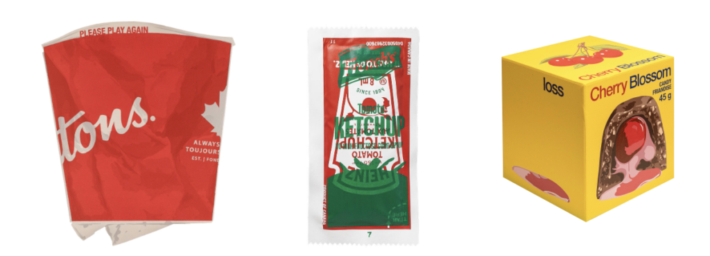
Christopher Rouleau, 2026, Tons, latex and acrylic on plywood, 24 x 18 x 1/2 inch; Ketchup Wars, latex and acrylic on canvas, bubble mailer filling, 36 x 18 x 2 inches; Loss, latex and enamel on canvas-wrapped box, 18 x 18 x 18 inches
To a Canadian, each meticulously-rendered image is a mental billboard along the highway of Canada’s history. As an immigrant kid on my first day at Golden Avenue Public School in South Porcupine, my own pack of “12 Brilliant Colors” landed on my desk on the first day of school. That’s how I remember it – cellophane-wrapped pencil crayons with a picture of a snow-covered log home below the word “Laurentian,” loosely-lettered in red.
The “Selling of Canada” has continued unabated since its confederation in 1867. In fact, even before there was a Canada there was Rupert’s Land. French fur traders Radison and Groseilliers learned that the best furs were found around the “frozen sea” of Hudson Bay. Since the French governor refused to back their plan to set up a trading post on the Bay, one thing led to another, until the fur trading duo got an audience with England’s Charles II through Prince Rupert, the king’s cousin. And the rest is history: the “Selling of Canada” began in earnest by the Hudson’s Bay Company with an act of government in 1689. “Made Beaver” became not just a brand but a commercial trading standard.
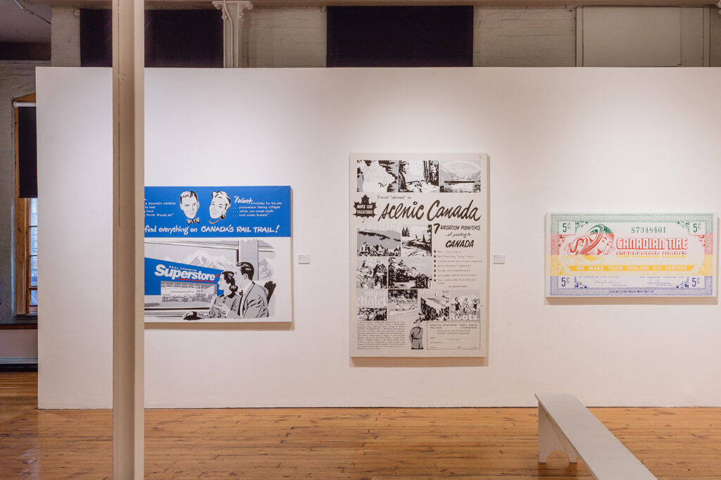
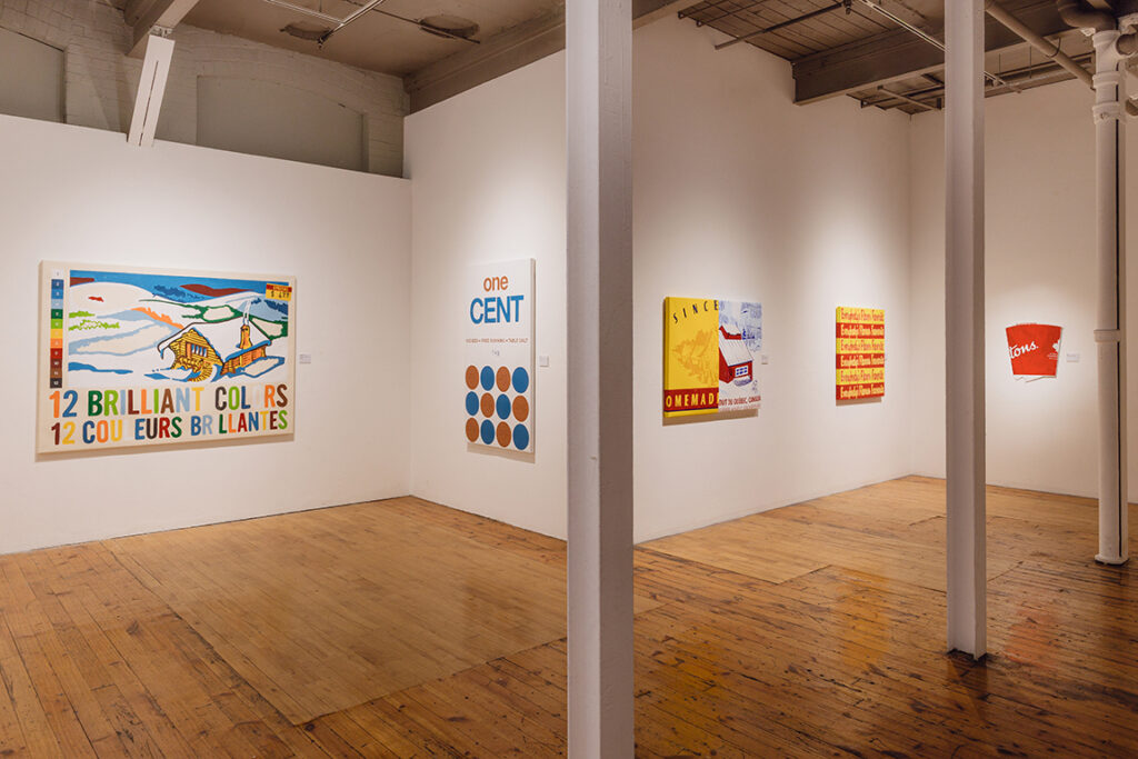
Christopher Rouleau’s “Selling Canada” installation view
Rouleau’s “12 Brilliant Colors” are rooted in the beauty of the land itself, here specifically the Quebec Laurentians, a crayon for every month of the year. A century ago, the Group of Seven placed a national stamp over the color and texture over Canada’s landscape. Influenced importantly by Tom Thomson, the Group expanded northward through Algoma beyond Lake Superior to the Rockies and the Arctic. To the east Quebec’s Charlevoix and Laurentian regions supplied the drama of shoreline and mountain. Branded into the consciousness these images in oil served as advertisement readymades for Canadian National and Pacific railways to sell travel across “Scenic Canada.” If going by car, vacationers might as well ride on “Canadian Tires.”
Christopher Rouleau, 2026, HBCanadian Tire, Latex and acrylic on canvas, 30″ × 60″
While Rouleau’s “Selling Canada” works are admittedly nostalgic, tapping into decades of collective memory, their insinuation casts a deeper, more complex shadow. As hieroglyphs of national identity, by virtue of their visual familiarity, the viewer is rendered essentially defenceless to their impact. Much like the work of Jeff Koons, Rouleau’s paintings here are “critic-proof.” To whatever might be said about his show, an apt response by the artist might simply be, “I intended it.”
Christopher Rouleau’s “Selling Canada” installation view
To some extent, Rouleau even seems not to be “wedded” to the paintings on display. “Selling Canada” may be read as a sample documentation of slices from our environment, mechanically reproduced. As the artist’s “Christopher” business card reads: “lettering, signs, graphic design,” implying that if the viewer were not impressed with the paintings display, he would be happy to provide ones more suitable to their taste.
Selling Canada: Guest Artist Christopher Rouleau, May 27 – June 20, 2026 at the Red Head Gallery, 401 Richmond Street West, Toronto, Ontario, Canada M5V 3A8
Nadia Coen, Mahmoud Hamadani, Armita Raafat, Michael David, Andrew Huston, Alyse Rosner, Paul Michael Graves, Bodo Korsig, Steven Salzman, Margaret Weber, Mark Williams at Bienvenu Steinberg & C in New York City
Across painting, sculpture, and installation, “Time and Materials” highlights the use of unconventional materials – glass, resin, plastic straws, fabrics, and carpets – to create works that are both temporal and tactile. Many of the works lean abstract, inviting the viewer to consider the significance embedded in the use of obscure materials and the progression of time encoded in the art.
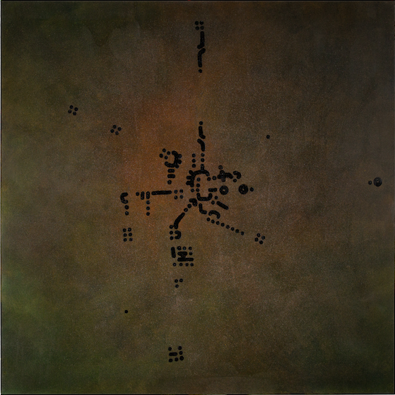
Paul Michael Graves, Fig. CXXXVIII., 2024, oil on canvas, 48 x 48 in, 121.9 x 121.9 cm
The exhibition repeatedly emphasizes material experimentation as an outlet for interdisciplinary expression. Paul Michael Graves’ pieces play with the intersection between art and his previous career as a helicopter pilot. Composed of black dots and lines set across a bronze background, the pieces evoke the visual components of aerial map making. Initially appearing abstract, the artwork deliberately uses the black marks to resemble plotted coordinates and flight paths as seen from above. Graves’ interpretation of time reflects the broader theme of the unique experience of time. The pieces display time and duration through flight paths rather than fixed units.
Mahmoud Hamadani’s geometric compositions similarly gesture towards his mathematical foundations. In his untitled work, Hamadani arranges nine black frames into a square. Within each frame, seven diamonds are uniquely oriented, with each diamond representing a day of the week. The subtle variations within each frame mirror the rhythms and changes of days and weeks. Continuing the larger theme of time interpreted through interdisciplinary practices, Hamadani’s geometric orientations suggest that time is measured, rhythmic, and symmetrical through a mathematical lens.
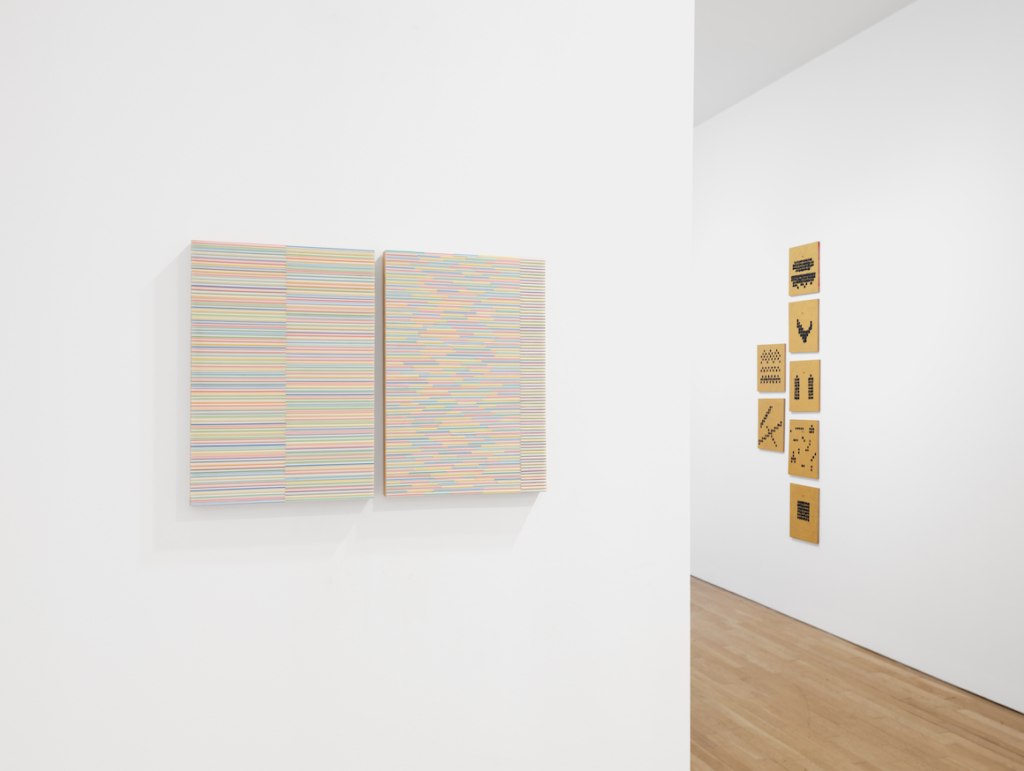
Installation view with work by Steven Salzman‘s Steaws III and Straws X (left), and Andrew Huston‘s Days of the week (right)
Andrew Huston continues the use of geometric shapes to portray time. With seven panels, each filled with gold pigment and black dots, the artwork represents the seven days of the week. Although the panels are fixedly aligned to emulate calendar pages, each panel is distinct. The variation among the series of panels emphasises the unpredictability of time despite the expected rhythm of the week.
Armita Raafat, Untitled, 2019, resin, paper mâché, tiles, fabric, mesh tiles, fabric, mesh, and acrylic, 38 x 80 x 7 in, 96.5 x 203.2 x 17.8 cm
Armita Raafat’s portrayal of time draws on a more fluid interpretation, by contrast. Raafat draws on traditional Muqarnas while reimagining it with vivid, unconventional materials. Composed of resin, tiles, and fabrics, the work revisits traditional architecture with a modern perspective, suggesting that time, rather than being fixed, can be actively returned to and reconsidered. The piece, being an extension of Raafat’s inquiry into Muqarnas, maintains the ongoing theme of interests and passions altering perception of time found throughout the exhibition.
Bodo Korsig, Tears of Silence, 2023, 7.9 × 10.2 in, 20 x 26 cm
Bodo Korsig’s “Zerspringen des Zustandes”, which translates from German to “Shattering of the State”, approaches the theme of time through one moment of rupture. The work suggests that time does not only unfold – it snaps. The “shattering” becomes a moment when continuity is lost, and a new state abruptly emerges. This interpretation of time aligns with Korsig’s focus on human behavior under extreme conditions. In moments of fear or violence, mental states often do not erode over time; they shatter instantly. The piece introduces the irreversibility of time and its capacity to collapse into a single moment of change. In contrast to other works in the exhibition, which focus on the cycle and rhythm of time, Korsig centers its immediacy and instantaneity.
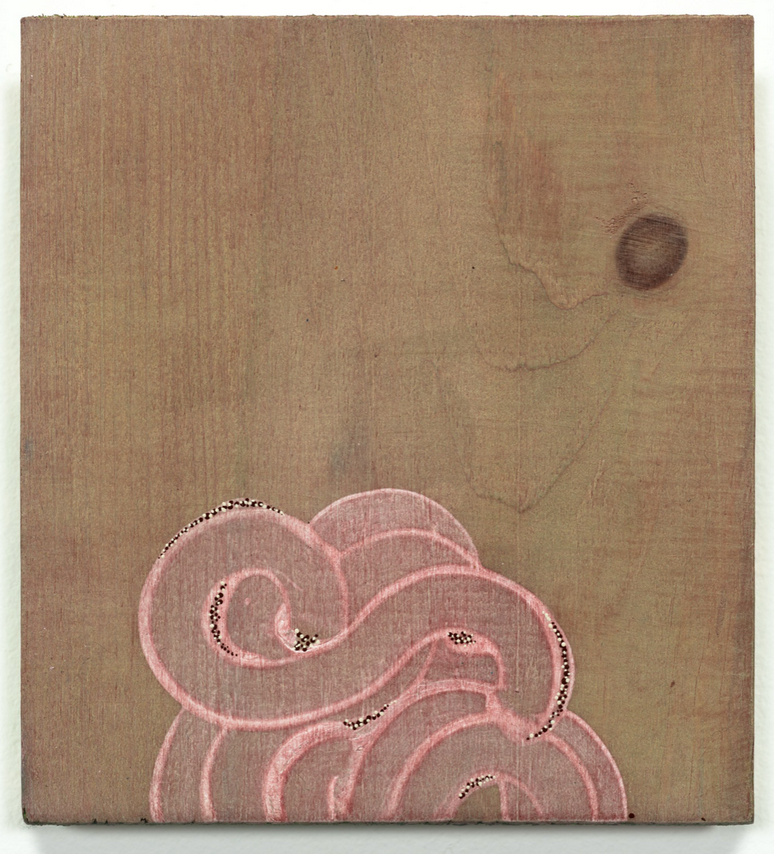
Alyse Rosner, From Wind or Sky or Myth (quiet pink), 2025, acrylic on raw pine, 6 x 5.5 in, 15.2 x 14 cmMichael David, The Batman, 2023-26, mirrored glass, silicone, fabric, glitter, acrylic and oil paint on wooden panels, 147 x 82 x 6 in, 373.4 x 208.3 x 15.2 cm
Alyse Rosner’s piece, “From Wind or Sky or Myth (shadow)” evokes the visual intensity of fireworks – brief yet expansive bursts that unfold simultaneously – suggesting that time is not a singular passing instant, but a convergence of multiple moments occurring at once. Some works do not specifically reference time, however. Instead, they fall under the exhibition’s material aspect. Michael David, for example, uses nontraditional materials such as glass, silicone, fabric, and glitter in his work, “The Batman”. Innovative uses of various materials are also present in the works of Nadia Coen, Steven Salzman, Margaret Weber, and Mark Williams.
Margaret Weber, Rivington or Wat, 2025, newspaper (newsprint), oil pastel, dye, acrylic paint, cardboard, 24 x 33.8 in, 61 x 85.7 cmMark Williams, PoC 47, 2022, oil, acrylic & pencil on cardboard, 24 x 30 in, 61 x 76.2 cm
The title of the exhibition draws on the policy under which clients pay contractors a fixed amount for the time spent and materials used. In the context of the exhibition, time and material are established as intertwined and in constant conversation.
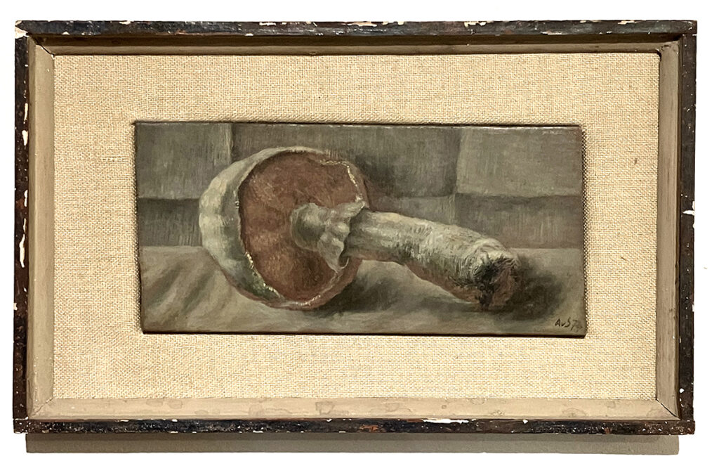
Alexey von Schlippe (1915-1988) left his title as a Russian Baron in the court of Tsar Nicholas II behind when he became a citizen of the United States in 1960. What emerged in his art during and after this transition, was a unique sort of social realism, not unlike the immediacy and empathy in the egg tempera paintings of Ben Shahn, but with more intimacy and isolation.
Still Life with Mushrooms (1974), oil on board, 3 ½ x 7 ½ inches, all images courtesy of the author
As part of the introduction to the exhibit, a descriptive wall panel mentions Von Schlippe’s inspiration from Giotto and Piero Della Francesca, which is clear in his dry brush technique common in the ancient art of egg tempera painting, an approach Von Schlippe manages even when he paints with oils. The text also mentions the influence of West African art that shows up in various ways including subject matter featuring a black woman with an exposed upper body ala mid-century National Geographic magazine, abrupt perspective in terms of the stylized masks and adornments, and anatomical simplification of the same. Beyond these influences, the content presented in Von Schlippe’s paintings has many psychological traits that break through. Additionally, and Like Andrew Wyeth who also masterfully worked with egg tempera capturing the distinctive souls of his subjects that he knew well, Von Schlippe’s way with egg tempera finds a less individual representation of a specific soul. Von Schlippe takes a more universal approach to the harm imposed on an oppressed group longing to be treated with the respect they deserve in an age of drastic social change.
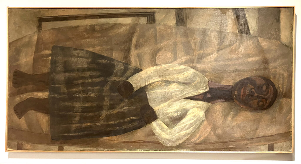
Reclining Figure with White Blouse (undated, mid twentieth century), egg tempera with oil on masonite, 24 ¼ x 48 inches
The paintings in this exhibition were created between the late 1950’s to the early 1980’s when America went through much social unrest and change. A fact that you can feel emanating from his female subjects in particular, which are often people of color seemingly exhausted by the burdens that come with living through troubled times. In Reclining Figurewith White Blouse (undated, mid twentieth century) you get a sense of temporary peace as a compositional chrysalis forms around the figure. In this dream state, the harshness of the outside world is quietly absorbed in waves of harmless cleansing transitions within that subtle enclosure. And despite the metaphorical cushioning, there remains tension in the bent arms and fisted hands as they respond to indelible memories of repressive circumstances.
Exhibited directly below Reclining Figure with White Blouse is Reclining Figure (1980), which features a middle aged woman who still wears her simple black shoes – a detail that does not appear in any of the other paintings that all feature bare footed subjects. Reclining Figure also has more clarity of the figure that includes more realistic facial features, sharp pleats in a long skirt, a formal couch and hands set in a classic sleep, prayer-like pose giving this particular person a feeling of security and personal importance. Perhaps it’s someone who is related to the artist.
Reclining Figure (1980), egg tempera with oil on canvas, 24 x 48 inches
Conversely, the figure in Reclining Nude (Half Nude, Hands Raised) (1958) offers great import due to its overtly spiritual component and attention to detail in the sinuous, interconnected folds of fabric. The uplifted arms also add power and presence to the figure that none of the other paintings share. In the subject’s face, the relatively blank eyes give off a mask-like presence that brings us back to Von Schlippe’s interest in West African sculpture in all of its ritualistic or ceremonial forms.
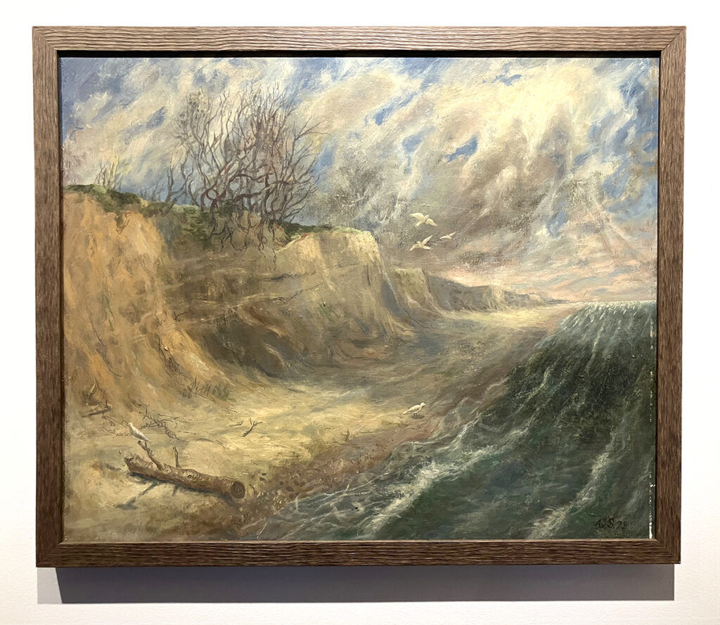
Seascape (1978), oil on masonite, 20 x 24 inches
Seascape (1978), which is solely painted in oil, ventures the furthest into the Surrealist realm. The composition has a sort of rocking motion, as if we are viewing the scene from a boat in choppy seas, as the looming sandy cliffs and flood of ocean water that shimmers in the distant horizon strain to gain their individual heights in the picture plane. Then you have the Houston to Boston leaning clouds above that create a clockwise rotation in the composition, giving the scene all of its endless movement. Ignoring all this upheaval is a seagull perched atop a small branch of a large piece of driftwood on the lower left of the painting. Facing outward and away from the center, the bird gives the narrative a bit of doubt to its truth, telling the viewer that all this commotion is imagined, pieced together from bits of memory and preconceptions.
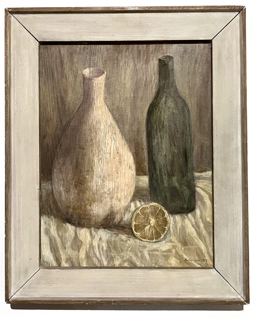
Two Bottles (1958), oil on board, 14 ⅔ x 11 ¼ inches
As a still life painter, Von Schlippe is equally skilled. Still Life with Mushroom (1974) has that George Grosz, Otto Dix brand of intensity, while Two Bottles (1958) leans a bit more toward the softened and shimmering – closer to Giorgio Morandi, only with lots of detail in the reflective surfaces. All in all, a striking exhibition in one of the most distinctive and magnificent buildings in New England that is best known for its extensive collection of world class plaster casts such as Michelangelo’s Pietà and Moses, Donatello’s David and the Laocoön and His Sons by Baccio Bandinelli. A destination that is well worth the visit any time you are in Norwich, Connecticut.