by Chunbum Park
The Art of Cross-Cultural, Trans-Atlantic Friendship and the Return to Our Magical Mythological Origins, New Paltz, NY
At Villa Isis, a gallery in the woods that also functions as a creative retreat, Lise Ellingsen curates an exhibition of 20+ artists and film directors as a form of cultural exchange and bonding of relations. This cross-cultural event sponsored by the Royal Norwegian Consulate General New York and in collaboration with Oscar Galleri from Norway is a trans-Atlantic gesture of friendship between the Nordic countries and the United States.
Titled, Villa Isis: A Nordic-New York Immersive Art Experience, the exhibition features the works of Jens Lien, Anja Breien, Eva Davidova, Tatiana Florival, Anki King, Avani Patel, Yasmeen Abdallah, Lisa Saeboe, Shayna Strype, Eliza Lu Doyle, Kristin Jacobsen, Karine Ruud, Lise Ellingsen, Avery Syrig, and additional invited artists.
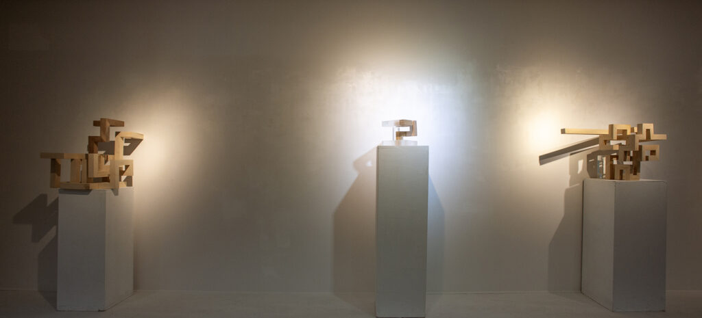
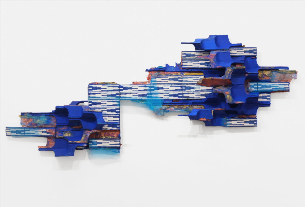
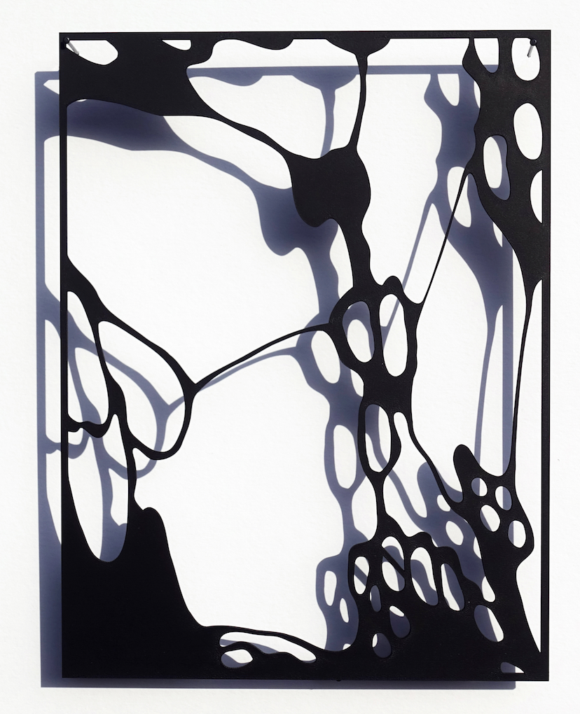
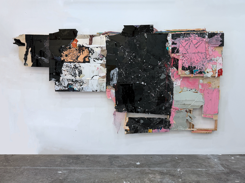
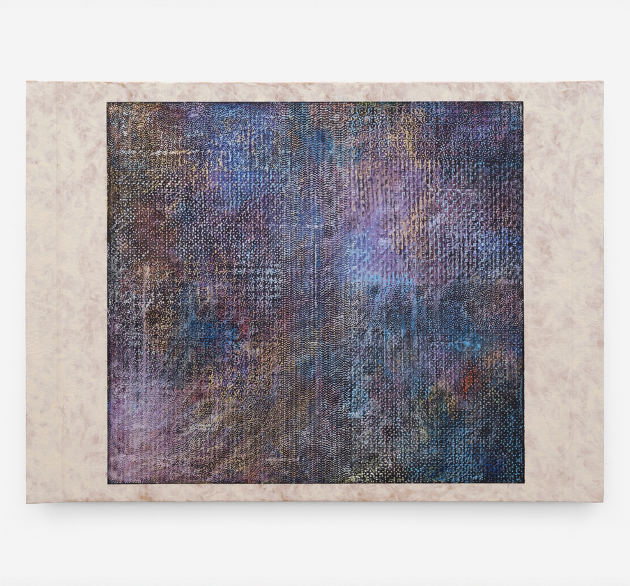
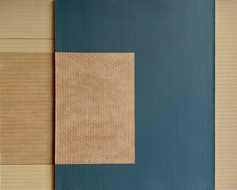
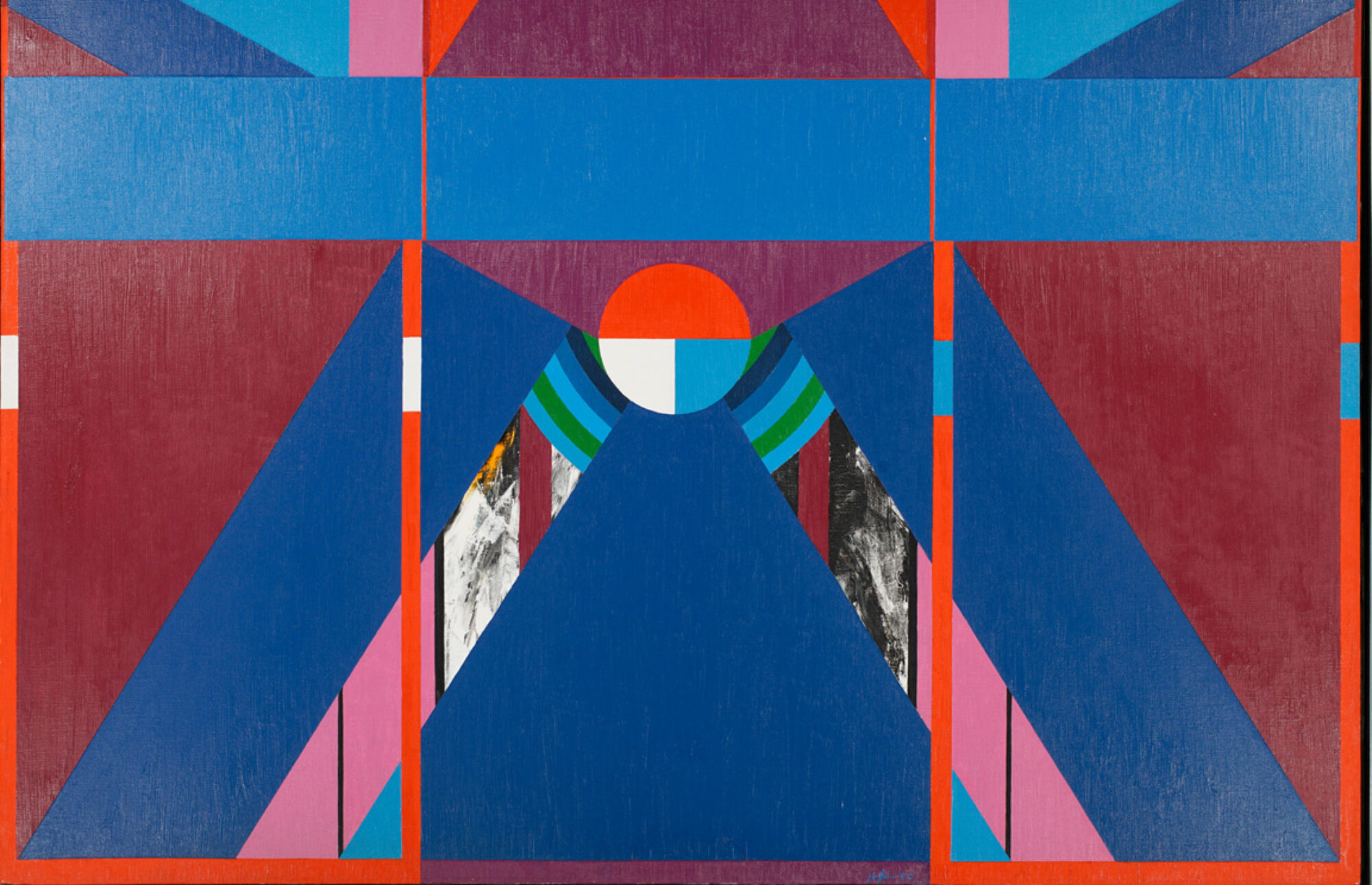
The scope of the exhibition includes works of painting, sculpture, and immersive VR and video projection, which occupy spaces out in the open amongst the foliages and within the interior of the gallery. The works all communicate with one another and inscribe experiences and new thoughts within the viewers in a complex ecosystem and web of ideas and meanings.
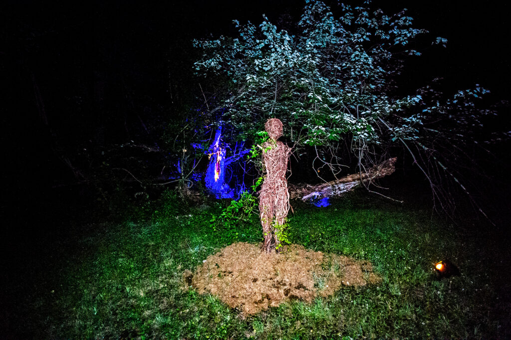
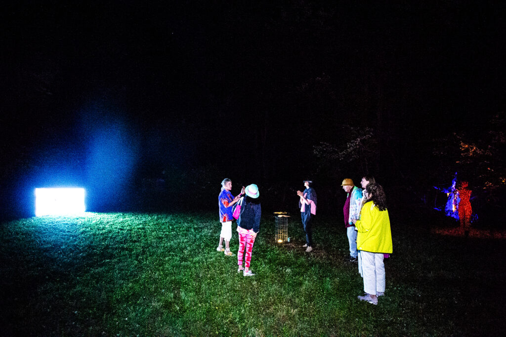
Anki King’s Human Nature is a sculptural installation made with branches and vines over armature that merges seamlessly with its natural surroundings. The work reimagines humanity’s DNA in the vegetal form requiring a magical power to transform into it. The vegetal and natural body representing a young woman is neither a prison nor a limitation; it is a type of liberation as if the person is waking up from a dream into the reality of the natural realm. The lack of arms on the figure is a part of the metaphor that captures the essence of existence for the vegetal forms existing in nature. This is just as flowers and trees lack upper appendages and digital manipulators (aka hands with fingers) and must rely purely on communication via pollens and other chemical signals. In the installation, the sculpture is lit with a red light for nighttime viewing and is surrounded by leaves and branches, the boundary to which is indistinguishable from the sculpture’s idea as the self.
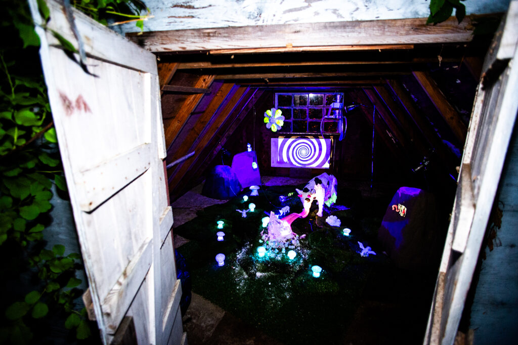
Lise Ellingsen’s Auðumbla (2023) is an ambitious sculptural installation involving lights, resin pieces, and a TV screen that illustrate the Nordic mythology of the primeval cow who fed the primordial frost jötunn Ymir milk. It is also said that Auðumbla, which is pronounced as “eidoombla” in English, also licked and dissolved the salty rime rocks to reveal Búri, the grandfather of the gods. In the work, we see the cow extending a giant tongue to lick away at the rock, surrounded by scattered and glowing mushrooms. The digital screen displays a repeating spiral pattern perhaps to visually represent the process and the sensation of touch and taste by the gigantic corpus linguae. This work along with Anki King’s Human Nature and others positions the exhibition as a space for contemporary reinterpretation of and re-engagement with the magical and mythological origins and perception of humanity. This is the aesthetic and symbolic realm and narrative mode that had existed for tens or hundreds of thousands of human existence before the rise of science and technology in the modern era, which shattered those realms.
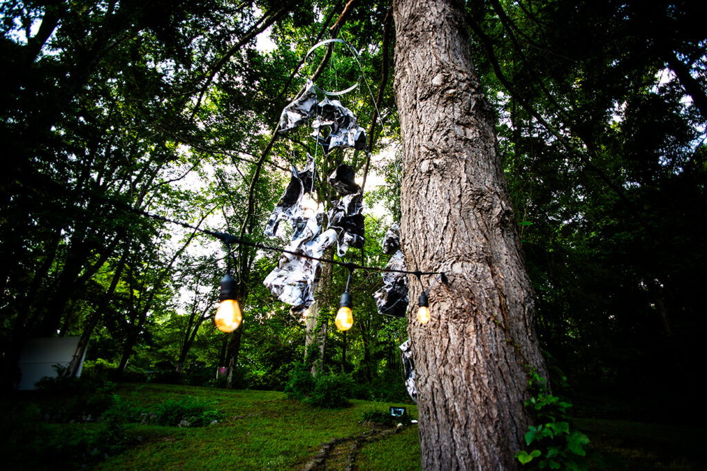
Kristin Jacobsen, a photographer and gallerist from Oslo, Norway, installs her signature piece titled, SMASH (2026), from the upper height of a tall tree. The installation is made from twenty A2 photographs mounted on aluminum mesh and crumpled like discarded pieces of paper. The aluminum metal furnishes the piece with a sense of permanency and longevity, which the photographs printed on paper would lack. And the photographs imbue the work with internal raw visual materials that add substance and narrative to the ideation and production process by the artist. The work is very much about the process of creativity. Why did the artist use the metaphor of the act of smushing the photographs? Jacobsen appears to reflect on the fact that the process of creativity involves steps of aesthetic and visual selection, in which additions of the ideal and the subtraction of the unideal take place. What works and what doesn’t in the final image or product? This may be a dangerous habit of artists that, when applied to the sociopolitical realm, results in evil policies of Nazi Germany and Imperial Japan around the time of World War II. The work serves as reversal of this habit and process of selection amongst the artists, in which the artist destroys photographs, whether her own or found, equally and without saving the favorites, as a form of expression and questioning.
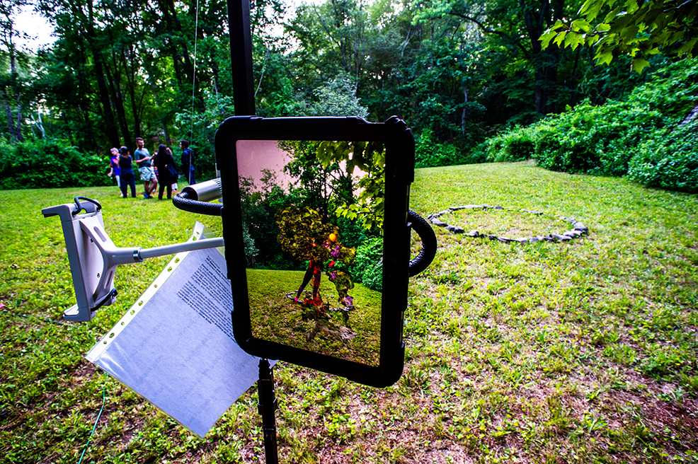
Eva Davidova’s AR Dancer with Plants utilizes augmented reality technology on a camera-equipped camera to project a dancing figure of a vegetal humanoid onto a circular grouping of stones. The augmented reality depicts not only a dancer but also the flowers and trees standing by the dancer. Davidova’s piece gives life and agency to the natural surroundings on figurative terms to which humans can relate, serving as a bridge between the human imagination and the natural realm. The work, which is technologically-based, traverses several domains, including the human, the symbolic, the metaphorical, the natural, and the electronic machine. As a result, the installation is a reaction against our word-based thinking and preconceptions that box us into rigid thinking, preset definitions, and binaries of opposition. Davidova’s art turns out to be not just an art or a 3D rendering, but it is a creature and a vegetal life form with a life force that exists within the symbolic and aesthetic realm of not just human but also the imagination of all life in the form of atoms per posthumanist theory and pananimism.
Villa Isis: A Nordic-New York Immersive Art Experience is a thoughtfully curated exhibition in which the artists’ and curators’ visions interact and engage in a meaningful dialogue for re-imagination and re-examination of our magical and mythological roots. The shifting of boundaries of identity and narratives that cross over multiple realms between the human and nature and the machine allows us to rediscover our potential for spiritual liberation and a means of finding our place in the universe. The exchange between the American and the Nordic artists is an encounter of identities and symbolisms between a locality and a cosmopolitan hybridity (consisting of multicultural origins).
In this communication and exchange, the Nordic artists who come from a particular region and people in Europe have something to teach to the Americans, who originate from all over the world (because the US is a nation of immigrants). While the progressive arm of the US had been a pioneer of the democratic values of diversity and equality, it is now the Europeans who learned the ideological modes of the Americans and are teaching the Americans in turn about their past morally superior position of democratic values and progressive ideals. This position was prior to the rise of Trumpism and MAGA, which destroyed the American stature as the leader of the free world. While the world is greatly turbulent and changed by the rise of right-wing extremism and strongmen, the exchange across the Atlantic is an important channel for communication between the progressively-minded people. This is because we must engage in this kind of gathering and dialogue in order to reflect on our own purpose and reinvigorate our trajectory… of progress in the pursuit of human rights and dignity, equality, democratic and humanist values… for not only humanity but also Mother Earth.