Essay by Todd Bartel
Mildred I. Washington Art Gallery/Dutchess Community College
Todd Bartel, Curator
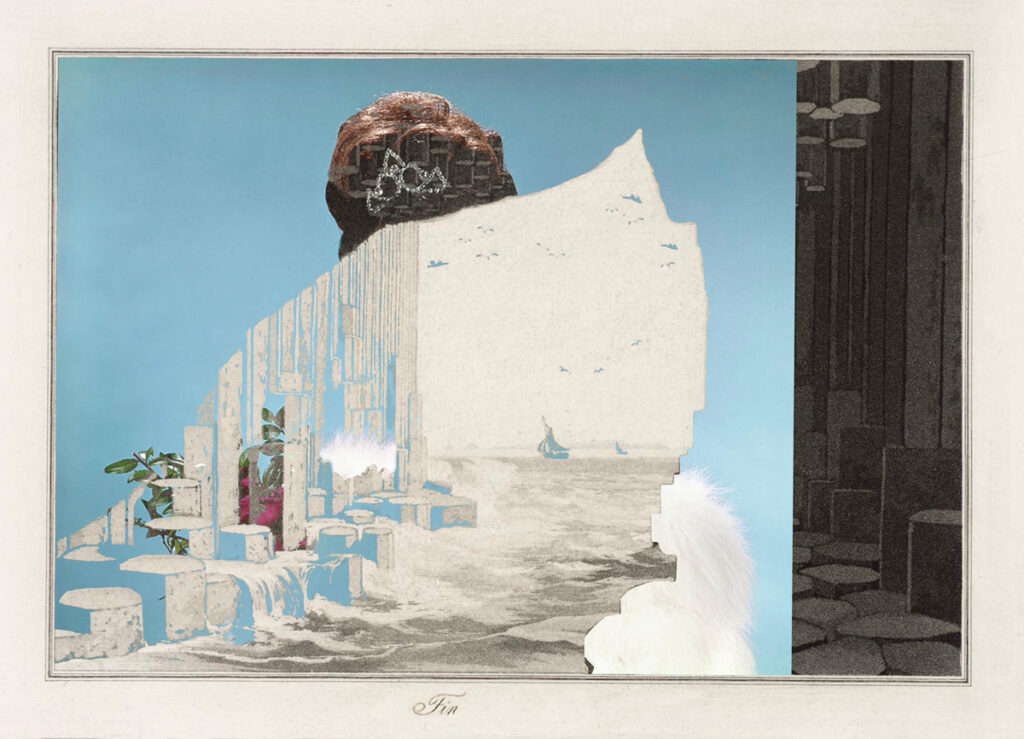
The term ‘Uncollage’ uses the prefix ‘un’ to denote when collage is not glued physically, but is glued intellectually. Uncollage – Seamless Unison examines the neologism by showcasing various practices of imagery fusion and providing comparative examples of cut-and-paste collage demonstrating the differences between physical gluing and immaterial gluing across a wide range of media.
I first used the term ‘Uncollage’ in 1998 to describe paintings that depend on image collection and are painted without physical additions glued to the surface—such as the work of Archibaldo, Grandma Moses, Mark Tansey, and Julie Heffernan, all of whom I have also published articles on. All too often, what comes to mind when the word ‘collage’ is uttered is glued paper, but collage is so much more. Collage is an operation that does not require paper or glue, and can be appreciated any time a creative process involves composite incorporation. I presented my thesis at the first annual Kolaj Fest, in New Orleans in the summer of 2018, a multi-day festival & symposium about contemporary collage and its role in art, culture, and society hosted by Kolaj magazine. After that, I expanded the concept in a series of 4 articles, published by Kolaj magazine in 2019 and another four articles since then, as well as written several exhibition essays for shows in the U.S., Portugal and Spain, which has led me to assemble the essays in a forthcoming book, Uncollage & Immaterial Glue — the Collected Essays of Todd Bartel that will be available in early July, 2026.
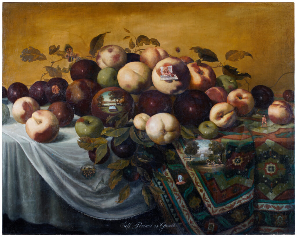
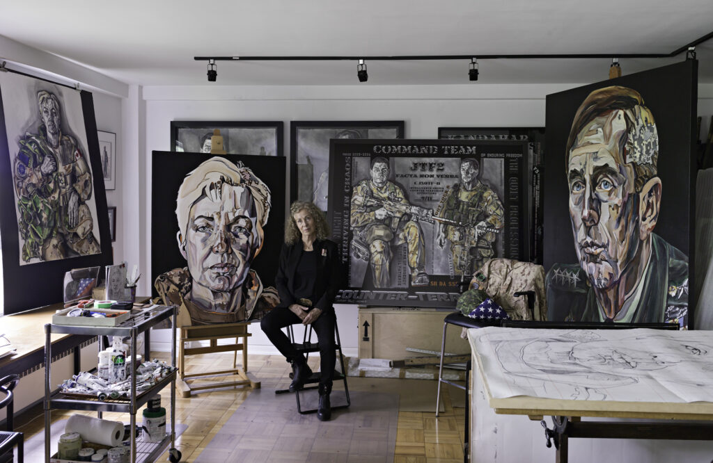
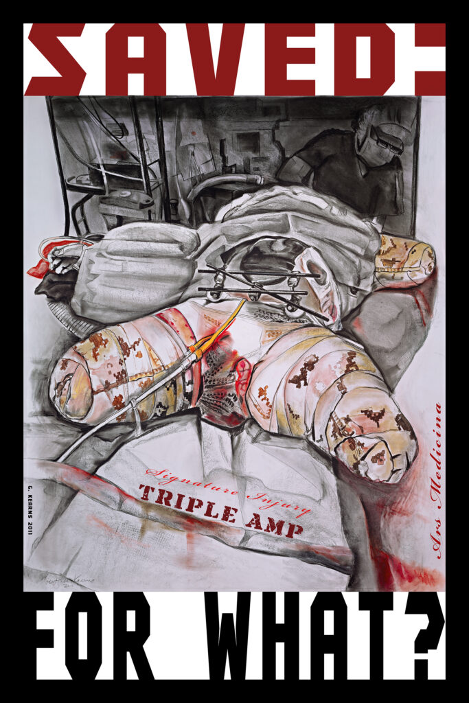
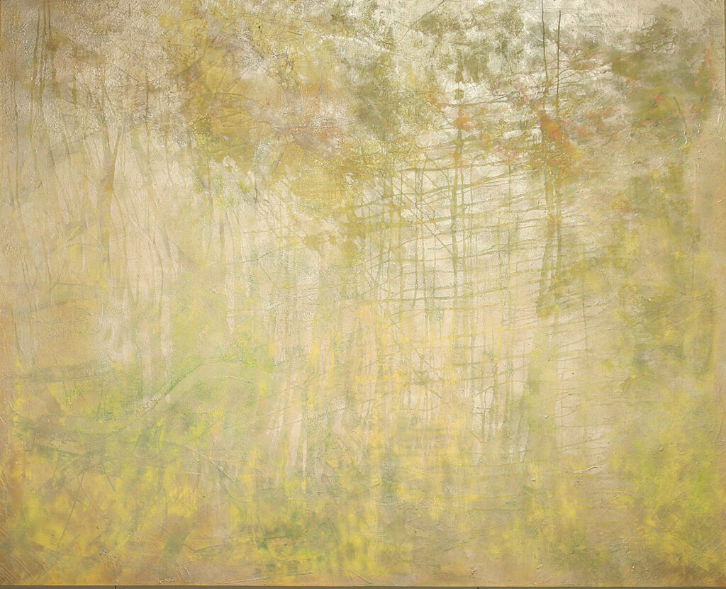
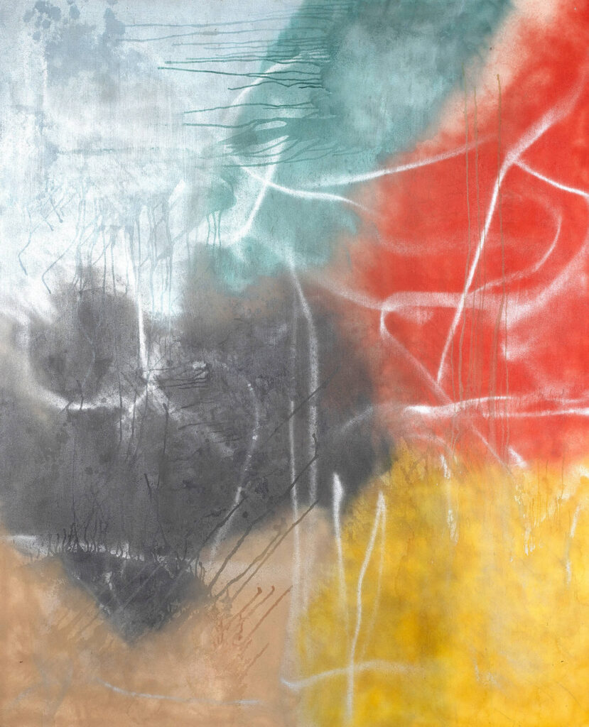
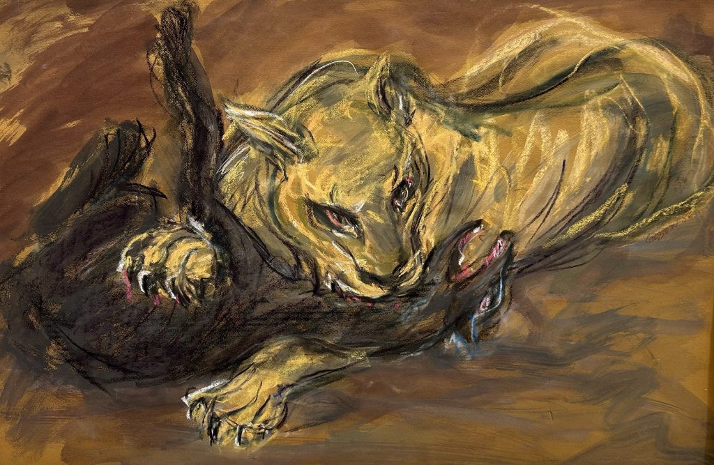
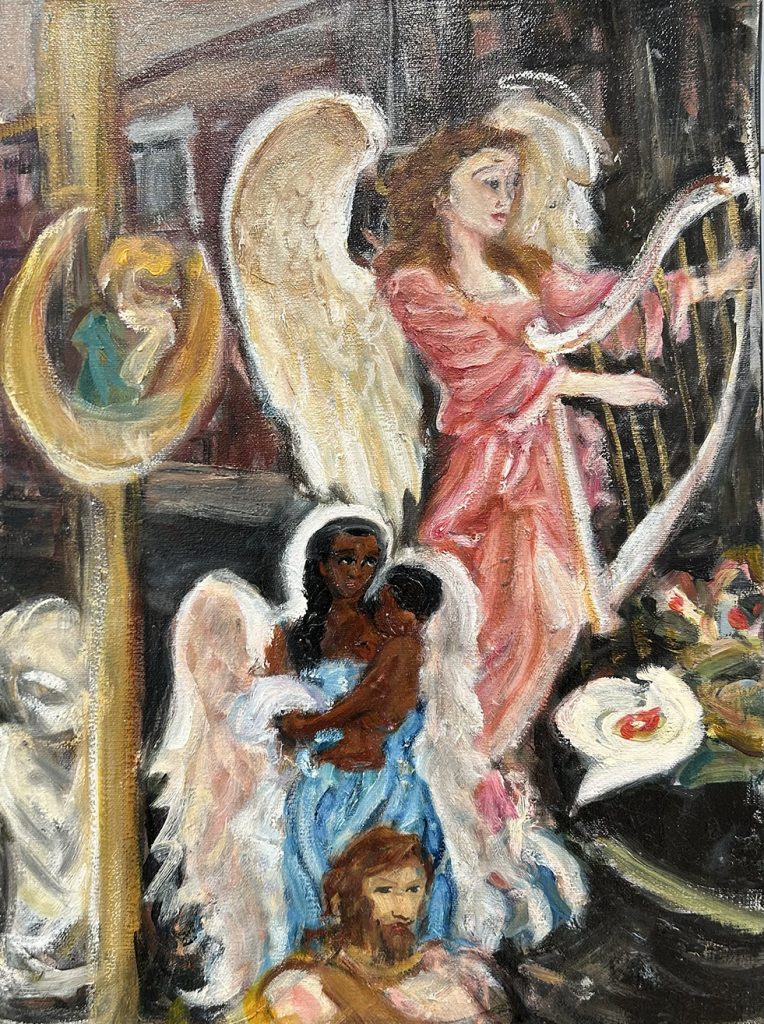
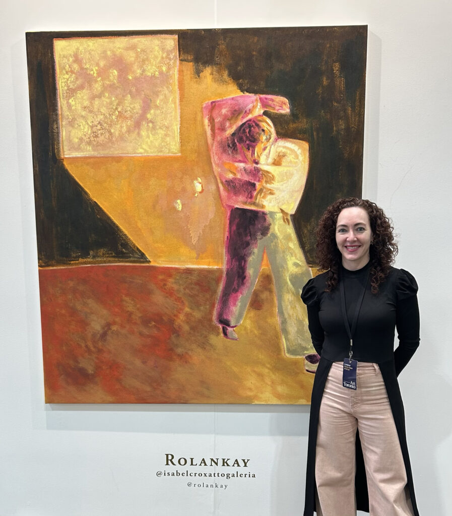
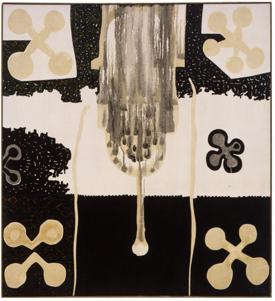
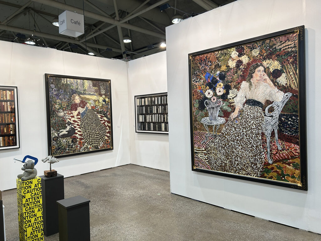
Uncollage—Seamless Unison assembles the art of thirty-one emerging, well-established, and historically notable artists, including the Abstract Expressionist painter Budd Hopkins (1931 – 2011). Hopkins, who wrote the influential essay, Modernism And The Collage Aesthetic, often made facsimile collage studies for his abstract paintings, and examples of each are the first works visitors encounter inside the gallery. The show includes paintings by Julie Heffernan, Bo Joseph, Fern Apfel, Brian Bishop, D. Dominick Lombardi, Ginnie Gardiner, Talin Megherian, Justin Richel, Denise Shaw, and Amy Talluto, who all fuse collage-based strategies to import and juxtapose collected imagery. Lombardi’s painting is noteworthy for repurposing a previously “completed” painting with complementary stylistic additions.
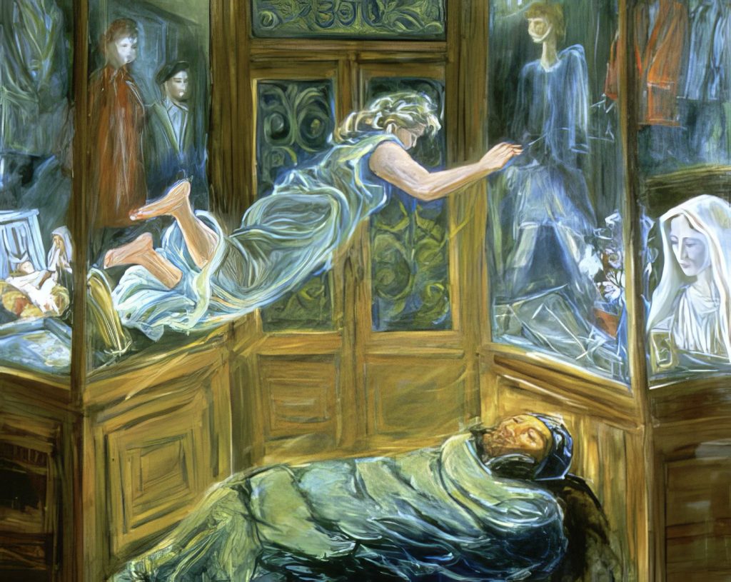
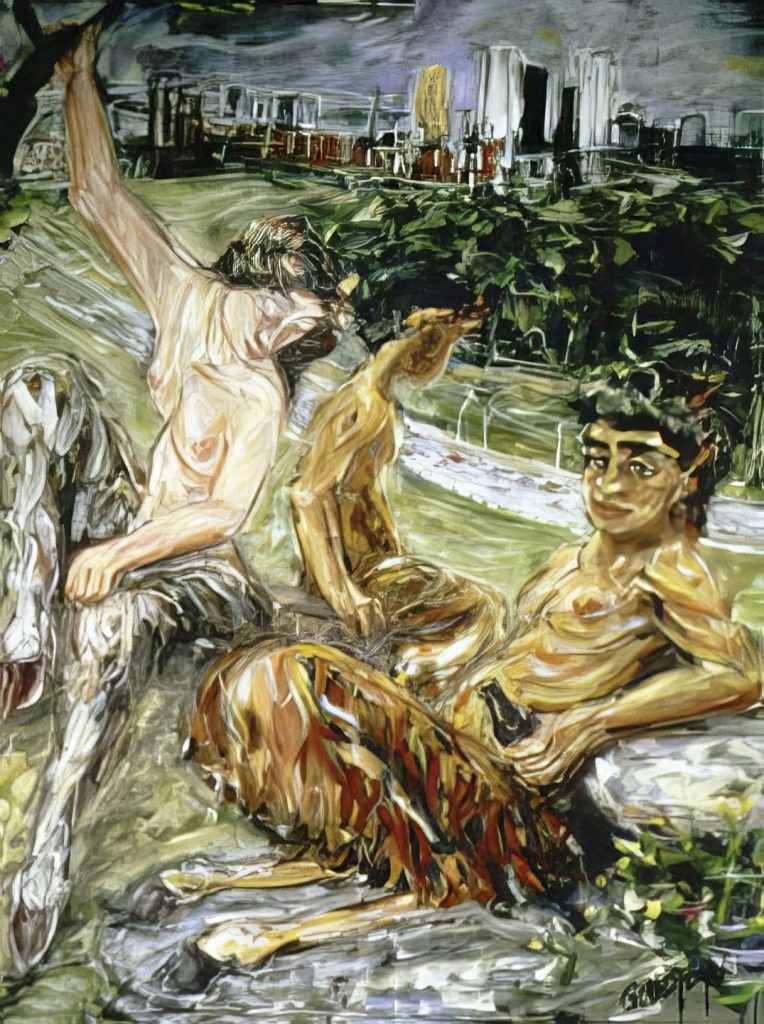
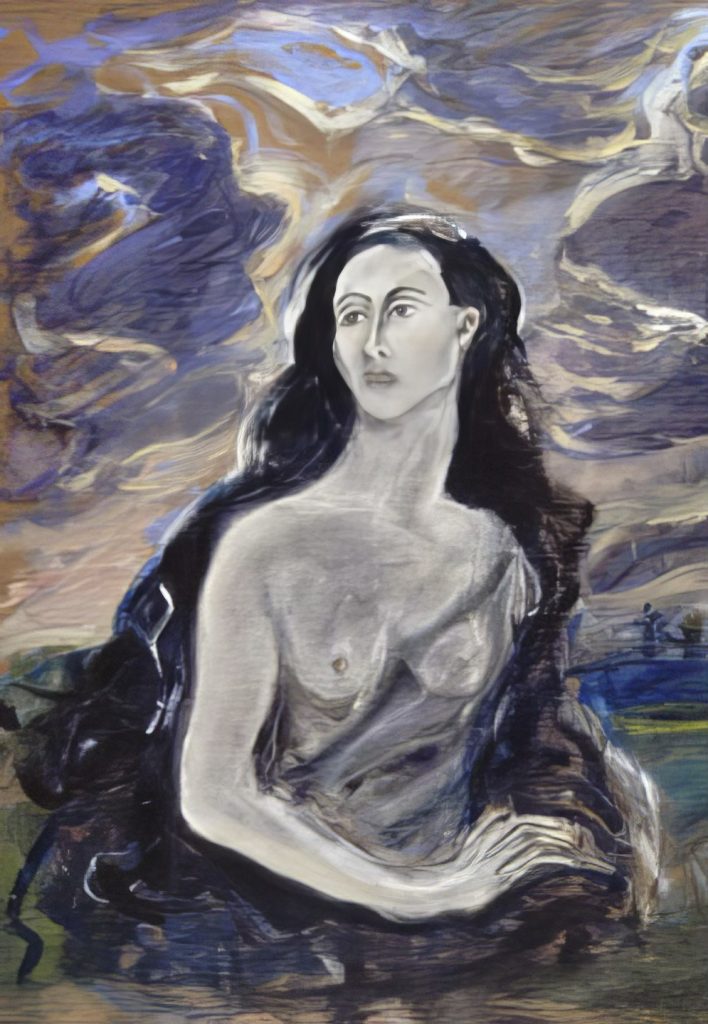
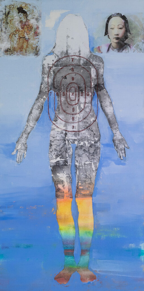
The exhibition includes several examples of trompe l’oeil drawing and painting, including works by Brian Bishop, Laura Christensen, Ruth Marten, Leo Sousa, and Amy Talluto, and a trompe l’oeil sculpture by Justin Richel. In all of these pieces, the genre is enhanced by the incorporation of ideas, brought into the work, if not known references to other artists’ works. Similarly, Julie Blankenship, Christensen and Marten explore ‘Uncollage’ through altered readymade, employing various drawn and painted enhancements.
Uncollage—Seamless Unison showcases several works that involve image transfer processes, including a Xerographic print on vintage paper by Michael Oatman, a hand-transferred Xerographic photo presented as an “original photograph” by Roma Megherian Bartel, and a painting with multiple acrylic gel-medium transfers by Denise Shaw.
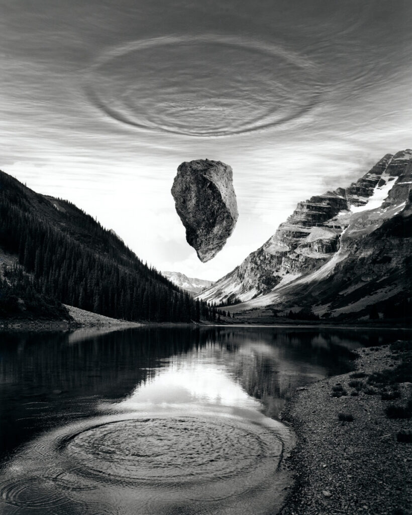
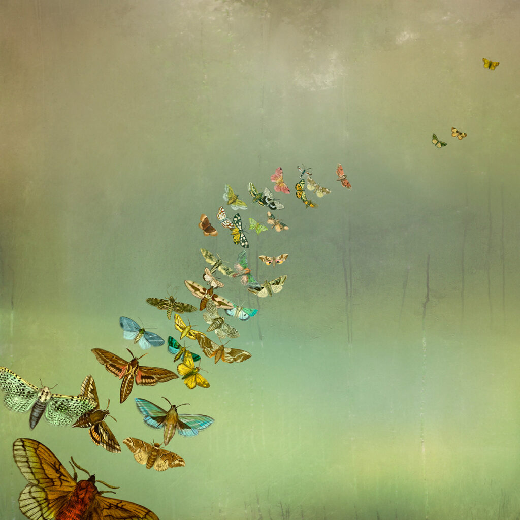
The exhibit highlights an iconic multi-negative gelatin silver print by Jerry Uelsmann (1934 – 2022), whose analog work may be said to have anticipated Photoshop, and, emerging photographer Max Labelle, who photographs cutout photographed images of quotidian objects in real-world settings, which confuse flattened depictions of real objects in actual spaces. The show counterbalances these analog photographic processes with the works of veteran digital collage artists Fran Forman and Maggie Taylor, as well as the work of Leslie Fry, Samplerman (Yvan Guillo), Wendy Seller, and Rowan Buffington, whose hybrid piece provides a blended example of analog and digital applications of collage.
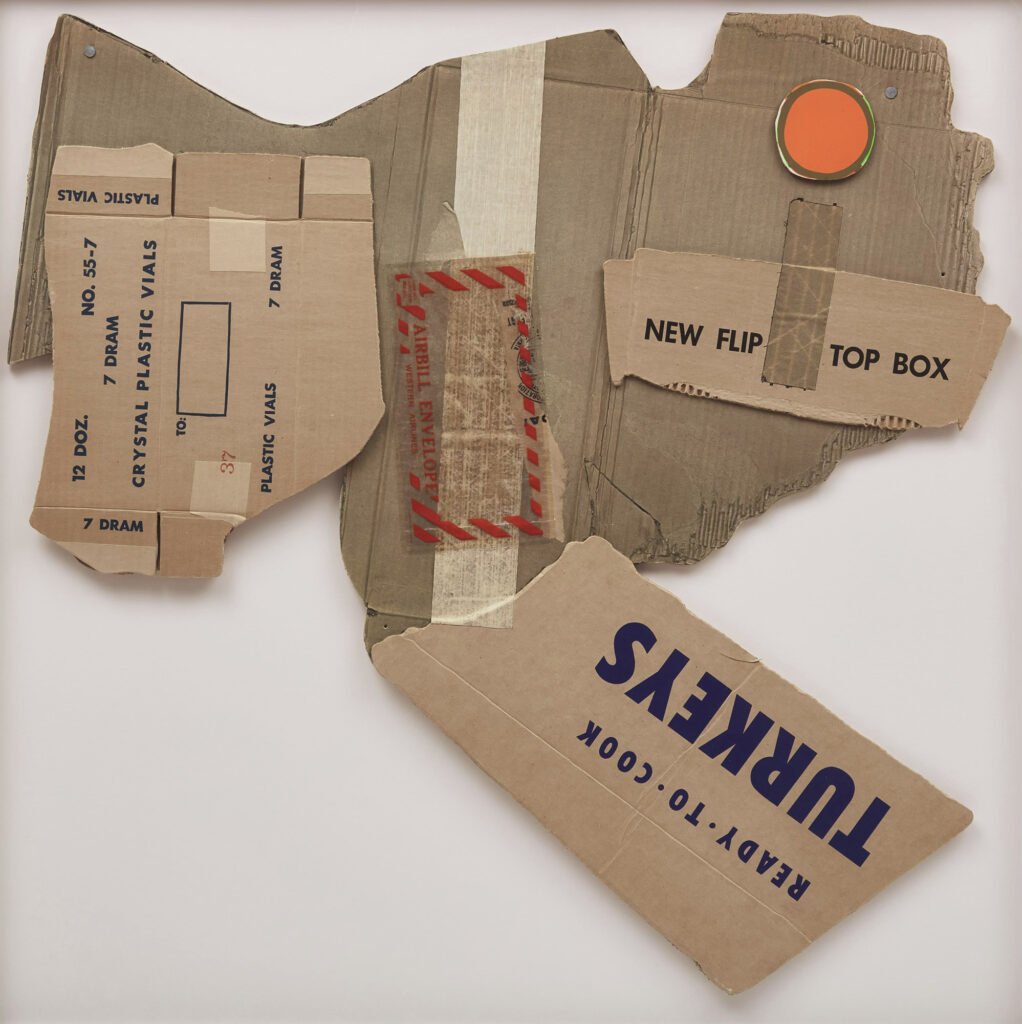
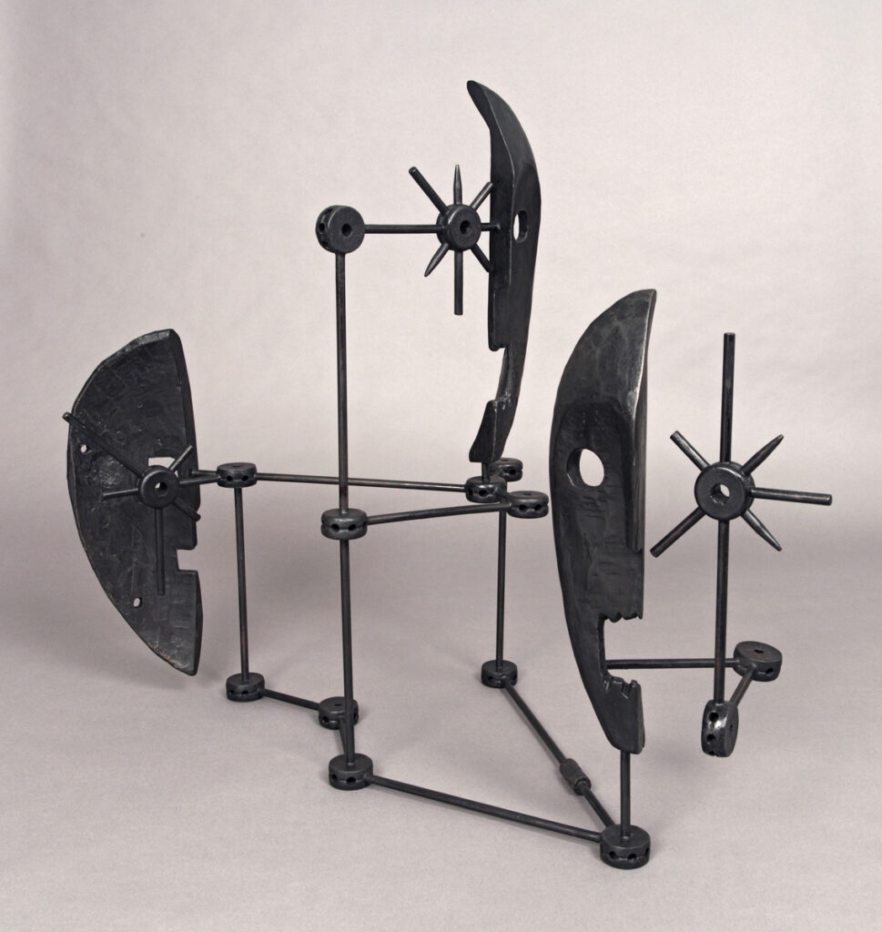
Also included in the show are several sculptures that more or less conceal their composite origins, such as D. Dominick Lombardi’s recycled refuse sculpture and Justin Richel’s stretched-canvas trompe l’oeil brick. There is also a objet trouvé bicycle by Jack Massey, an assisted readymade with an intellectual coupling to a well-known work by Pablo Picasso, as well as the conceptual sculptures of Darryl Lauster and Bo Joseph that expand the neologism into the time-honored practices of lost wax bronze sculpture.

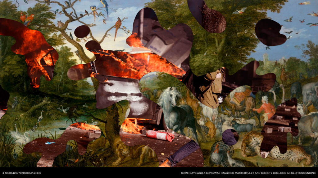
The show also includes examples of static and moving AI image generation by artists Joann, Will Close, and Máximo Tuja, as well as a multimedia installation by James Andrew Scott that blends analog drawing with pixelated digital video, using an array of four 4 x 4-foot LED panels to display looped video imagery incorporating abstracted versions of many of the works in the exhibition.
The unexpected diversity of media and imagery showcased in Uncollage—Seamless Unison reveals the term’s inclusivity, which credits collage in places not often considered collage-based. Máximo Tuja (Argentina/Spain, a.k.a. Max-o-matic), one of the creative forces behind The Weird Show, an independent platform dedicated to exploring and redefining contemporary collage since 2010, and an artist featured in Uncollage – Seamless Unison, described the concept this way: “Uncollage reminds us that the art of collage is not confined to tangible materials but extends into the realm of the immaterial. It highlights the versatility of collage as an artistic practice, allowing artists to explore and combine various elements, whether physical or conceptual, to create entirely new and meaningful compositions.”
The unofficial first exhibition of Uncollage paintings appeared at the Knoxville Museum of Art, where I was invited to peruse the museum’s online catalog of holdings and select half a dozen works from the collection that exemplified the concept for inclusion in the museum’s Currents exhibition as part of 2021 Kolaj Live Knoxville. I gave tours of the exhibition and spoke about the differing strategies of collage and uncollage. There was no invitation, title, or museum didactic for that show, which makes the Mildred I. Washington Art Gallery show the first of its kind. Unlike the unofficial show, the official version showcases a much wider breadth of the concept.
Uncollage – Seamless Unison is one of ten satellite exhibitions presented by the Transforming Collage Hudson Valley Exhibition Series this summer. The exhibitions are organized in conjunction with Making Meaning: A Collage Symposium, taking place July 22–24 at the Vassar Institute for the Liberal Arts in Poughkeepsie, NY. From their website, “This important gathering celebrates the evolving language of collage and the role of contemporary artists in shaping cultural dialogue, experimentation, and community connection.” There, I will present a slideshow about Uncollage and the exhibition at the Mildred I. Washington Art Gallery as one of the presenters of the Making Meaning Collage Symposium. Both the exhibition catalog and my forthcoming book, featuring the collection of my Uncollage essays, will be available at the symposium and on Lulu.com. Interested individuals can register to attend the symposium at: https://www.transformingcollage.com
The artist’s reception and gallery talk for Uncollage – Seamless Unison is scheduled for Friday, July 24, 3-6 PM. The exhibition runs from June 29 to July 31st, 2026
Making Meaning, organized and directed by Andrea Burgay & Monica Church, is from July 22 to July 24, 2026.