by D. Dominick Lombardi
Braço Perna 44 in Lisbon and Atelier Ghostbirds in Caldas da Rainha, Portugal, D. Dominick Lombardi, curator
The online Oxford Dictionary defines pretending in this way: “speak and act so as to make it appear that something is the case when in fact it is not.” Most of us can still remember playing as a child; dressing, behaving, claiming to be something we were not but hoped to be one day. Some of those pretend characters were the classic princess, an adventurous astronaut or explorer, a ballet dancer, a sneaky spy, or simply a person that operates a car, boat, train or plane. What is common with artists, is that childhood pretend playing often occurred with aspects of drawing, painting or just simply creating in an imagined world that was funneled through the images and installations produced by the pretenders.
As a child, I clearly remember drawing crazy looking fish on paper, cutting them out and playing with them on the floor as if I was immersed in an underwater world. Luís Almeida remembers making drawings where he would represent what it was like living in an underground world where there were traps, bugs and warring soldiers. He also remembers making drawings of tall buildings with a childhood friend, where the windows would show what was going on inside each floor. When Run Jiang was a child in kindergarten, she remembers drawing a picture of a couple all dressed up and getting married. Soon, other children gathered around asking her to draw one for them, all pretending to be all grown up and getting married. Izumi Ueda Yuu remembers her home in Japan, where there was a window between the living room and the hallway that had many wooden slats. Ueda Yuu used those slats as shelves to display her found treasures: pieces of glass with rounded corners that she picked up on the street, scrap metal, some rusty and some still shiny, dried flowers, seeds, especially large camellia seeds, souvenir wrapping paper, and whirring oil paper as she made installations of those precious things every day in her little private gallery.
As adults, that ability to move into an alternative place that is under control solely by the creator, that form of pretending, is still very much alive in the work of the four artists in the exhibition: Izumi Ueda Yuu, Luís Almeida, Run Jiang and myself.
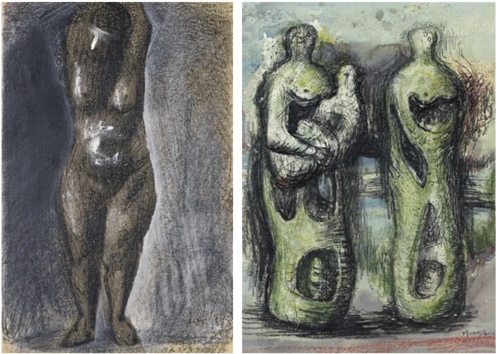
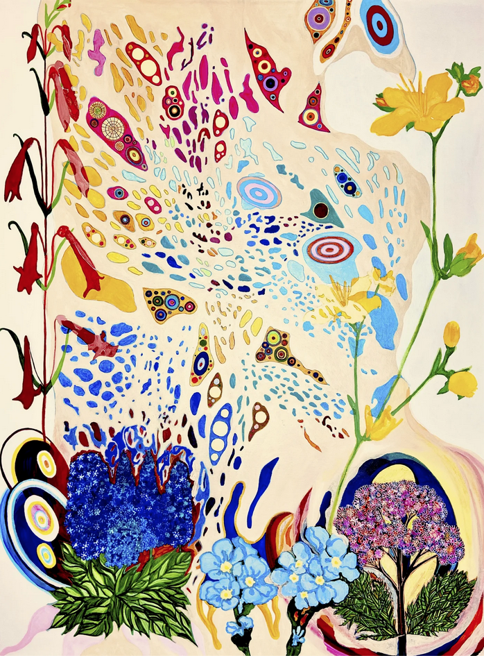
The art of Izumi Ueda Yuu relates very much to Symbolism in the way it conjures up dreamy narratives through pure, poetic, potent iconography. Everything, every belief, emotion, realization is boiled down to its essence, waiting to re-emerge in the mind and thoughts of the viewer. Once the conversation begins between the art and the viewer, the mysterious spiritual aspect of the art comes forward. The artist’s imagined, created place of make believe is one built of memory, childhood dreams, things that sometimes happen in the periphery that later become central and Ueda Yuu’s art lives in that space where the mind transcends the matter.
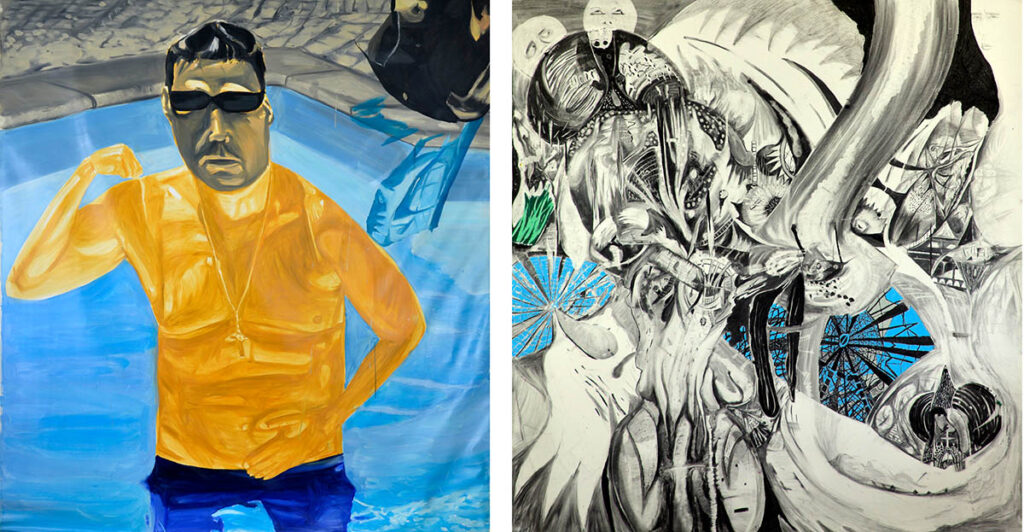
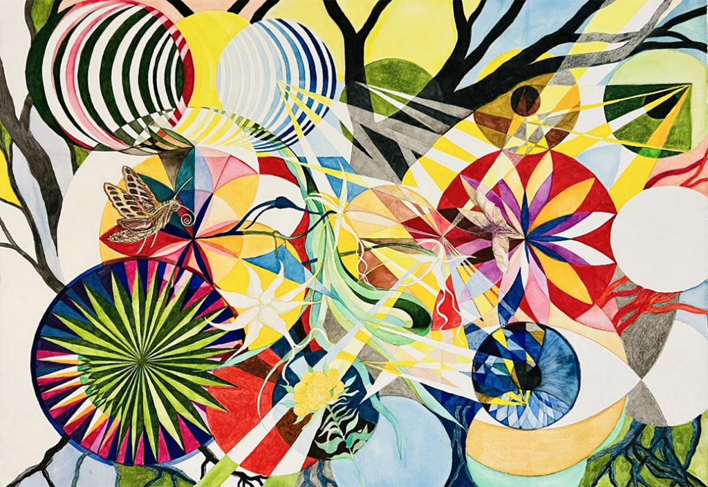
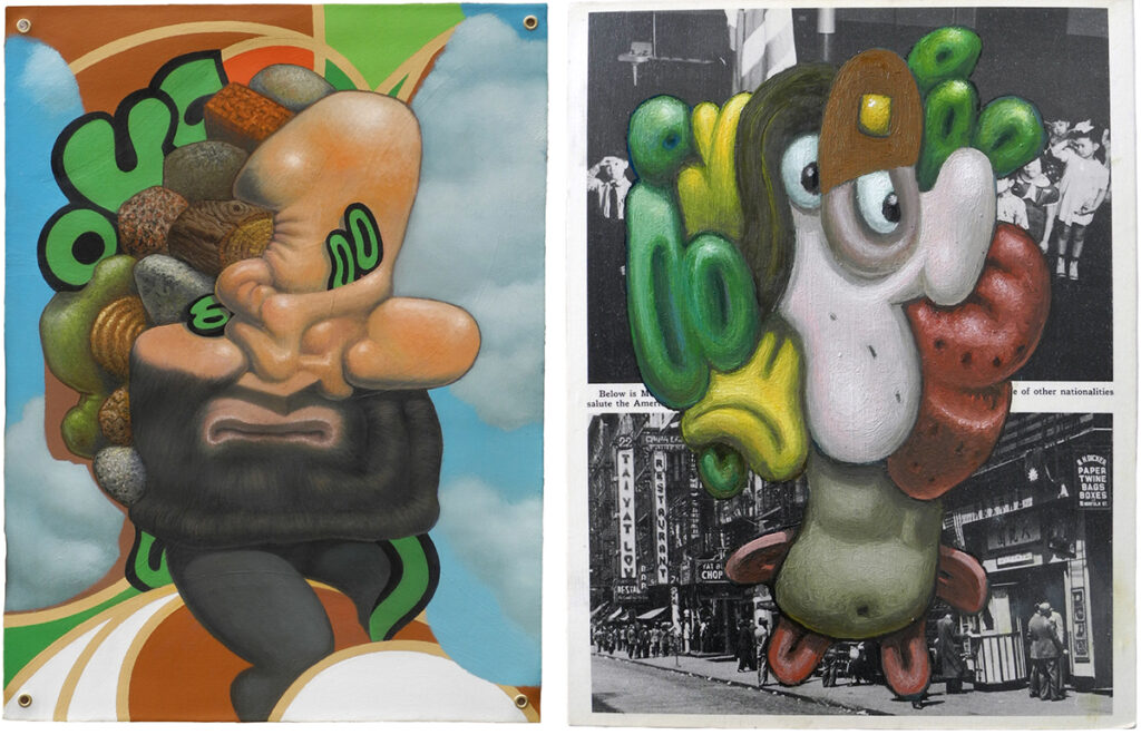
Luís Almeida’s art goes back and forth between fantastical, heroic imagined worlds to a brutal form of representation. His ability to reveal a mystical imagining overrun with narratives to the simple truth of the absurd or benign aspects of the everyday, all with an element of wild humor is the core of Almeida’s art. A brilliant draftsman and a provider of unadulterated color theory, this artist is still very much connected to that inner child that once ruled all his thoughts. The message here is: “There is no art without total freedom of thought and expression.” A mental state that hinges solely on his ability to leave it all out there for everyone to see.
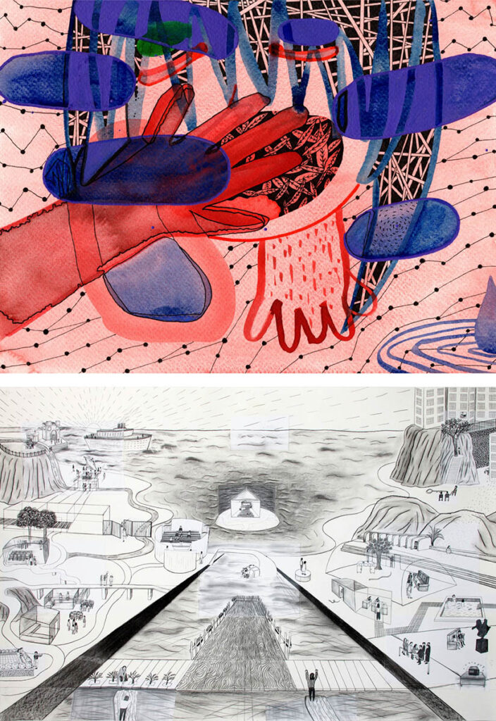
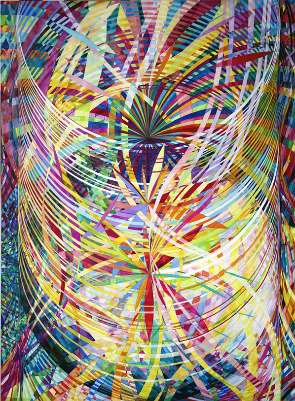
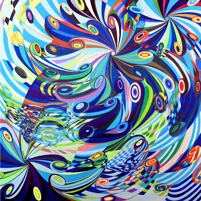
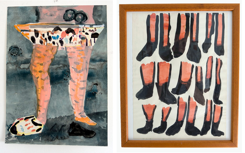
Run Jiang’s art is a perfect blend of being and pretending. Jiang’s more colorful works focus on the waking dream state, when one’s thoughts are completely unrelated to one’s physical place. In this instance, Jiang puts forth her own unique way of portraying the multi-planar reality theory whereby previously unseen worlds collide. In her black and white ink drawings which she notes as a Dream series, Jiang brings together lifelong experiences, both real and imagined, into a precious series of vignettes and vistas that can at one moment seem bucolic and the next imperiling.
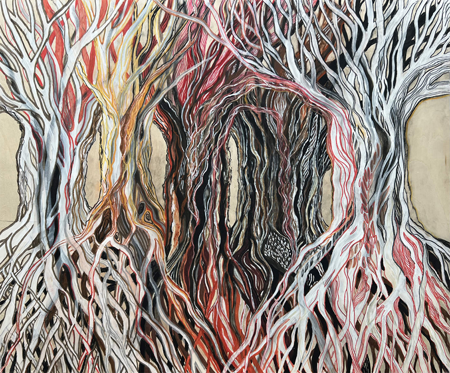
In my paintings, I am repurposing the thousands of small drawings I made when most of the world was sheltered in place. For an artist, this state of being sheltered and alone is not so unusual. In fact we crave it. However, the danger that lurked just outside the studio door and windows in the time of the worst COVID days was very imposing. Studying, mining and resolving a few of the numerous, relatively automatic drawings I made back then, recreating them into oil on repurposed canvases or on 1960’s and 70’s printed materials gives me the chance to return back to a time when I pretended everything, one day soon, was going to be okay.
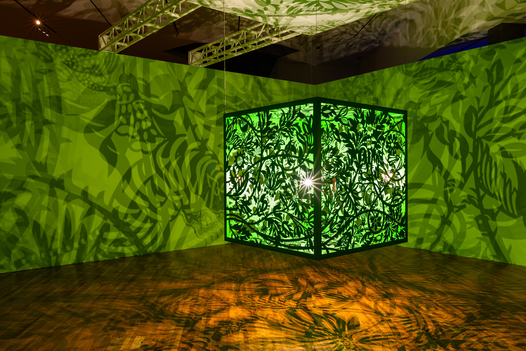
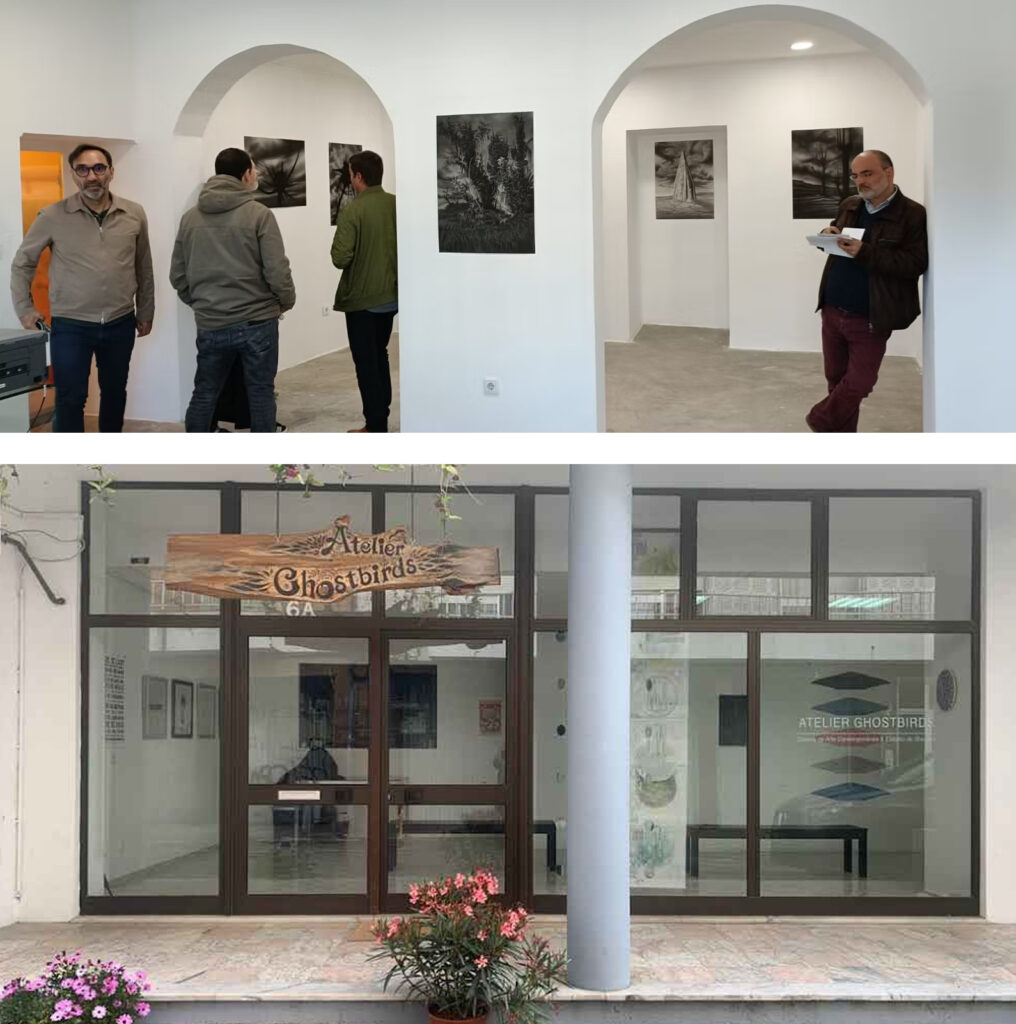
The exhibition “Fingindo ou Fingimento (Pretending),” which will include the work of Izumi Ueda Yuu, Luís Almeida, Run Jiang and myself (D. Dominick Lombardi), will be held at two compelling venues. The first will open on October 30, 2025 at Braço Perna 44 in Lisbon. Run by João Fernandes, Braço Perna 44 is one of the more charming spaces in town, where they always present some of the most visually stimulating, intimate and intriguing art in the capital city of Portugal. Luís Almeida and Run Jiang are represented there. The second venue opens on November 7, 2025 at Atelier Ghostbirds, which is run by Mika Aono. Located in Caldas da Rainha, Atelier Ghostbirds is a formidable and central institution in an area where there are many artists living and working. In addition to eye opening and fun exhibitions, the gallery also offers printmaking workshops and art related events.