The impulse to shred back issues of dArt magazine to make pulp and paper had yielded dozens of 21 x 16 inch sheets some five years after the 2011 dArt Burger exhibition at De Luca Fine Art in Toronto. The show co-producer Ben Marshall had insisted that we install an actual meat grinder in the show, its function having been symbolic. Practically speaking, neither grinding nor shredding paper is possible with it. A basic office shredder and a uniquely-designed blender are the sole equipment requirements for dArt magazine paper production. For James Cooper’s video on the collage potential of dArt click: Dart Onion.
Steve Rockwell, Minced dArt, 2011, meat grinder with shredded dArt magazine pages and cropped magazine
A lingering colloquialism since the horse and buggy days has been the tale of glue factories killing old horses and grinding up their bones to make glue. The bubbling up of the saying, of course, arises generally in response to some human inkling of its own mortality. I sense that it might be into this very psychic cranny that San Antonio artist Hills Snyder casts his Dickensian shadow. Here is my account of meeting the artist at the 2005 Artpace Chalk It Up event in San Antonio:
Hills Snyder, Misery Shoppe Repairman
“Hills Snyder arrived in undertaker black to set up his Misery Repair Shoppe, comprised of a chair and a desk with a meat grinder with which to pulverize his chalk one stick at a time. He set up shop on the Houston bridge above the banks of the San Antonio River, in itself a bit chalky from limestone, I suppose. Grinding chalk is a dry, dusty job, as is purging despair. Snyder was making a connection with the white cliffs of Dover, specifically Shakespeare Cliff, where the Earl of Gloucester, blinded for his loyalty to King Lear, took his imaginary fall, demonstrating to the ages the cathartic power of tragedy.”
More can be said about the pulverizing of chalk over the centuries. Lessons have been sown and inculcated into the fertile cranial soil of blinking pupils facing dusty blackboards, generation upon generation, stick upon stick, scratched by the stern “chalk grinders” of yesteryear.
In the French city of Rouen in 1913, a young Marcel Duchamp chanced upon a chocolate grinder displayed in a confectioner’s window. The machine became the subject of two paintings, precise in the style of an engineering diagram with flattened planes, eschewing the artist’s hand. To the artist, however, its operational churning suggested something auto-erotic. Duchamp made it the subject of a major work, The Bride Stripped Bare by Her Bachelors (1915-1923), its mechanical subject matter conversing in the language of the sexes. Frequently the artist would sign his art with his alter ego, Rrose Sélavy, or “Eros, that’s life,” as he had done with his 1919 L.H.O.O.Q. work, signifying the extent to which sexuality was at the heart of his philosophy of life.
I selected Duchamp’s L.H.O.O.Q. as the “meat” for my own grinder, understanding that the gesture was consistent with at least one principle of Dada, the cycle of breaking and making – a shadow cast by Snyder’s chalk grinder. We all go to the same place. We all come from dust, and to dust we all return.
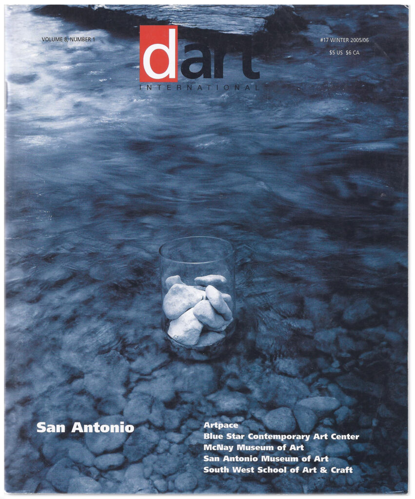
San Antonio edition of dArt Winter 2005/6 with Neil Maurer cover
I never got to ride on the carousel, aerial tram, nor on any horses for that matter, in Brackenridge Park, while I was in San Antonio. It would have been nice to go through the Japanese Tea Gardens with its winding walkways, stone bridges, and pools in what was once a rock quarry. No complaints. I had a brief glimpse of the SBC Center, the home venue for the San Antonio Spurs of the NBA after a bit of Sax in the CitySouth at the Red Berry Mansion. The program notes tell me that it might have been “A” Sharp Jazz Band or Planet Soul that was playing at the time—something that the South San Antonio Chamber of Commerce had put together, that included some art and a cooking competition. The Mansion was an extraordinary slice of prohibition era godfather-kitsch Texas style.
Downtown San Antonio itself is halved by the lazy sashay of the San Antonio River. Looping at its center is a bit of man-made canal work with its famous River Walk. You descend to the river from the pavement on stone steps and ascend again at the next street, continuing in this fashion from block to block. The Walk is a quaint canyon oasis perhaps 20 feet down or so, shaded by trees, bridges, and buildings that press against its edges. The sun likes to dapple the river water into glints of milky jade. It’s a cool stroll.
A first-time visitor might lose his sense of direction (like I did repeatedly), even with a map. On the other hand, it was a great way to ‘read’ the ghosts of the city. With your index finger you can trace out street names like Alamo, Houston, Travis, Crockett, and Bowie. The musket smoke, of course, has cleared long ago, as have the military musical chairs between Mexico, Spain, the Lone Star State, and the Union. San Antonio is now the eighth largest city in the United States, pushing a population of two million. Its art and culture, however, continues to seep through the cracks of history—if not exactly seeping, art has been stitched and crafted into what were once private estates, breweries, convents, warehouses, tire stores, and automobile showrooms, places that are enjoying second incarnations as vibrant and dynamic art facilities. I will now take you through some of the museums, art centers, and schools of San Antonio in the order that I experienced them.
The McNay Art Museum
Driving into the twenty-three acre McNay estate from North New Braunfels is a bit like stopping in to visit a friend. You are coming to see Marion Koogler McNay, and as long as the museum that bears her name is open, you are guaranteed a warm reception. Of course, Mrs. McNay passed away more than 50 years ago, but she left so much of herself behind, that it is impossible not to think of her at every turn. Admittedly, it is not readily apparent which works make up the original endowment, yet, walking past a Gauguin, Manet, or Cézanne acquaints us with Mrs. McNay as if she was there in person.
Jesse H. Oppenheimer who celebrated his 50th anniversary on the McNay board this year, remembers as a child, riding his horse in the brush beyond his home. Neighbor, Mrs. McNay had peacocks, guineas, and other exotic birds, and he recalls hearing the screaming of the peacocks.
The first modern art museum in Texas, Marion Koogler McNay left her art collection, her Spanish Colonial Revival-style residence, and an endowment “for the advancement and enjoyment of modern art.” While the original collection consisted of some 700 works, the museum has now grown to over 16,000 objects.
Based on her recollections of Seville, Spain, Mrs. McNay had personally supervised details of the construction of the building and grounds, including the placement of massive Texas red granite boulders and the sequence of fountains and waterways. The estate includes fountains and a Japanese-inspired garden and fishpond. The recent acquisition of the 1970 Alexander Lieberman sculpture, Ascent, monumental and vivid red, dazzles the eye against the lush green of the lawn and foliage.
Public and Media Relations Manager, Margaret Anne Lara, and recently appointed, Curator of Art after 1945, Rene Paul Barilleaux, gave me a splendid tour of the museum. From the start, at the building’s entrance hall, a warmth and hominess pervades, enhanced by details such as the stencilling of an intricate pattern into the wooden beams of the ceiling, and the overall wall color, touches that restore the McNay to a sense of its origin as a residence.
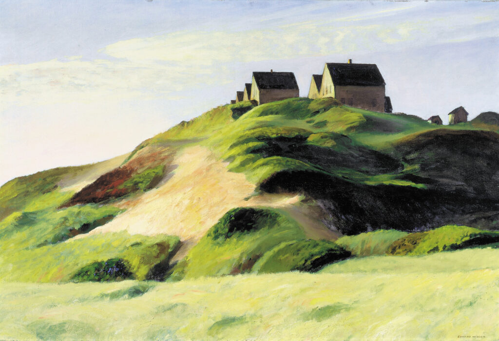
Edward Hopper,Corn Hill (Truro, Cape Cod), 1930, oil on canvas, 28.5 x 42.5 inches. Courtesy the McNay Art Museum, San Antonio, Texas
From here, the visitor is invited to “step into a masterpiece,” a most apt slogan for the McNay Art Museum. Very quickly, you may find yourself absorbed in a Sisley, Monet, Manet, Cassat, Pissarro, van Gogh, Gauguin, or Cézanne, while passing from one room to the next. Moving from the 19th century to the 20th, your eye may be captivated by a Picasso, Matisse, O’Keefe, Dove, or Hopper, to name just a few. Contemporary art and modern sculpture are growing strengths, which number over 14,000 objects. Sculptures include Rodin, Renoir, Rickey, Smith, and Hepworth.
The museum’s collection of prints and drawings is one of the finest in the Southwest. Prints by noteworthy artists are represented in considerable depth, including Mary Cassatt, Henri de Toulouse- Lautrec, Pablo Picasso, Diego Rivera, Jose Clemente Orozco, Louise Nevelson, and Jasper Johns. Drawings and watercolors include masterpieces by artists that range from Winslow Homer to Cy Twombly.
The museum features a 30,000 volume research library, the 300- seat Leeper Auditorium, and a Museum Store.
The core of the McNay collection of Art after 1945 has been assembled primarily by gifts from private San Antonio collectors. Louisiana native Rene Paul Barilleaux was recently appointed the new Curator of Art after 1945, after serving as Deputy Director for Programs at the Mississippi Museum of Art, Jackson.
The current director of the McNay, William J. Chiego, makes the case that modern art begins with the establishment of public art museums, naming the Louvre in Paris and the National Gallery in London as influences to artists. At the end of the 18th and the beginning of the 19th century, artists obtained extraordinary access to these institutions, touching off an explosion of new movements, through the rediscovery of past masters. This view is consistent with the museum’s philosophy to embrace historical works as well as contemporary art.
A noteworthy exhibition, currently on view at the McNay until the end of this year is Waking Dreams: The Art of the Pre-Raphaelites from the Delaware Art Museum. Regarded as the most significant collection of its kind outside the United Kingdom, Waking Dreams showcases 130 works of art that include oil paintings, watercolors, and drawings, as well as ceramics, jewelry, and furniture.
It is difficult perhaps for us to regard the Pre-Raphaelites as rebels today, in view of the 20th century and its artistic upheavals, but in the mid 19th century in London, they were a group of young disaffected British artists and writers preparing to strike out in a new direction. The band, Dante Gabriel Rossetti, William Holman Hunt, and John Everett Millais, sought to paint directly from nature, drawing inspiration from art before the time of Renaissance artist Raphael. Modes typical of early Italian art such as bright color and close attention to detail, are prominent features of their work.
It was a delight to view Henri Matisse’s Jazz, on view at the McNay for the first time in over 10 years. It is a complete portfolio of 20 pochoir, or stencil prints. Completed in 1944 for Verve, an artistic and literary review which was published in French and English. Its predominant themes are the circus and the theater, with allusions to experiences from the artist’s past. The text of Jazz is a take on his view of life and the world. Unable to find a printer’s font that pleased him, Matisse handwrote the words in his signature calligraphic style.
The McNay Print Suite Series V highlighted four artists who influenced the 1960s art movement, Pop Art. Described as “transient (short-term solution), expendable (easily forgotten), low-cost, mass produced, young (aimed at youth), witty, sexy, gimmicky, glamorous, big business,” the Pop Art movement was inspired by consumer goods, comic books, movies, television, and advertising. The most appropriately ironic inclusion, I felt, was Roy Lichtenstein’s Cathedrals series, matching Monet stroke for stroke with his own mechanical Ben Day dot. Andy Warhol’s Camouflage suite presented more irony. Camouflage doesn’t camouflage anything when it’s hung on a museum wall, particularly when screenprinted in bright, fluorescent hues. Jasper Johns was featured in one of his best known suites, the Black and White Numerals. Claes Oldenburg’s Notes lithographs were taken from his sketchbook of ideas for his monumental sculptures, combining drawings, found images, and scribbled remarks.
On loan from Southern Methodist University’s Meadows Museum, was Francisco Goya’s Students of the Pestalozzian Academy (fragment), 1806-07. It was a response to the McNay’s loan of Pablo Picasso’s Woman with a Plumed Hat, 1901, to the Meadow’s exhibition The Rebirth of Spanish Art: Cosmopolitan Painting from Fortuny to Early Picasso.
The Tobin Collection of Theatre Arts is a unique part of the McNay Museum, comprising a spectacular 10,000 objects that grew from Robert L.B. Tobin’s passion for the theatre.
Southwest School of Art and Craft
In 1851 seven Catholic nuns arrived in San Antonio to start San Antonio’s first school for girls—four from the Mother Convent in New Orleans and three from the convent in Galveston, Texas. The Galveston sisters stepped out of a stagecoach accompanied by Father Claude Dubuis, pastor of San Antonio’s San Fernando parish. Classes in the beginning were taught in four languages—French, English, Spanish, and German—reflecting San Antonio’s particular ethnic makeup. Located on the edge of downtown San Antonio and skirted by the meandering River Walk, the Ursuline Campus of the Southwest School of Art & Craft is on the National Register of Historic Places, and now one of the country’s largest community-based art schools, offering classes to established artists as well as to beginning and intermediate students of all ages.
François Giraud, an American architect and engineer of French descent enlisted the services of a French mason to construct the First Academy Building. Much of the warmth and rustic charm of the building’s structure can be attributed to its pisé de terre construction, a layering of local clays, rocks, straw, and plaster.
Here, the pervasive sense of tranquility and sanctuary derives, no doubt in part from the lush moat that the bending San Antonio River provides. Plants native to Texas such as oak, pecan, anaqua, and Texas mountain laurel do their part to muffle and shield the campus from the city’s more abrasive aspects. Not surprisingly, the Ursuline Campus is a popular choice for events and celebrations, and consequently the school’s primary fundraiser. From time to time, residents on the opposite bank of the river are treated to the joyous cacophony of music, song, and laughter.
Southwest’s Novarro Campus was completed in 1998. Triangulated by the colorful San Antonio Library, it provides a rugged contrast to the old Ursuline Campus. Spacious modern studios, exhibition spaces, workshops, and classrooms belie their earlier incarnation as a tire store—a remarkably seamless architectural transformation. What the Novarro Campus lacks in charm and intimacy, it makes up for in functionality—appropriately suited to ceramics, printmaking, bookmaking, glass art, drawing, painting, weaving, fibre, metalsmithing, jewelry, and more—adding a total of 33,000 square feet of studio and exhibition space.
When Paula Owen, the current president of Southwest School of Art & Craft first visited the center, she recalled that the school had everything that she cared about: “Community programs, programs for children, programs for low-income and students with special needs, a high-quality adult curriculum, a strong exhibitions program.”
She had been hired to oversee the Novarro Campus expansion in 1996, seeing it through its fund-raising, strategic planning, and expanding enrollment. Currently, 2,400 adults and 1,600 children and teens study here, as well as an estimated 20,000 children citywide in off-campus outreach.
Owen’s efforts have not gone unnoticed. In 2005 she received San Antonio’s Ford Salute to Education in the Arts Award. To quote Ricardo Hernandez, executive director of the Texas Commission on the Arts in American Craft, October/ November 2005, “The school is stellar in its operations, and really has been a boon. Paula’s leadership has taken it to a place none of us imagined. The kind of transformation that the Southwest Center went through to some degree makes up for that loss. It’s significant when you’re talking a state of this size and artist population.”
More growth lies ahead. With the acquisition of additional property nearby, there are plans to add woodworking, large metals and hot glass—essentially towards the building of a comprehensive visual arts school.
Together with M. Anna Fariello, Paula Owen authored Objects and Meaning: New Perspectives on Art and Craft. In Owen’s essay Labels, Lingo, and Legacy: Crafts at a Crossroads,she opened with a critique on the current word usage of “craft” and the troublesome ambiguities that the word has accrued over the years, to the extent that the word has become practically meaningless. Most people can’t separate “craft” from its connotation with hobby-level kitsch, something to which the craft establishment has been willing conspirators. The consequence is a field without a critical and theoretical base, basically lacking ideological rigor.
On the other hand, Owen observes that the “craft” object has already crossed over into a new context via conceptual art, feminism, and multiculturalism. With the “dematerialization” of art has come the challenge to “rematerialize” concepts and ideas. Studios are replete with “made” things. The tactile impulse is very much alive today.
Blue Star Contemporary Art Center
Bill FitzGibbons, the executive director of Blue Star, managed to arrange for me to see The Last Great Places of Texas exhibition before it closed at Blue Star, thankfully. It was a show that FitzGibbons himself had curated, as a complement to In Response to Place, a national exhibit of photographs that the former New York Times critic Andy Grundberg curated initially for the Corcoran Gallery of Art in Washington in 2001. The exhibit was included in Houston’s FotoFest in 2002 and most recently at the Boston Public Library before coming to Blue Star.
In Response to Place, is the work of twelve visual artists who were each asked to visit one of The Nature Conservancy’s Last Great Places and to respond to what they experienced there.
Grundberg observed that the traces of human activity in the pictures read less as a critical commentary than a recognition of the cheek-to- jowl coexistence of the realms of nature and humans in today’s world, and that even conservationists encourage ecologically compatible human uses of lands and waters as part of their protection.
Celebrity photographer Annie Leibovitz chose the Shawangunk Mountains in upstate New York “…to better understand my backyard.”
Hope Sandrow traveled to Komodo National Park in Indonesia to satisfy her fascination with the movement and flow of water. With the lens of the camera halfway under water she could record marine and terrestrial landscapes at the same time.
Canine antics were supplied by William Wegman’s Weimaraner in Cobscook Bay in Maine. His Andromeda photo might have been a sly reference to the Andromeda of Greek mythology, a beautiful Ethiopian princess who was fastened to a rock to be ravaged by a sea monster. In any case, the seaweed wig on the puppy was fetching.
The Last Great Places of Texas exhibition served to underscore the importance of preserving our natural world, but turned out to be a fascinating document in its own right, of places less traveled and places less observed. I liked Dan R. Goddard’s quote by San Antonio photographer Bob Maxham in the San Antonio Express -News, “I love West Texas, but everybody out there has a cracked windshield because the roads are extremely rough. I know from my painting experience that you put a sharp line across a picture to give it a sense of depth. You have to look past the crack in the glass to see into the landscape. This is how a lot of people see the Davis Mountains.”
Michael Nye of San Antonio saw plenty of alligators at the Clive Runnels Family Mad Island Marsh preserve in Placios. Mainly marsh and prairie, this 7,000 acre preserve is home to nearly 250 species of birds. Nye spent two days, snapping the marsh grass, water channels, and low-flying clouds.
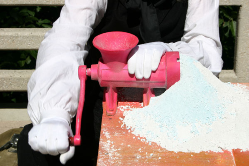
Neil Maurer’s image of a water glass filled with rocks and set into the middle of Barton Creek in Austin grabbed me — a small, simple intervention, that had come out of the understanding that the creek had been part of a real estate deal, and dwarfed by development as a result.
I spoke with UTSA teacher Larry Leissner about his employment of a special scientific scanner that is able to greatly magnify the subject, in this case seaweed and shrimp egg casings from the Francine Cohn Preserve in Corpus Christi. From a sample much smaller than the palm of his hand, he observed in the final color print, that the twisting DNA structure of the shrimp casing is visible to the naked eye.
Ramin Samandari’s exhibition Fragments of Memories: A Personal Glimpse into Modern Day Iran was featured in Blue Star’s project space. As an Iranian immigrant to the U.S. with the newly acquired freedom to to return to Tehran, Samandari’s intent was to, not only reconnect with his own personal history, but to allay some of the prevalent political distrust with his human narrative. With Iran’s many changes, after an absence of 27 years, he felt as both an insider and an outsider. His work is an attempt to reconcile the two halves of his existence, and also to portray ordinary Iranians enjoying a peaceful life, something that he finds disturbingly absent in the western media.
Clearly, Samandari has kept overt politicizing out of his work. Initially, the element of judicious digital “tampering” had the effect of distracting somewhat from his subjects. By slicing and cloning sections of the photo, and further highlighting these interruptions with color, from the generally black and white images, Samandari seemed to want the observer to pay particular attention to certain details. By personalizing the image with a “tag,” he voided a photo-journalistic association, perhaps. This device worked quite well in the picture of the man blowing on the hookah coals. By complicating and patterning the hookah, Samandari teased playfulness, even humor, from his subject.
Blue Star Contemporary Art Center, now in its 20th year, is a non-profit, non-collecting contemporary art center that focuses on the curating and exhibition of contemporary art. Through a variety of programs, Blue Star is lends active support to the development of the visual arts on a regional, national and international level.
Each year, emerging or internationally renowned artists are featured in at least twenty exhibitions within four distinct gallery spaces. Blue Star’s events and programs have played an instrumental part in the social and economic revitalization in the surrounding neighborhoods of the King William Historic District and SouthTown Mainstreet Alliance, as well as the Lavaca Historic District. The result has been an estimated $2.6 million in investment and re- development over the last few years.
In May 2004 Blue Star and the Instituto de México collaborated in the exhibition of the largest ever collection of Mexican contemporary art in San Antonio. The work of 58 artists, Mexican Report consisted of more than a 100 pieces of art, in the main recent work by young artists.
Graciela Iturbide, one of Mexico’s best-known photographers exhibited in September 2004. In Ojos Para Volar or Eyes to Fly, a commission by Blue Star, she photographed the landscape of South Texas.
San Antonio Painting 2005 was shown in two parts between January and March to accommodate the volume of work, painterly efforts that might conceivably be described as high realism, low realism, and no realism, that is non-objective abstraction. Curated by Bill FitzGibbons, the show reflected the city’s demographic, a sampling and cross-section of current San Antonio painting.
Made by Hand: Straight to Video was an exhibition at Blue Star this past winter that was inspired by Artpace studio director and sculptor, Riley Robinson’s residency in Norway, where he encountered Europe’s newest wave of video artists. He selected five for the Blue Star show: Natalie Djurberg of Norway, Juha von Ingen of Helsinki, Finland, former San Antonio resident, Chris Musgrave, who is studying in Antwerp, Belgium, Ola Pehrson from Stockholm, and Macedonian-born Robert Gligorov from Milan, Italy.
A recent show that resonated with San Antonians, was Granite Sculpture, large-scale pieces by Jésus Moroles. Over 45 tons of stone were installed in the largest show of his work to date in San Antonio.
Artpace
Getting to Artpace’s Chalk It Up street event Saturday from Hotel Valencia was no more difficult than falling out of bed in the morning. Sometime after nine, cardboard boxes with art supplies, mainly chalk I suspected, popped up on Houston Street. A peek between the dark wood slats of the hotel room blinds signalled a sunny day. The damp from yesterday’s drizzle was already evaporating—much to the relief of Libby Tilley and other the Chalk It Up organizers.
Chalk and water mix only too well—a happy discovery to some of the artists when they realized that the chalk could be painted on, to smooth effect. James Cobb’s giant flatfish was one its liquid benefactors. It took long time nevertheless, and the final touches weren’t applied until the end of the afternoon. Similarly, it took most of the day for Lloyd Walsh to tame the coiled tentacles of his mammoth squid.
Hills Snyder and Misery Repair Shoppe
Hills Snyder arrived in undertaker black to set up his Misery Repair Shoppe, comprised of a chair and a desk with a meat grinder with which to pulverize his chalk one stick at a time. He set up shop on the Houston bridge above the banks of the San Antonio River, in itself a bit chalky from limestone, I suppose. Grinding chalk is a dry, dusty job, as is purging despair. Snyder was making a connection with the white cliffs of Dover, specifically Shakespeare Cliff, where the Earl of Gloucester, blinded for his loyalty to King Lear, took his imaginary fall, demonstrating to the ages the cathartic power of tragedy.
San Antonio artist Cruz Ortiz set himself a singular task, to block out in black and white the number 26,457, in figures tall enough to fill the width of the sidewalk. I suspected that the number had a tether and hook to an issue of some dimension. As a town’s population, the figure is modest. When applied to human loss of life, the number accrues gravity. Pointedly, 26,457 was the total of civilian deaths in the Iraqi war up to the day of his chalking, a number deemed not as newsworthy as as the more politically sensitive tally of military casualties.
The Chalk It Up event and the Artpace building itself were only separated by a block or so. It took executive director, Kathryn Kanjo and I no more than brief walk along the river’s edge and an intersection-crossing to get to 445 N. Main Street.
We stepped past the plate glass window that had been deliberately pounded into cracked submission with a sledge hammer by Scottish-born San Antonio artist Rae Culbert. A mystified window installer had watched the proceedings, ready with its replacement, finding it curious that the smashed window and its shards should remain.
San Antonians remember the Artpace building as a Hudson automobile dealership and body shop built in 1920’s. Pleasing and functional, the renovation by the award-winning firm Lake/Flato Architects, is a seamless transition into the 21st century.
Artpace owes a debt to a favorite San Antonio picante sauce, the salsa not “made in New York City.” Founded in 1995 by Linda Pace, heir to the Pace Picante fortune, Artpace has developed into an internationally renowned foundation and gallery.
Invited by a guest curator, three artists take part in the Artists-in-Residence program (AIR), four times a year, one international artist, one national, and one from Texas. Upon arrival they complete a two-month residency, followed by a one-month exhibit of work produced during the artist’s stay.
Rob Storr, the Senior Curator at the Museum of Modern Art in New York at the time, was Artpace’s inaugural guest curator. He chose three artists: Jesse Amadao from San Antonio, Felix Gonzalez-Torres from New York, and Annette Messager from Paris. Since then, to name a few places, artists have come from Estonia, Australia, New York, California, and throughout Texas. Past guest curators include Okwui Enwezor, Susanne Ghez, Sun Jung Kim, Cuauhtémoc Medina, and Carolyn Bakargiev.
Current resident artists are Harrell Fletcher from Portland, Oregon, Katrina Moorhead from Houston, and Parisian-based Melik Ohanian.
Fletcher’s art is personal and human, exploring social connectedness. Through sets of assignments, other artists and collaborators, convert the most mundane and trivial aspects of our lives into an artistic testament of sorts. For example, he asks you to make a poster of your shadows, draw a constellation from someone’s freckles, and photograph a scar and write about it. That there is an underlying, homespun tenderness to the project may be evinced from the naming of his website: www.learningtoloveyoumore.com
A graduate of the Core Program at Glassell School Houston, Katrina Moorhead was one of the artists representing Northern Ireland at the Venice Biennale 2005. There her monumental sculptures of DeLorean car doors were on view in the exhibition The Nature of Things, a group show of work by Northern Irish artists curated by Hugh Mulholland. When I toured the Artpace studios, she was in the midst of constructing a ceiling upon the studio floor, with its fixtures rising upward.
Melik Ohanian likes to view the cosmos, not in a detached, rationalistic sense, but as an eventful, changing interface. Using film and photography, he explores scientific, social, and cultural communities. From striking workers in Liverpool, the filming of a snowstorm and the birth of new land near Iceland, to the switching off of the lights in a neighborhood, artist and viewer connect into a joint constellation.
The current exhibition was curated by Berta Sichel, Director of the Department of Audiovisuals, and Film and Video Curator, Museo Nacional Centro de Arte Reina Sofia, Spain.
In its tenth anniversary year and in recognition of San Antonio’s many artists of Latin descent, Artpace devoted the entire year to guest curators whose philosophy and interests reflect Latin American art.
San Antonio Museum of Art
A few clues that the Lone Star Brewing Company in San Antonio has not been brewing beer for awhile, are some minimalist impositions to the original complex of historic buildings. A covered walkway links the two towers well above the entrance building, and a curiously- screened, elongated box structure superimposes one of the building’s wings. The latter is the recently-opened Lenora and Walter F. Brown Asian Art Wing of the San Antonio Museum of Art, allowing for almost 1,400 square meters of exhibition space—twelve galleries plus a changing exhibition space.
Actually, the ten-acre brewery site has undergone more than a few transformations in its 120 year life. Purchased in 1892 and opened only in 1904 after extensive renovation and expansion by the renowned St. Louis brewer, Adolphus A. Busch, the Lone Star Brewery had a healthy life until the Prohibition. After bottling a non- alcoholic drink called Tango and a short stint as a cotton mill, the buildings suffered neglect and decay for almost half a century.
Then in 1970 the Museum Association’s new director, Jack McGregor, struck museum gold, when he rediscovered the old dilapidated buildings.
On July 13, 1977, with the breaking of a bottle of beer, Mayor Lila Cockrell christened the new San Antonio Museum of Art. It took until the spring of 1981, but on March 1 of that year nearly 13,000 visitors toasted in San Antonio’s new art facility.
An innovative renovation design to complement historic aspects of the buildings was produced by Cambridge Seven Architects, assisted by associated architects Chumney, Jones, and Kell. The results were praised in Progressive Architecture magazine, the New York Times, and Museum News.
Besides the new Asian Wing, the Nelson A. Rockefeller Center for Latin American Art was opened in 1998, housing a collection that spans 4,000 years of Latin American history. The extensive pre– Columbian, folk art, Spanish Colonial, and Republican collections are bracketed by modern and contemporary masters of Latin American art, such as Diego Rivera, Joaquín Torres-García, and Rufino Tamayo.
The museum’s 20th-century collection is devoted to post-World War II American painting and sculpture with works by Hans Hoffman, Helen Frankenthaler, Philip Guston, Richard Diebenkorn, and Wayne Theibaud. More recent acquisitions are works by Andy Warhol, Alex Katz, Manuel Neri, Mark di Suvero to name a few.
Near Eastern and Islamic collections include calligraphic works, ceramics, metal work, and jewelry.
A recently completed Oceanic gallery displays Aboriginal bark paintings, carved wood sculptures, war clubs, bowls, ceremonial masks, and more, from Australia, Hawaii, New Guinea, Melanesia, Micronesia, and Polynesia, a collection distinguished as one of the primary places in the region to view Oceanic art.
The museum’s collection of antiquities is one of the largest and most comprehensive in the Southern United States, including Egyptian, Greek, Roman, Byzantine, and particularly ancient glass, and Graeco- Roman sculpture.
Special exhibits have included René Magritte: A Surrealist’s Eye, that included 20 lithographs, etchings and unique double-sided drawing.
Since 2000, the museum has focused on enlarging its Asian collections. David Douglas Duncan, renowned for his photographs of Pablo Picasso, has contributed a remarkable group of Japanese and Southeast material. Living in Tokyo during the Korean War photographing for Life magazine, Duncan was introduced to the art of Japan by Haru Matsukata, who later married the U.S. Ambassador to Japan, Edwin O. Reischauer.
An outstanding example of his contribution is a pair of Japanese screens that illustrate the story of the Great Woven Cap (Taishokan).
Fujiwara Kamatari, founder of the Fujiwara clan in the seventh century established a dynasty that ruled Japan during the Heian period. A gang of bandits working on behalf of the Dragon King, as the legends goes, stole a precious jewel, that was later recovered by Kamatari’s second wife, a pearl diver. In a dramatic ocean-climax to the story, she sacrificed herself in order to deliver the jewel to Kamatari.
The Indian collection has also grown significantly since 2000. A noted acquisition in the early 90s was a 10th century stele of yogini from the Uttar Pradesh and northern Madhya Pradesh regions. On loan for many years to the Los Angeles County Museum of Art, it was exhibited in 1977 in their traveling exhibition, The Sensuous Immortals, and was also featured in the inaugural exhibition for Casa Asia in Barcelona, Spain.
Martha Blackwelder, the Maddux-Cowden Curator of Asian Art at the San Antonio Museum of Art, was kind enough to take me into a cavernous space that warehoused Egyptian, Byzantine, and Graeco-Roman treasures. This was a highlight for me, in some way, of my tour of the San Antonio Museum of Art, since visitors, I wager, would rarely get to see priceless artifacts, stacked casually on industrial shelving. Weaving between statues, mosaics, busts, and crates, it reminded me somewhat, of what the enormous, dimly-lit prop department, of a film studio might be like.
It might also have been a glimpse into the restless potential of a dynamic museum, pausing to stretch its wings.
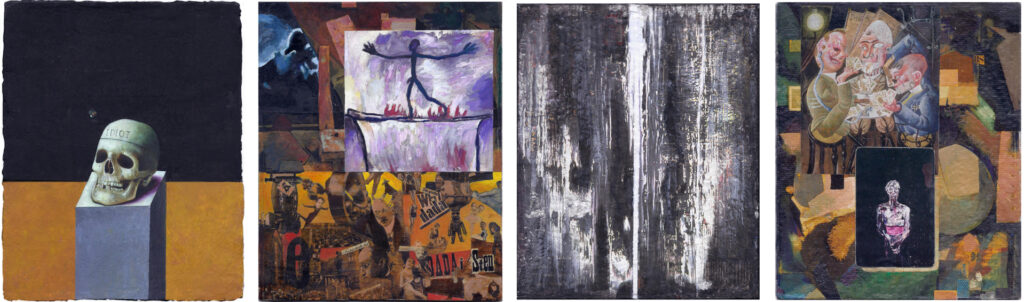
Dead Idiot, Penck’s Passage, Richter Scale, and Card Players. Citing the work of Paul Pretzer, Mamma Andersson, Kurt Schwitters, A.R. Penck, Hannah Hoch, Gerhard Richter, Otto Dix, and Julian Schnabel.
A reading of the Curated Content #2 group of images may require the passage over something that Maurice Blanchot calls the “empty deep.” The Richter Scale image in the group had been the cover for the Fall 2002 edition of dArt magazine, featuring author Bruce Bauman’s review of Gerhard Richter’s exhibition at the MoMA in New York. Bauman conceded that seeing the retrospective forced him to reevaluate why he wrote about art. Bauman’s full article here.
In his search for, what cannot be put into words, Bauman arrives at what he calls, “the necessity of art: the search for that space in each individual for the longing for the lost god, for meaning, for beauty, humanity – the quest for truth which is our soul. In falling into that empty deep we can truly confront that terribleness of human history, the horror and little cruelties that live within us all.”
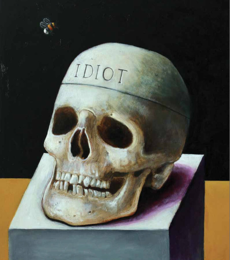
Paul Pretzer, Dead Idiot, oil on wood, 17.1 x 15 inches. Courtesy of Marc Straus Gallery
A tiny antagonist buzzes over the skull of Paul Pretzer’s Dead Idiot. The painting was part of Mortality: A Survey of Contemporary Death Art. Curated by Donald Kuspit, and assisted by Robert Curcio, the exhibition was to be held at the American University Museum in Washington, D.C. in 2020, but was terminated due to Covid-19. Since the exhibition catalog had already been produced, the show’s virtual life was extended as the 2021 dArt cover feature, in the sense that the Curated Content project had also breathed life into it. If Pretzer’s Dead Idiot is a focus on mortality as an individual struggle, the Otto Dix Card Players (1920) in panel four exemplify its residual collective trauma. The black card with Julian Schnabel’s portrait of a scarred Andy Warhol, deals the irony of someone who survived an assassination attempt, only to fall victim to a scalpel in the hospital.
A.R. Penck’s stick figure with outstretched arms embodies survival, literally here a trial by fire and tightrope in his 1963 oil Passage. The work was part of Art of Two Germanys/Cold War Cultures (article by Emese Hajagos) and addresses the wider sociopolitical impacts of war, whether hot or cold.
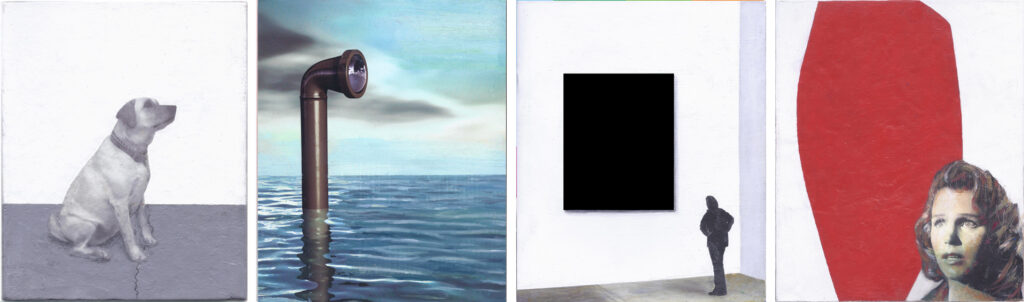
Steve Rockwell, Good Gordo, Casual Observer, In the Black, andHard Edge, 2024. Citing the work of Steve Rockwell, Hills Snyder, Lorser Feitelson (1963 painting), and Otto Preminger’s “Anatomy of a Murder” (with Lee Remick).Hills Snyder, Casual Observer/Causal Observer, 2010, Blue Star Contemporary, San Antonio, Texas, installation view
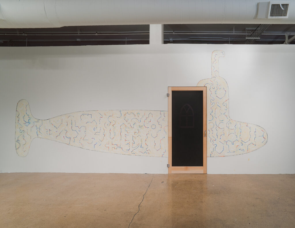
Curated Content #5 is a four panel image sentence that clusters pictures into paragraphs. As we read, a story may unfold. Dog observes a periscope rising out of the sea that breaks into light from something hidden – the “submarine.” Although Hills Snyder employed its image to advertise his 2010 exhibition at Blue Star Contemporary in San Antonio, Texas, the original periscope image was created byAndrea Danti for Shutterstock.com. Snyder’s employment of the periscope becomes a key that breaks the seal to his container of objects and experiences – now accessible to even the casual viewer. To get the “full” picture, however, further observation is necessary. A documentation of the work that went into mounting Snyder’s elaborate installation can be accessed by clicking Casual Observer.
Hills Snyder, Casual Observer/Causal Observer, 2010, Blue Star Contemporary, San Antonio, Texas, installation view
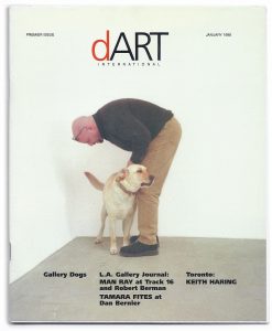
An attentive Gordo in the first panel mimes the periscope, having been obedient to his master’s voice (Stuart Regen) in posing for my photograph – a captured moment that merited the cover of the premier edition of dArt magazine in January 1998. By sheer coincidence, the dog’s front paws in the Good Gordo image cover a crack in the concrete floor, echoing the one in the Snyder submarine photo. In that respect, as the dArt genesis account unfolds, Gordo’s paw bruises the wriggling serpent crack on the floor of the Regen Projects gallery.
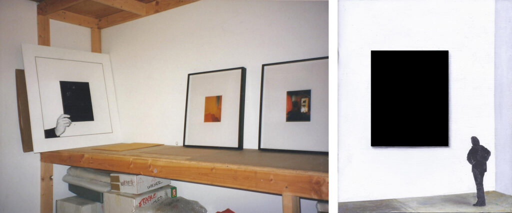
The third panel of a woman contemplating a black rectangle is derived from dArt‘s 1998 second edition and was provided ACME gallery in Los Angeles to accompany More Shifts in the LA Gallery Landscape, an article by Michael Darling. Two years earlier ACME had consented to take part in my Storage installation project by storing a 32 by 32 inch acrylic on panel painting showing my hand holding a black card. The project served as the visual component for the book work Meditations on Space, An Artist’s Odyssey through Art Galleries in Europe and North America, published in 1996. My earlier visit to ACME in Santa Monica on January 3, 1996 had taken a geometric bent, “I walked in a straight line from the door to the back of the gallery where someone was installing work. He pointed me towards the desk corner. I made a 40 degree turn and walked over to speak to Randy Sommer, and then a 70 degree turn for the door. That completed the triangle.”
Left: Steve Rockwell, Storage Project, 1996, ACME gallery, Los Angeles, installation view. Right: In the Black, 2024, oil and mixed media on dArt magazine page, 8.5 x 7 inches
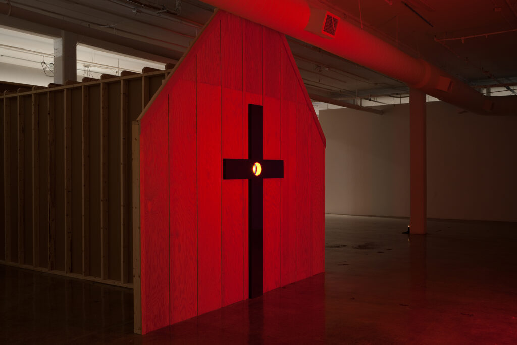
The fourth panel, Hard Edge features Lorser Feitelson’s 1963 Untitled painting, managing a further echo, this time, of the red facade of Snyder’s installation exterior. If a connection were to be be made between the peephole in Snyder’s Casual Observer/Causal Observer to ones in the Spanish door of Marcel Duchamp’s Étant donnés installation at the Philadelphia Museum of Art, an intriguing possibility is introduced – a murder of the mythic art kind. Lorser Feitelson’s red lozenge shape in Hard Edge is interrupted in its right corner by a film still crop of Lee Remick testifying in Otto Preminger’s courtroom drama, Anatomy of a Murder.
Historically, artist Lorser Feitelson has a tie to the emergence of “hard edge painting.” He was featured in the 1999 dArt magazine article Testing the Fabric of the New Color Field by Michael Duncan. Duncan had been critical of this group of primarily Los Angeles-based artists writing, “For me a lack of ambition and conviction is the problem with the most hyped members of the so-called New Color Field movement.” Duncan preferred works of several older LA artists, “whose explosive and inventive use of color and abstract design provide quirky and fruitful contexts for the works of the younger experimenters.” A dip into the trove of art world narratives about Paris, New York, and Los Angeles from a century ago, should not disappoint those truly interested. Simply click the Lorser Feitelson Interviews for a brouse.
With colorful, gestural abstract forms, exuberantly captured through diverse emotions, conceptual word-games and expressive brushstrokes, Ariadne Vitastali’s paintings are a unique evolution of the visual tradition of the Northwest School Abstraction. Full of spontaneous markings of color tones with melodic lines as seen in Abstraction Lyrique, or automatist subconscious gestures, similar to Action Painting and finally gentle calligraphic movements reminiscent of the techniques of the American painter Mark Tobey, her neo-expressionist images can be formally compared to the radical experiments of the Dutch-American painter Willem de Kooning.
Ariadni Vitastali, Untitled 096, 2023, mixed media on paper, 39 x 28″
Willem de Kooning believed about his abstract painting that «It’s really absurd to make an image, like a human image, with paint, today, when you think about it…. But then all of a sudden it was even more absurd not to do it. … It [painting Woman, Ι] did one thing for me: it eliminated composition, arrangement, relationships, light – I put it in the center of the canvas because there was no reason to put it a bit on the side. So, I thought I might as well stick to the idea that it’s got two eyes, a nose and mouth and neck.». Artist statements can sometimes be misleading in that, out of a desire to control their public image artists sometimes overstate or exaggerate their statements.
Thus, one can safely assume that de Kooning’s work and by extension Vitastali’s were very meticulously planned, whilst both artists precisely considered the formal aspects of their compositions before their artistic execution in order to create a paradoxical sort of accidental perfection. Morphologically this can be confirmed by a careful examination of their artworks. De Kooning saved and cut-out various images of women from popular presses, something that demonstrates forethought and planning, while their placement also illustrates pre-planning and strategy as also Vitastali’s carefully chosen compositional designs. In fact, Vitastali’s compositions are often diagonally situated causing the eye to be active according to Expressionist principles.
Ariadni Vitastali, Untitled 111, 2023, mixed media on paper, 39 x 28″
Although Vitastali’s recent works are abstract, her oeuvre straddles the categories between abstract and abstracted, in that her non-relational images maintain some recognizable motifs. As seen in several 2022-2023 Untitled paintings, the artist uses abstracted modes in order to treat subjects with a feminist bent while depicting mythological heroines. One such painting is Untitled III, 2023 -wherein a figure is seen tumbling backwards into a chasm-that can be read in terms of the Demeter legend. When Persephone, her daughter was abducted by Hades the God of the underworld, Demeter went to Hades to seek her out, and her absence caused a famine on earth. To Vitastali’s predecessors -the American Abstract Expressionists- myth was also important informing the work of William Baziotes, Jackson Pollock, Willem de Kooning and Mark Rothko. These artists including Vitastali, used a semi-representational or abstracted style in their early careers later becoming increasingly abstract.
The term “abstract” and its varying degrees, carries a whole range of associations and descriptions. German-born American artist and museum founder, Hilla von Rebay, used the term gegenstandlos(to describe her abstract painting), which American artists later mistranslated as “object less painting.” Rebay who associated her visual production with “pure” music, like Kandinsky, believed that art should be externalized from the inner cosmos of the artist and not from a simple abstraction of external nature. This particular idea paradoxically already existed in the Christian aesthetics of the Middle Ages and Scholasticism and was quite widespread until the Renaissance and Mannerism. The artist-craftsman was not supposed to simply copy, or mimic the material world, but instead to reflect within his inner psyche, the divine “ideas” that constitute a higher dimension than world of phenomena or changing space-time.
Erwin Panofsky in his book Idea: A Concept in Art Theory, specifically wrote that the work of art “far from being merely derived from the creations of nature and transferred to the work of art by a simple act of copying, lives in the mind of the artist himself and is directly translated by him into matter.”Similarly, modern abstract painting rejected the Platonic concept of art as “mimesis” and attempted to return to a more primal state of art, i.e. to a non-representational art, where the artist expresses an inner and intuitive world-picture (Weltbild) of the external reality -or as Rebay meant the word gegenstandlos as“subjective”. The art theorist Wilhelm Worringer also believed that primitive art is par excellence a “pure, geometric and abstract” art, where the subject unconsciously tried to escape the eternal flux of the varying phenomena of the outer world.
Ariadni Vitastali, Untitled 9075, 2023, mixed media on paper
As Kant believed, despite all the avant-garde’s radical convictions about an abstract art of the future, abstract art essentially managed to return to a primordial side of pictorial art, where the inner world of the human psyche with all its violent permutations is no longer separated from an inaccessible rift in the external world. But instead, through abstract art (as well as music), the numinous phantasmagorias of the soul are translated externally without the need to appropriate a material form, or an external image. They should instead be expressed through a kind of formal “formlessness”, in which they visually diffuse without the metaphorical clothing of a phenomenal world. Thus, the Kantian separation of the thing-in-itself (i.e. the noumenon) and ephemeral phenomena no longer exists and the abstract artist as a new kind of shaman, or magician directly externalizes his immaterial and aniconic thoughts-feelings into objective reality, restoring thus a long-gone universal communication for humanity, despite linguistic, ethnic and cultural differences among civilizations. The imaginal (and also formless) medium of the abstract artist here manifests itself as a universal language of specific moods (Stimmungen) or even archetypical experiences, which every human, as Carl Jung strongly affirmed, everywhere in the globe subliminally shares.
Likewise, Vitastali’s complex, yet simultaneously time-minimal works externalize the boundary between abstraction and figurative painting. Between the dreamlike masses of pure color, anthropomorphic figures and illusory forms can be discerned, which blend together within the streams of discrete colorfulness. Thus, different fragments of lost forms are revived in an elaborate, but simple mosaic of lively hues, where the unconscious tendencies of an inner world are imprinted like living spots on the white paper, while morphic modulations and color-form sketches recreate the subliminal tones of a lyrical locus of abstract images. Her present paintings are abstracted, representing as such an engagement with her earlier mode of working, which rigorously marks her maturity as an artist.
As Ariadni Vitastali writes in her statement about her new works “the painting elements of form, color, gesture, line, as also fragments of phrases, or simply words, define the worked surface as abstract elements, insinuating a glimpse view of a momentary and subjective reality”.