Making Print Editions of dArt Magazine into the Subject of a Single Work of Art
by Steve Rockwell
I don’t have an exact date for the genesis of the playing card theme that is featured in this 2021 edition of dArt magazine. It’s possible that the subject as an expressive idea has been simmering in the magma of my unconscious from the very start of my art making. With the crust of culture now universally in its brittle phase, the card idea seems to have bubbled up through the fissures.
To drive home the point, some biographical notes might lend gravity. As suggested in my Gothenburg narrative piece, erecting a house of cards can be be fun pastime for a kid. Missing from the story, was that it had been been introduced to keep me from scribbling on the window sills of our all-white hotel suite. I had discovered that dragging a metal object such as a coin over the lead-based paint produced lovely, grey squiggles.
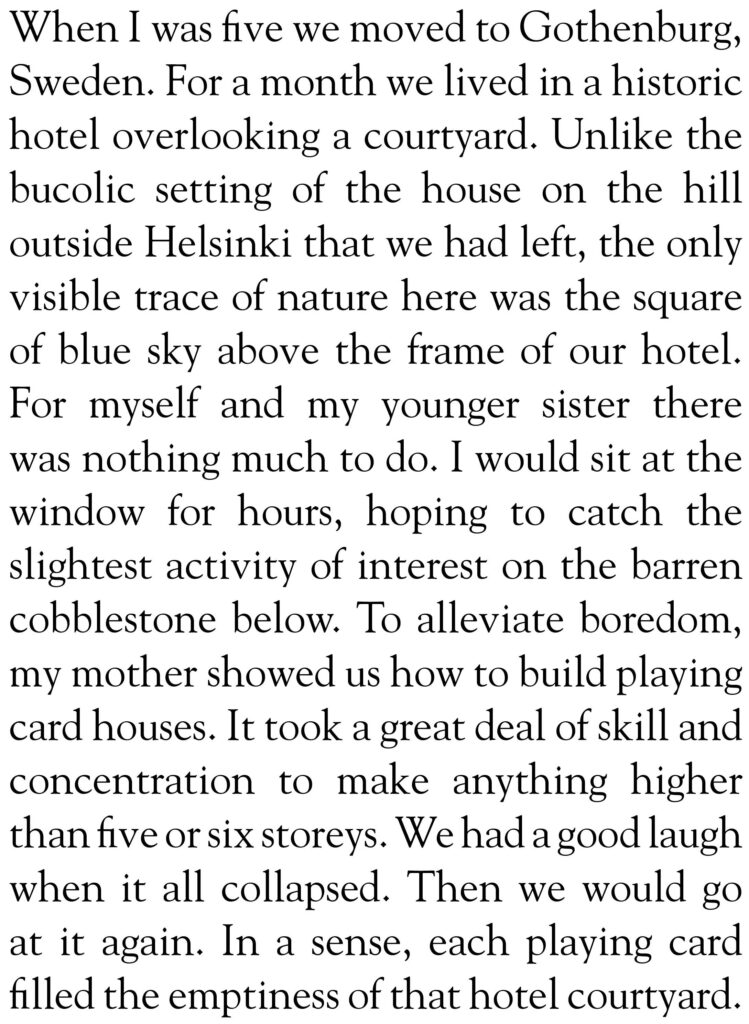
Having quickly tired of making card houses, my mother twigged onto a diversion that fed into my impulse for drawing. In a nice bit of improvisation of her own, she smoothed and cleaned off the wrappers that had held spatula scoops of butter from the nearby market. Parchment-like and transluscent, these made for excellent tracing-paper. The newspaper became my subject, its attraction the back pages, where islands of black line illustration floated in oceans of cryptically-pebbled Swedish text.
What all this might speak to is the human need to funnel experiences that we cannot always verbalize through one sort of activity or another. Somewhere, I suppose, in the space between the mindful and the mindless wriggles meaning.
Since this present print edition of dArt magazine is intended as a summary and reflection on what had gone before, at the heart of the publishing project as personified, lurks an urge for something new altogether.
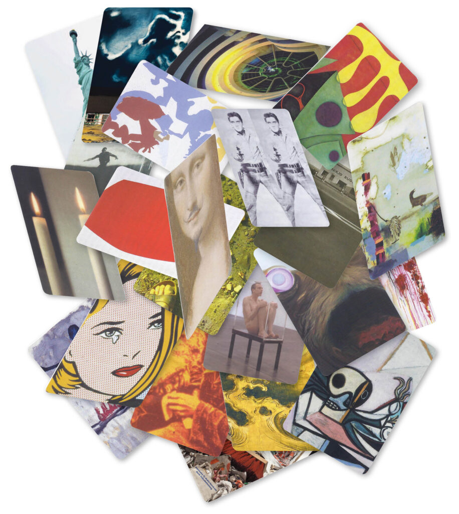
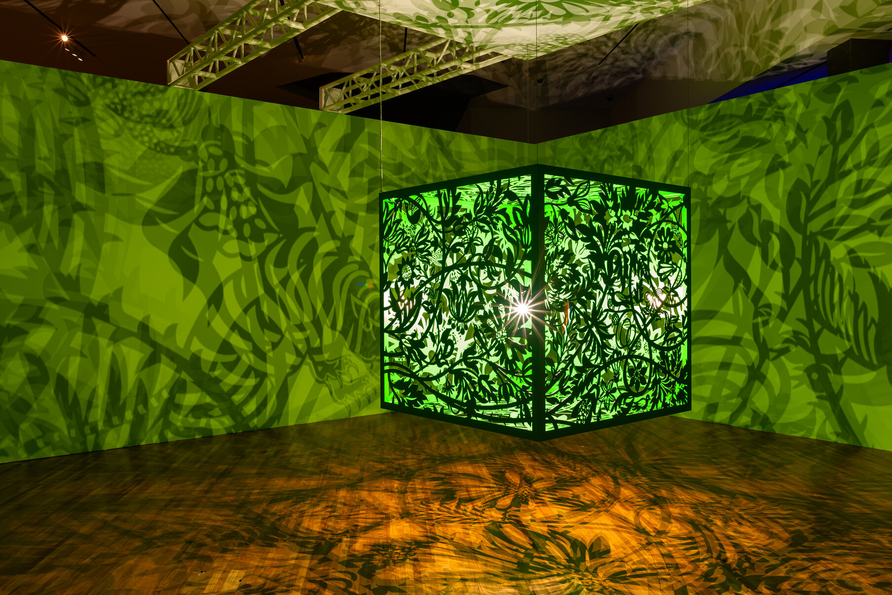
Twenty-two images sized as standard playing cards from dArt’s back issues might stand as core samples through which the corpus of the print version of dArt may serve as probes in the hope of fulfillment of this aspiration. We might call it a pair of eleven-card “hands” dealt from a full deck of images. Since the period of publication we are considering spans 22 years, each card image stands in for a year of publication. In a house-of-cards construction, it is essential that all units be uniform in size and weight for stability. In a card game, this equivalency, in terms of imagary is true for the back of the card only. Without a graduated scale of values for each card there can be no game, and for the game to work fairly, the assigned values must be fixed.
In regards to the construction of the house of cards, without a stable base its collapse is not just probable, but inevitable. Were we to assign a universal value say, to the theme Mortality, against which all picture cards might be measured, it’s possible that this house of images might cohere in our minds. Should our attention hold, it just might stand.
With its publication, Ed Ruscha’s Twentysix Gasoline Stations acquired the status over time as being the first modern artist book, speaking to the medium of print itself as potential for art practice. In the Summer/Fall 2003 edition of dArt, Bruce Bauman asks the question: “…is it possible, necessary, for an artist to create work to stop the madness of the approaching nuclear explosions and future holocausts?” His Art of War article was written in the shadow of the conflict in Afghanistan, finding a kind of solace in Ruscha’s Gagosian Los Angeles exhibition: “And I dream of the art of Ed Ruscha where I hear the words of Bertolt Brecht: In these dark times, Will there be singing, Yes, there will be singing, Of these dark times. “
Further to the theme of mortality in relation to Twentysix Gasoline Stations, Ruscha himself has accepted that “..there is a connection between my work and my experience with religious icons, and the stations of the cross and the Church generally.” The last book image, of a Fina station, has been interpreted as a pun on “Fin,” the French word for end.
If we scratch deep enough into the phrase “Life, Liberty, and the pursuit of Happiness,” its meaning and satisfaction at each rung is a prize wrested from an evident challenge to our mortality.
dArt’s 22-YearTrain Ride: Trying to See the Forest for the Maze of Printed Trees: 1998–2019
Since dArt, in its 22-year life hadn’t stuck to a consistent schedule of publication, I began to liken my take on the subject to a train ride – the magazine wouldn’t leave the station until all the passengers (whether ad or article) were on board.
Now in the process of sifting and weighing the volume of pulp that’s been freighted, the load of 37 published editions is more than adequate for dArt’s present phase. My challenge has been the judicious unpacking (to use a popular cliché) of what has been delivered over the years. The solution to sampling images from the full array dArt content arrived as playing card format – think glorified emoji.
Launching card image probes into the magazine’s black box of content has stimulated chain reactions. One image sparked another. Previously inert writing sprang to life. Taken together, streams of images are acting as a coda. Criss-crossing glimpses coalesce into view from an otherwise shapeless mass. With sinews and bones knitting together, it is not clear if this nascent Frankenstein will birth as friendly.
Limited edition copies of each Spring/Summer 2021 dArt magazine are signed, featuring a unique playing card cover image. The numbers 1–176 fulfill a practical function. dArt was built over the conceptual framework of my narrative book work, Meditations on Space – an Artist’s Odyssey through Art Galleries in Europe and North America. The notes on visits to art galleries in Paris, New York, Los Angeles, and Toronto from 1995 to 1997 amount to 175. Designating a joker to my edition length gives us that 175 + 1 correspondence – a nod to aesthetic symmetry.
Attention to dates and numbers permit threaded connections between otherwise disparate content. The last page of the premier dArt edition carries a photo of Los Angles artist Kyle Lind, the subject of the 175th and final Meditations on Space entry. I photographed him at 01 Gallery, and asked about the meaning of the gallery name. “Are the zeros and ones a reference to computer language?” Kyle replied, “No. A lot of people think it’s binary. Zero is when there is nothing. One is when there’s something. The space between the zero and one is the creative act.” This latter day John the Baptist’s cry in the Los Angeles art wilderness has since served as a punctuation to my book project, smoothing the path for the creative act that ensued a year later– dArt International magazine.
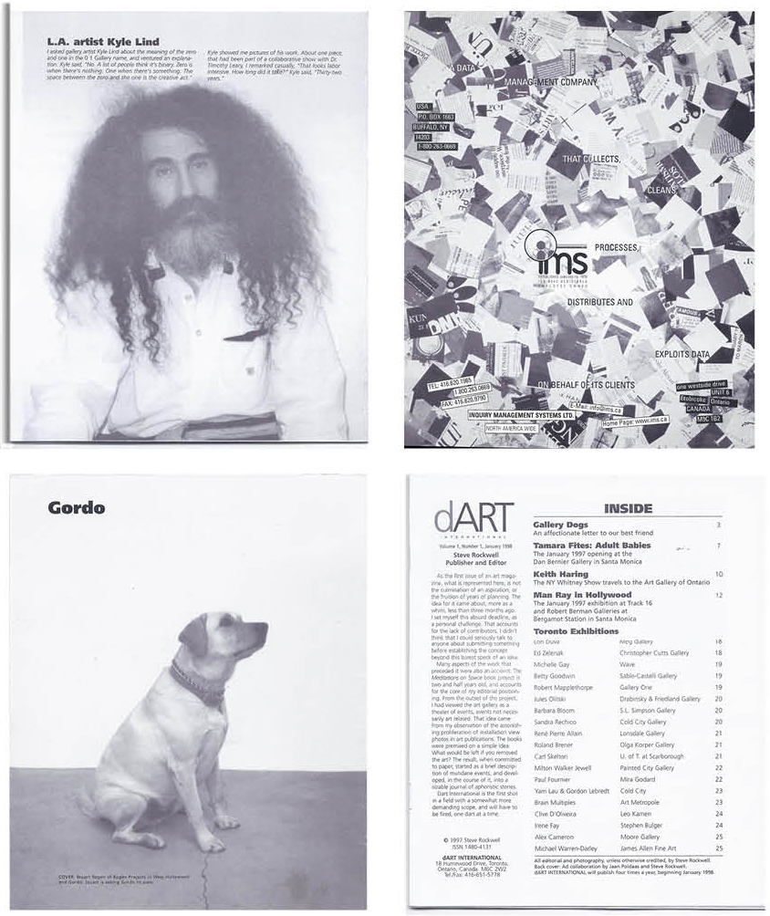
Kyle Lind bears a kind of witness to the current phase of dArt as well. The advertisement to his right was created for the data management company, Inquiry Management Systems. What appears as strewn paper fragments are squares of a chopped-up copy of Artforum. In the ad copy, IMS promised to collect, clean, process, distribute, and exploit its data on behalf of its clients. This, of course, is the stage at which dArt magazine now sits, as it shuffles and deals out its own image shards.
dArt’s premier cover has Regen Projects Stuart Regen posing his dog for my photo. On the inside front page Gordo is looking up toward the dArt masthead, suggesting the canine as unofficial mascot for the magazine – overseer to dArt’s Los Angeles launch January 1998.
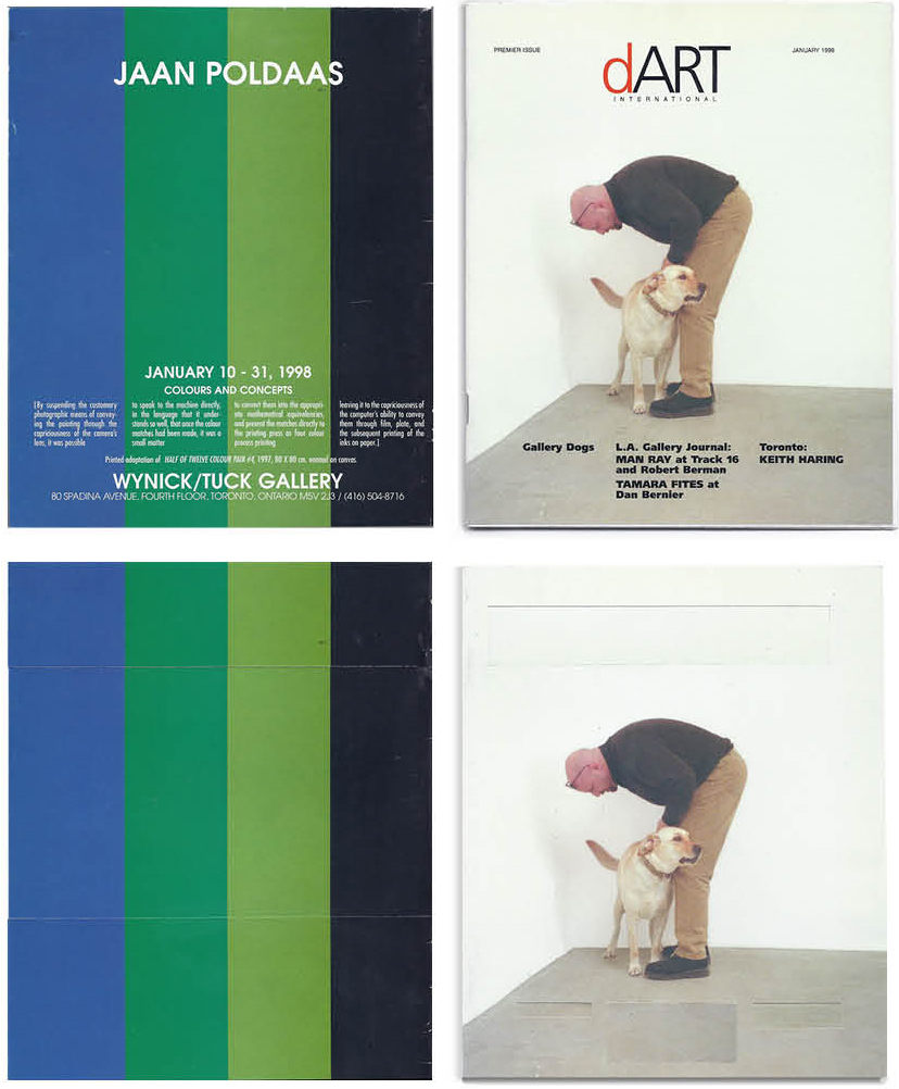
The back cover ad for Jaan Poldaas in first edition of dArt is not a reproduction of a work of art, but a conceptually-derived unique work. While it is based on the Poldaas enamel on canvas work, Half of Twelve Colour Twelve #4 (1997) painting, there are differences. As detailed in the ad copy, the image was “spoken” into existence from numerical color matches. While the Poldaas painting itself is square, the stripes in the dArt ad fill the rectangular page dimensions, the blue bar being slightly wider to account for page trim. The ad is the outcome of a dematerialization of its original – making abstract the actual Poldaas painting. This aligns with the Mortality theme of this present edition. Curator, Donald Kuspit noted that abstraction is that which “is hidden behind the scenic representation it supports.”
The four cover pages of the first edition work as binary opposites: front/back, inside/outside, image/abstract, order/chaos, and so on. A front/back dynamic is also present in the Winter 2002 edition of dArt. Its cover features Roy Lichtenstein’s I… I’m Sorry, a painting part of the Los Angeles County Museum of Art exhibition that displayed four decades of art from the Eli and Edythe L. Broad collection. The work was selected as cover art because it depicted a teary regret. The country and the world were then trying to cope with the shock and horror of the 9/11 World Trade Center attacks. Lichtenstein’s thought bubble came across as jokey and emotionally thin to me. I had hoped that under these circumstances, this irony-tinged sentiment might somehow be sublimated into genuine emotion – a heart-felt reaction to real tragedy.
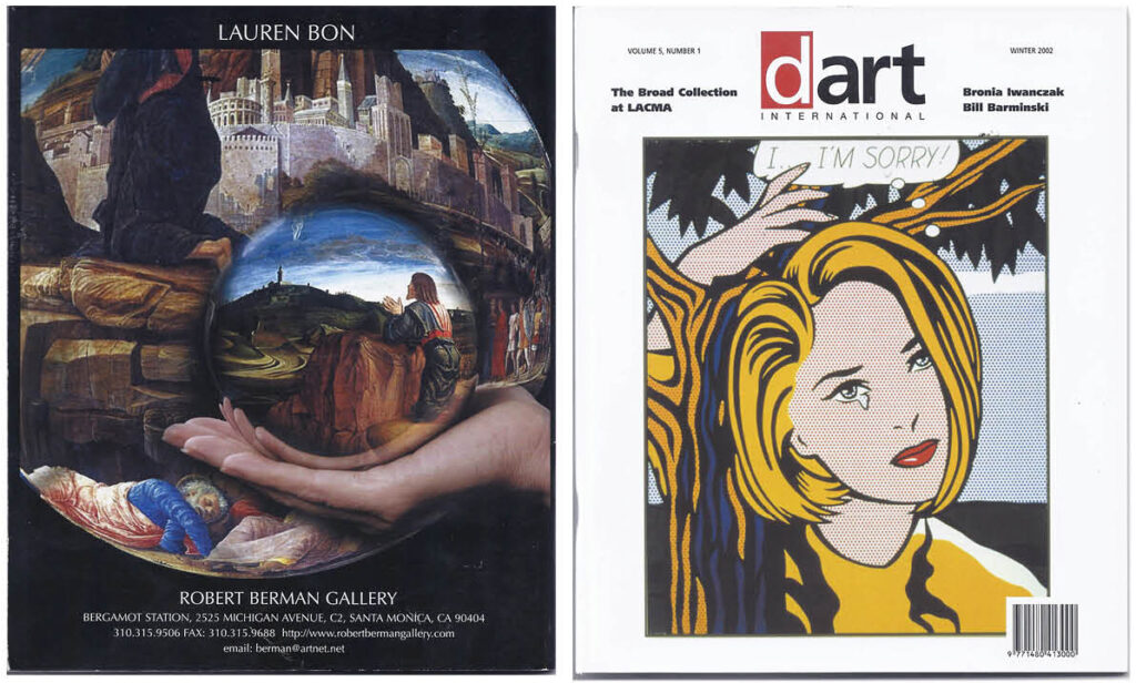
For this edition, the Robert Berman Gallery submitted an ad featuring the work of Lauren Bon. Her photo presented a gazing ball before the Andrea Mantegna Renaissance painting, Agony in the Garden. Might this pairing of images punch depth into the Lichtenstein comic book tears, when considered against a backdrop of Christ sweating drops of blood in the Garden of Gethsemane? How deep can the regret of our pop subject go, standing as she seems to be under a tree in her own garden?
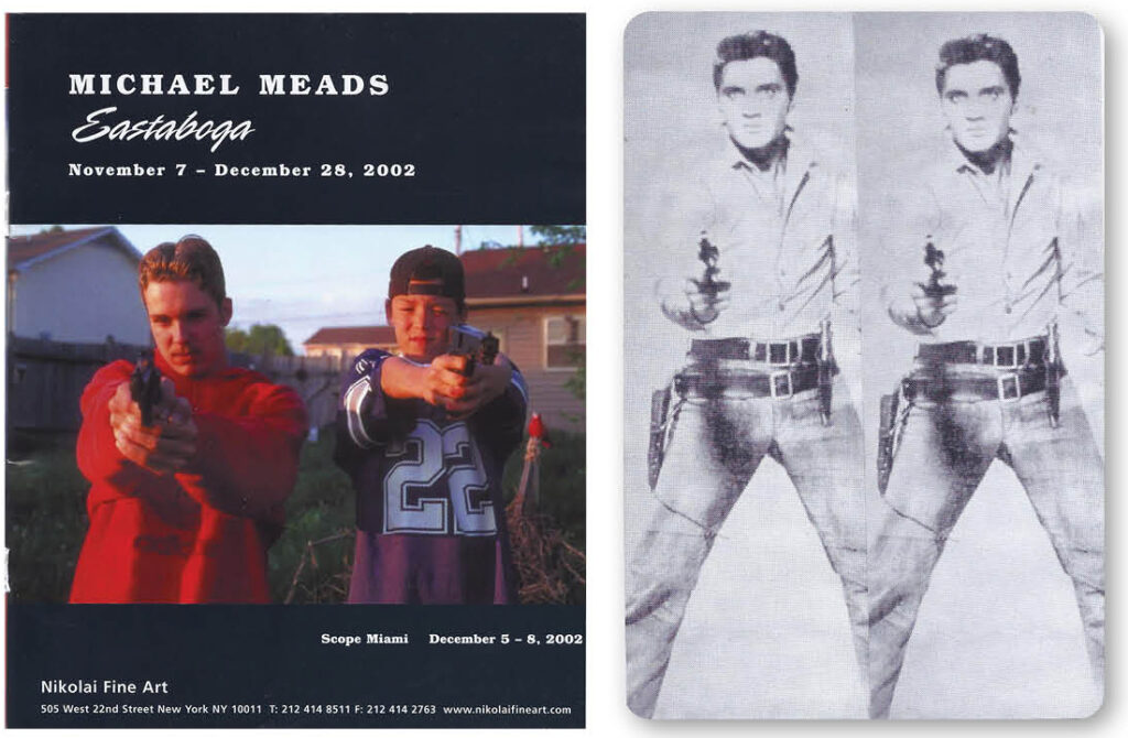
The twinned playing card Elvis repro was cropped from Andy Warhol’s 1963 Elvis, also part of the LACMA Broad exhibition. My paired doubling of Elvis echoes an ad submitted by Nikolai Fine Art to dArt’s Fall 2002 edition. The photo by Michael Meads has his Eastaboga boys point their guns at the viewer in a bit of play violence. Under the fun and games, however, slithers the genuine act, as it did on a grand scale with the 9/11 tragedy.