by Steve Rockwell

The first 44 of the 175 edition print edition of dArt magazine began its release to private collectors this July 2021. Its custom-designed frame allows reading access by flipping the hinged polycarbonate “glass” cover from the bottom.
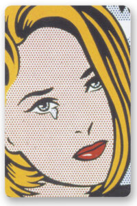
The Roy Lichtenstein’s “I…I’m Sorry!” painting had been selected as cover for the Winter 2002 edition of dArt. The sentiment as presented in the work may have seemed trite in the context of the just previous World Trade Center terror attacks, but I had felt the need to convey an expression of grief and regret through the images accompanying the articles of that edition . The words “I…I’m Sorry!” seemed as succinct as anything else available at that time. To view more images in the playing card format please click:
dArt Playing Card Hand #1 Oct.1, 2021
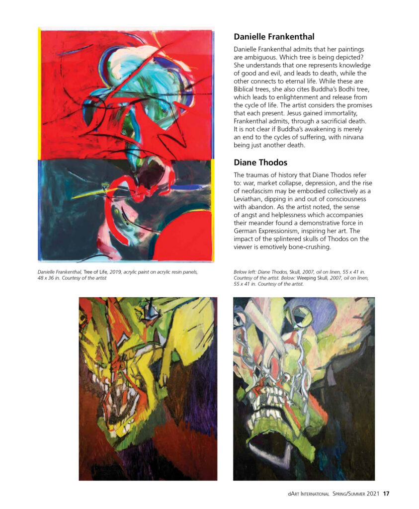
That Litchenstein entwined the arm of his teary subject into the branches of a tree, binds the woman and tree as possible symbols of something deeper, tapping into the wellspring of universal themes. While the artist himself, may have decried any message beyond, “Love hurts,” his rendering of tree and its branches into rivulets of ochre bark tug at further associations. Litchtenstein’s compositions, when viewed as abstractions, diverge importantly from the comic book sources that inspired them. Elements that make up “I…I’m Sorry!” such as the strands of yellow hair combine with wriggling chords of bark in a release of uncommonly expressive energy. The pop subject has unconsciously tied a yellow ribbon to her tree in the hoped reunion of an absent or estranged lover. Viewed from this perspective, we are are very close to territory explored by Bobbie Moline-Kramer in her All That Remains series – family fragmentation, loss, and its subsequent emotional toll. In the page 16 layout, a pairing with Stephen Newton’s The Wake painting sums up grief with an image of a casket – simply-rendered.
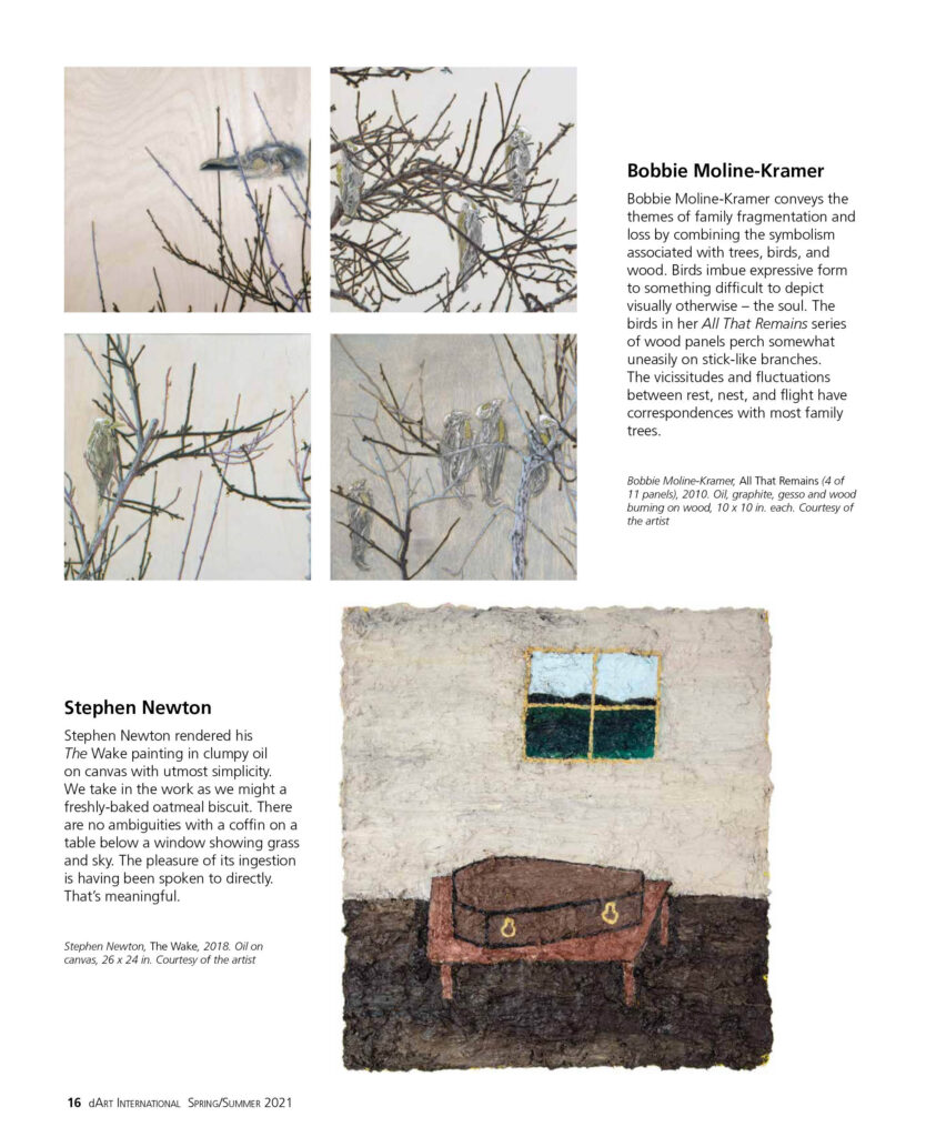
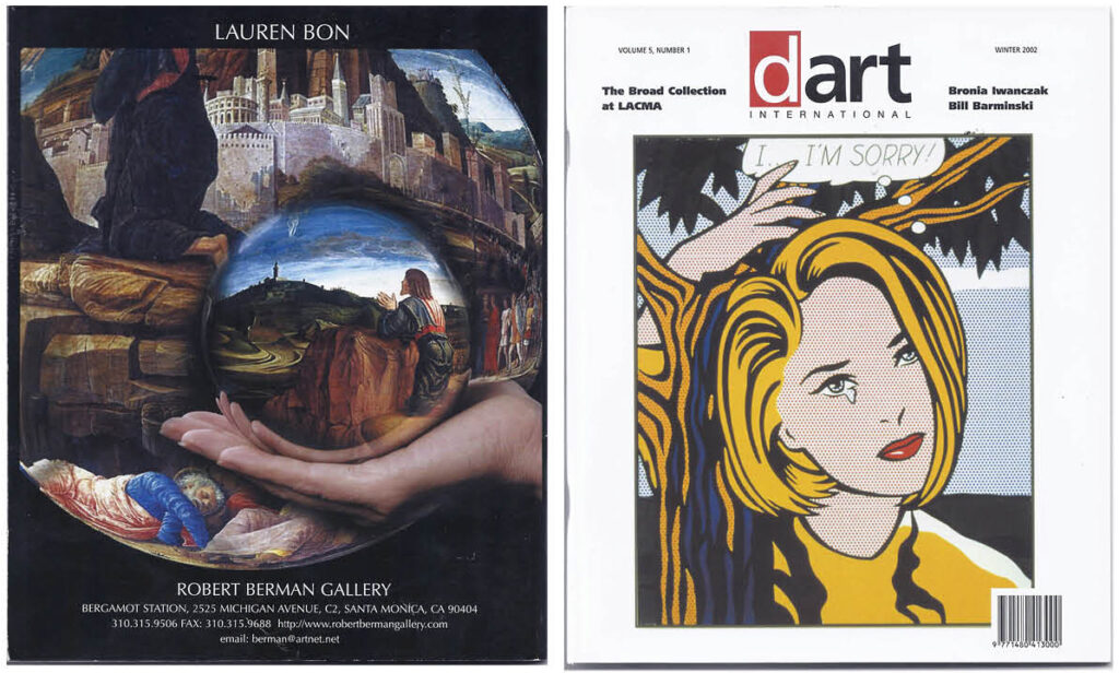
The facing page of the Mortality featuring Danielle Frankenthaler and Diane Thodos adds a level of depth to the tree theme. The tree of life as a protean idea, its branches and roots encompassing humanity from the beginning of time. Frankenthaler’s Tree of Life abstract painting juggles the spiritual import of the tree as symbol. Thodos decries human moral failure throughout history, its politics having left us the miseries of war and economic depression. With this association we may complete the circle of references, since it had been the terror attack of 9/11 that led to the choice of “I…I’m Sorry!” as cover for the Winter edition of 2002 dArt magazine.
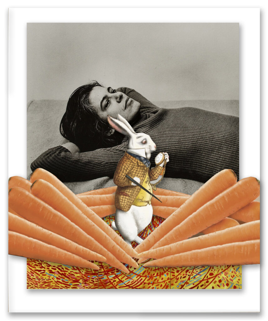
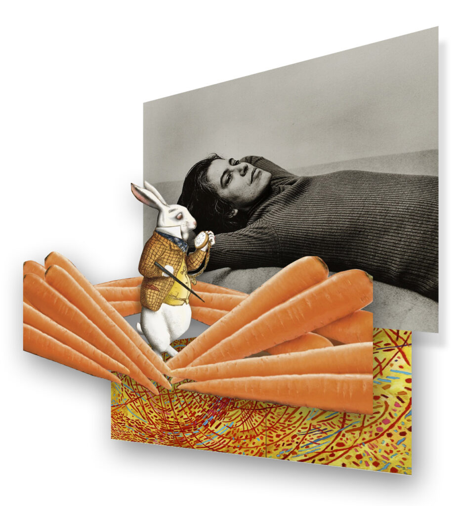
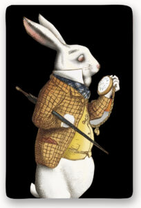
Much has been said about the White Rabbit in Alice in Wonderland. Is it the spark of curiosity that activates Alice’s spiritual awakening, as has been suggested? To begin with, we know that he led Alice down the rabbit hole. Always running late, Carroll himself saw him as nervous, elderly and even feeble in contrast to the youthful and confident Alice. White Rabbit could be seen as a personification of Tempus fugit, the Latin phrase for “time flies.” In the story, he functions as a herald, whose job it is to make proclamations and carry official messages, signifying the imminence of events. In Lewis Carroll’s mind, perhaps a cuter, softer version of Father Time would play better with children. As a symbol, benign Father Time might otherwise devolve into the grim reaper, hour glass in one hand – a scythe in the other.