at the Arvada Center for the Arts and Humanities in Colorado
by D. Dominick Lombardi
Barbara Kruger, Jenny Holzer, Ed Ruscha, and Christopher Wool are just a few of the most renowned artists who have very successfully used words as key elements in their art. After all, visual art is a form of communication, and the addition or focus on text in the creative process can be a very powerful tool. Currently, the Arvada Center for the Arts and Humanities in Arvada, Colorado is presenting two excellent exhibitions curated by Emily Grace King and Collin Parson that focus on a number of contemporary artists who too address the import and range of text in art.
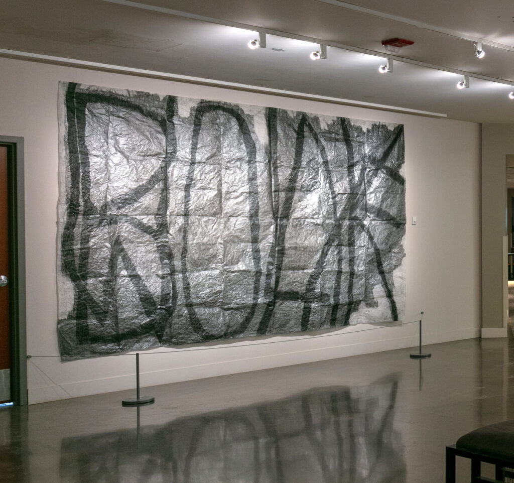
In the main gallery, on the first floor of this long-standing, unique, multi-purpose arts center is the solo exhibition Roland Bernier: In Other Words, which features many years of compelling text inspired art. What I find most alluring here, is the artist’s focused and unwavering intent, and the variety of materials employed to project humor, optimism, cynicism and social commentary through words and text.
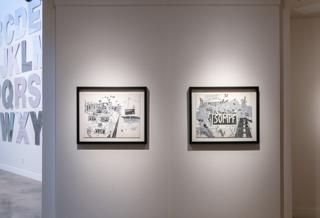
Two of the earliest works in the exhibition, Untitled (Cluf) and Untitled (Sompf), both from 1969, show something of an underground, counter culture feel with hints of Edward Gorey. In Untitled (Sompf), there seems to be a protest going on, one with security forces attempting to squelch the momentum, while both works feature a jumble of legible and illegible demands that add up to the captivating mayhem of these dream-like scenes.
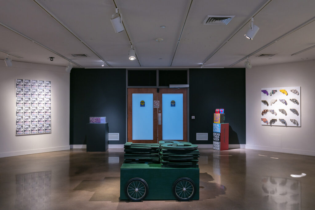
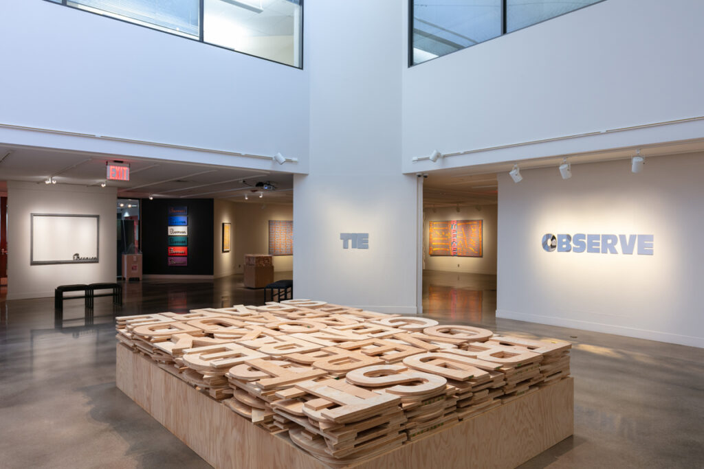
The lion’s share of the exhibition are works from the past 25-30 years, where Bernier’s relentless dedication to the word or letter totally dominates his oeuvre. Visitors may find the more Pop Art suggestive works in this exhibition reveal the real genius of this artist. For instance, GPT (2003), which is dominated by a park-bench green box-like cart, sporting spoked go-kart wheels and a rope, and carrying systematically stacked oversized wooden letters, is noticeably impractical, yet playfully awkward. An excellent commentary on how communication can be burdensome and hyperbolic.
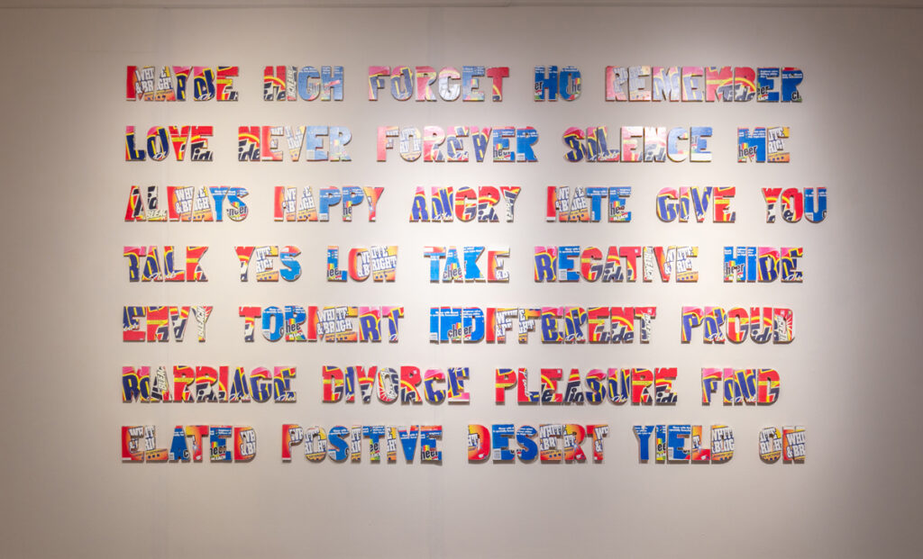
Soap Opera (1997) is composed of 35 to 40 words made of block letter collages covered with colorful laundry soap box cardboard. Brand names such as Cheer, Bold and Tide brilliantly contrast the words they decorate such as ‘indifferent’, ‘silence’ and ‘negative’, suggesting much more than just commentary on the culture of this daytime genre. With work like Chit Chat and Word Works 2, both created in 1997-98, it is easy to see the incredible dedication to quality and craft Bernier brings to the table in this very important exhibition.
Continuing the theme on the upper floor galleries is the group exhibition Word Play, which features the works of 15 contemporary artists. What is most notable here is the curatorial approach taken by King and Parson to offer an expansive variety of approaches to language and text, while the materials used vary from digital to straight up graphite on paper.
The two digital video artists in the exhibition are Jeff Page and Joel Swanson. Page offers us a fast moving video where a pile of coarsely cut out letters move stop-action style, up and down onto a corner created by two adjacent angular walls. The text is nearly impossible to read in situ as it moves too quickly, however, one may decipher some of the phrasing by videoing the projection with a camera phone, then go frame by frame to read the words: “vocal fry,” “kinda dark,” “girly voice” and “2 gay 4 work.” Whether or not anything here indicates conflict or identity concerns, the overall visual presentation before my stop-action analysis reminded me of the 1920, silent horror film The Cabinet of Dr. Caligari, due to this work’s awkward movements and abrupt angles.
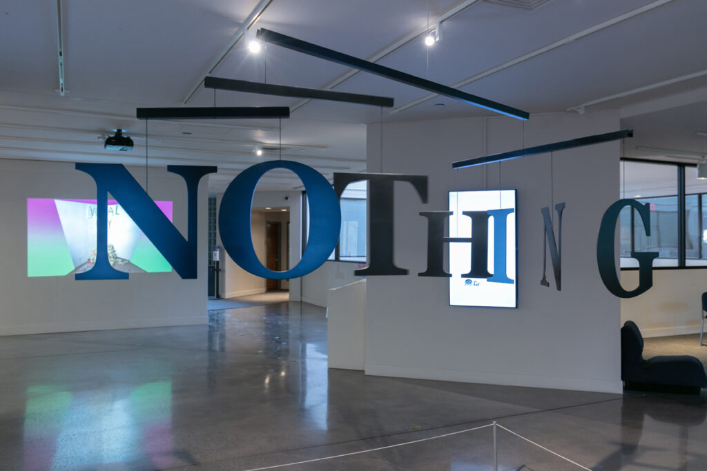
Swanson’s five part room installation, with its four vertical video monitors and central mobile-like hanging letters titled Merriam Webster, 1995 (2021) and NO/NOT/NOTHING (2021) is much about how language is acquired randomly, then meaningfully. The central hanging black letters, which, depending on the movement of the mobile, will occasionally spell out the words in the title, suggesting how language and the meaning of words can change depending on the angle you take. This could go a long way to explain how information, or disinformation can change so drastically in part, from source to source.
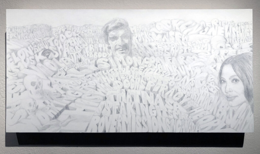
During these past several months of COVID there have been a number of odd and often divisive headlines throughout various media. Donald Fodness takes some of the most bizarre captions, and rolls them into balloon-type lettering creating buoyant fields of endless insanity. In Landscape 2021 with Icons (2021), where we see familiar entertainment icons, Fodness adds a bit of Pop to the spectacle of peculiarities as his subtle and sensitive drawing techniques reveal potent portrayals that inevitably reference a sort of subconscious cynicism that bubbles to the surface.
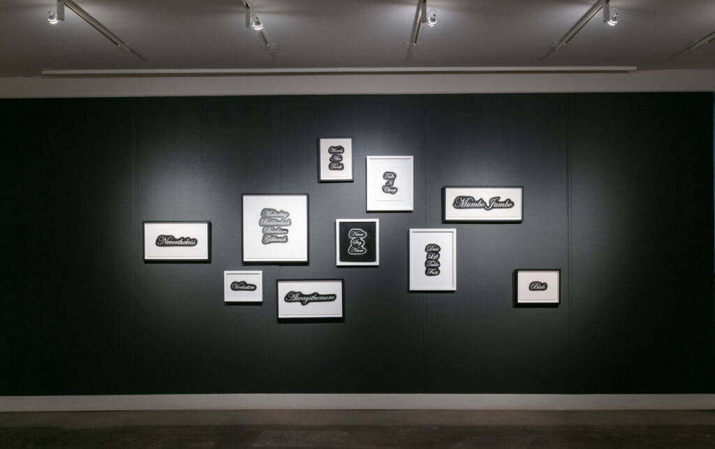
Jim Johnson’s meticulously drawn words done with charcoal on paper, boast beautifully rendered cursive captions such as Never Say Never, Talk is Cheap and Mumbo Jumbo. At first glance they appear to be as much about a tattoo aesthetic as they are referencing familiar sayings. However, after further consideration, the entire installation, which is presented on a matte black wall, gives the entire design a classic and highly cultivated look leading one to believe there is enlightenment beneath the cliché.
Joe Norman’s Faith/Doubt Model (2019) is the 3D maquette for a much larger outdoor installation in the expansive sculpture field nearby. Using five letters constructed in such a way as to change when walking around the sculpture, visitors will see the word ‘faith’ turn into ‘doubt’ then back to ‘faith’. Some may take away a certain commentary on how religion often conflicts with science. However, Norman turns the conflict-ridden conundrum into a playful and thought provoking transition through insightful simplicity.
Sammy Lee’s two organic looking multi media relief-like works add an abundance of mystery and tactile quality to the exhibition, while Masha Sha’s graphite and black lead on tracing paper drawing titled Homo Homini Lupus(2021) revels an incredible intensity in technique, coupled with references to graffiti and the effects of tag bombing. The distinctive untouched areas in the corners and edges is something of an homage to Clifford Still, while the energy and focused mark-making is mesmerizing.
Trey Duvall’s Repeat That Again (2021) is perhaps the most conceptual work in the exhibition, reminding me of the sort of thing I would occasionally come across in the SoHo galleries of Manhattan back in the 1970’s. Jade Hoyer’s20 Ways of Saying No (2021) is a powerful, albeit delicate balance between humor and sexual harassment, skillfully disguised as benign beauty. Many will be struck by Scott Young’s Human(e) (2021), a neon work that sporadically fluctuates between ‘humane’, with an occasional failing of the letter ‘e’ to ‘human’ – as we all must remember that humanity is both a right and a responsibility. Paula Gasparini-Santos offers a familiar take on street art referencing Jean-Michel Basquiat, adding sweeping text to the wall beneath the paintings, with such lines as: “you dear are not the tide or the rain…” suggesting excerpts from a novel or some such revelatory text, while Tom Mazzullo offer a series of exquisitely rendered Type Improvisations that reflect a dimensional aspect to the old lead or wood block letters once used for type-setting.
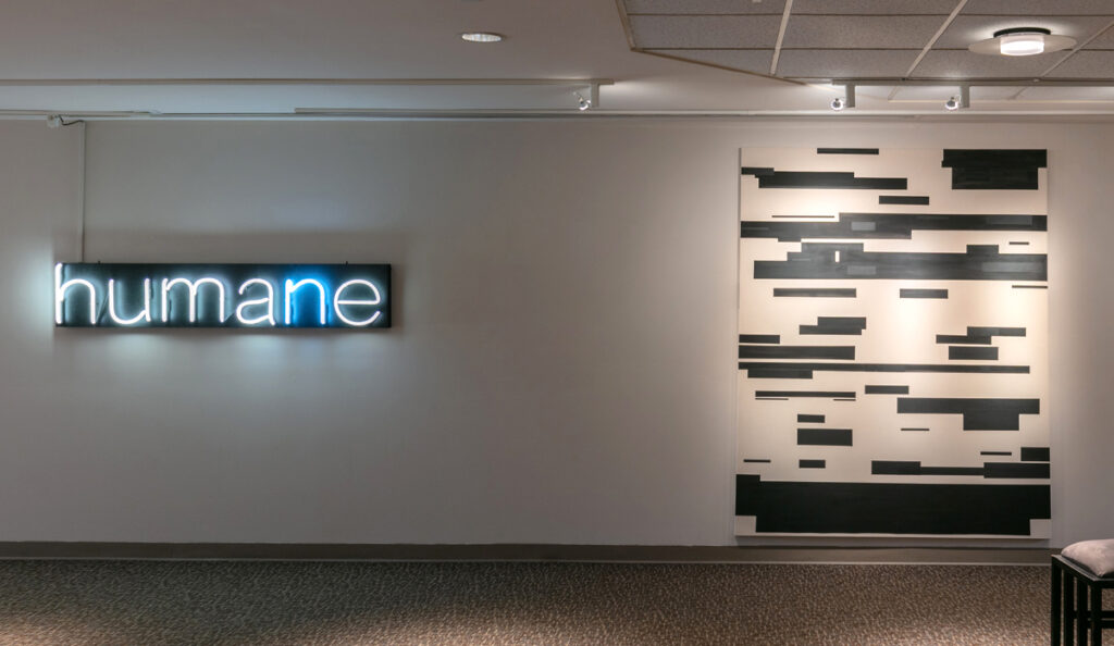
Paul Weiner’s Motion for a Certificate to Compel Attendance (2021) riffs off of his smaller redacted text-type piece Jurors Questions for Witness (2021). In the larger painting, the blocked out text becomes a hard edge painting sporting a unique rhythm of dark and light, not so dissimilar from the old computer key punch cards of the early 1970’s. Rounding out the exhibition are Cherish Marquez with an interactive video game that interjects words into an otherworldly environment; and Lares Feliciano, who offers a digital collage presenting the word PALANTE as a magical, tropical paradise.
For more information about either exhibition, go to https://arvadacenter.org