by Jen Dragon
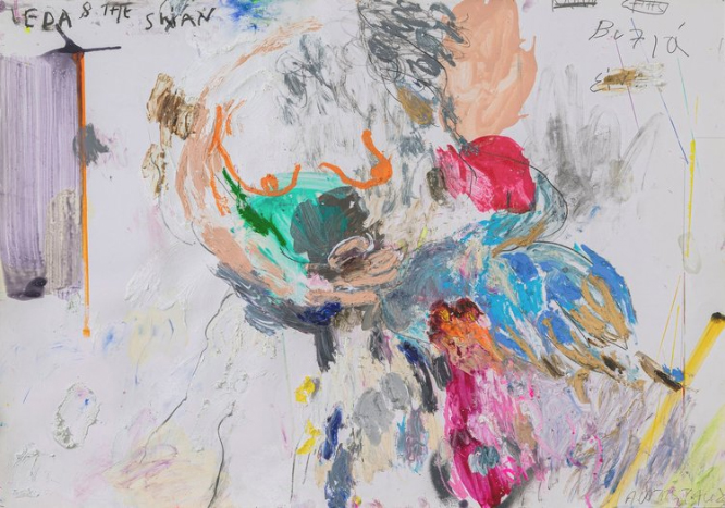
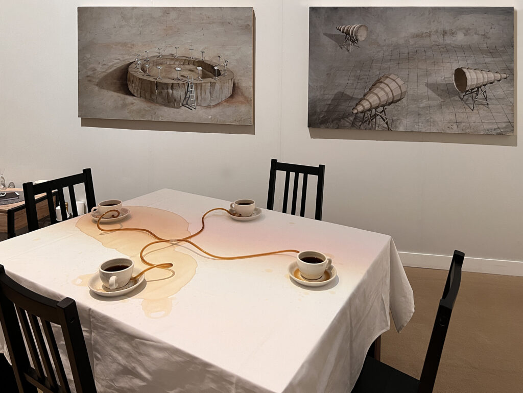
In the current solo exhibition at Mazlish Gallery in New York City, the soulful paintings of Loy Luo evoke timeless songs with unknown origins and infinite possibilities. The abstract artworks have the depth and strength of stone combined with the lightness of air and space. Luo not only encourages her audience to look but also to listen and move in place as they view her art. The musicality comes from Luo’s background as a musician and her notations that are painted on the canvas recount ancient songs of friendship and love. To fully experience the evershifting color, depth and space, the viewer is compelled to move from left to right and from up to down in order to grasp the dimensions described by the powerful presence of each artwork.
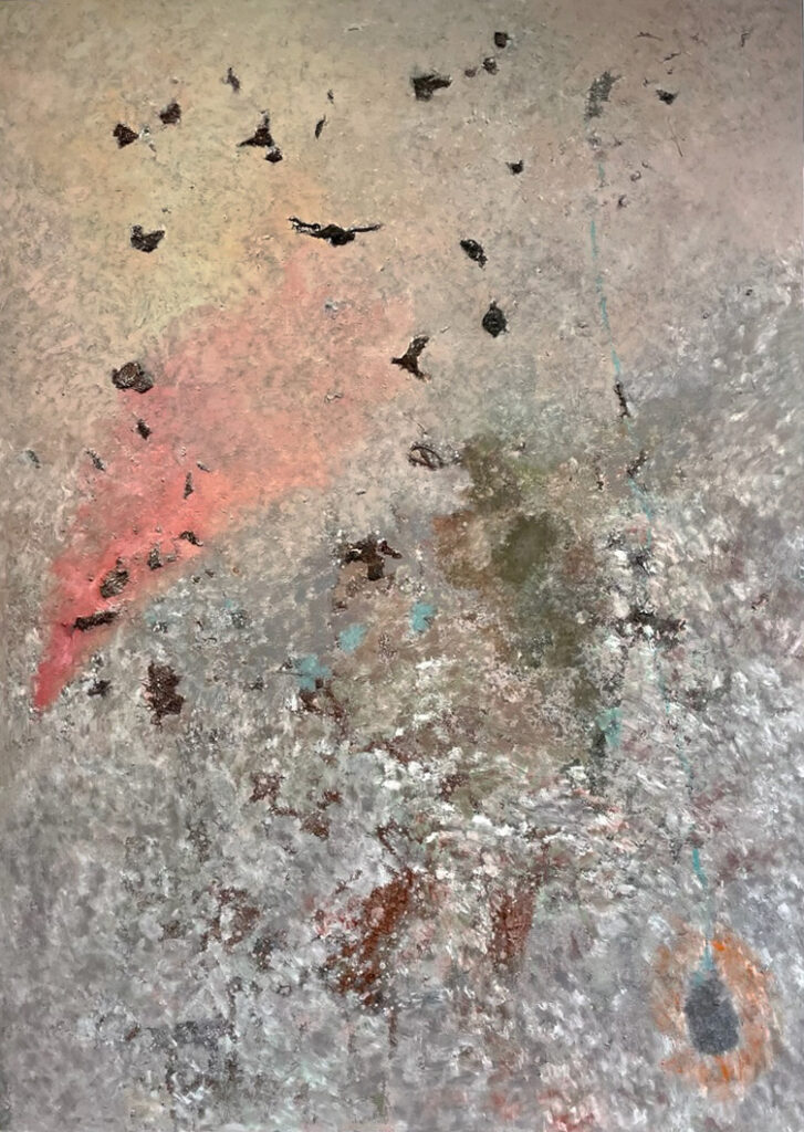
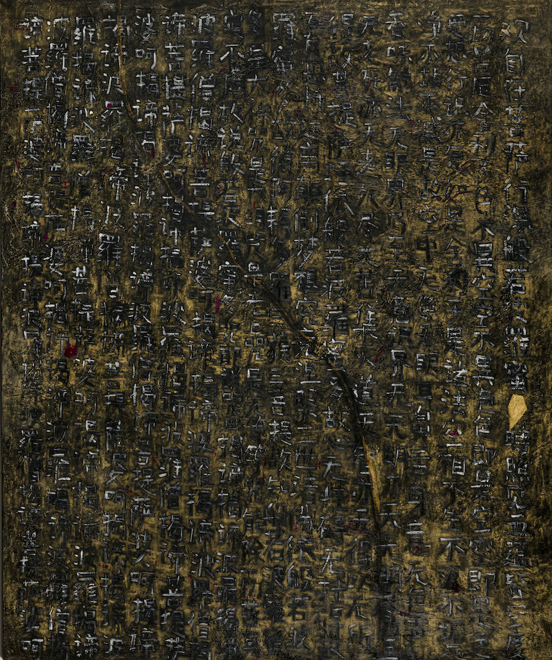
All of Luo’s artworks present a vast, borderless space. In this floating, gravity-free world, Luo paints intangibles with such conviction that these abstractions are made manifest. With precise, deliberate brush marks, Luo creates an alchemic surface that changes according to the ambient light. In Half Diamond Sutra, the mineral green of the ground unites the suspended marks and objects as well as the calligraphic notations scratched into the patina. In Abstract Theater A8, the sense of the self suspended in the experience of gazing towards a rosy light peppered with floating forms that are at once bird-like yet solid. The vertigo created by this tilting space is caused by a depth of field that seems to accelerate with the passage of time. In the Rune series, the sensation of different spaces is more direct: in Rune 2, the painting evokes the sunlight through trees as one gazes upwards and in the painting Rune 3, the atmospheric blue places the viewer adrift in a celestial orb.
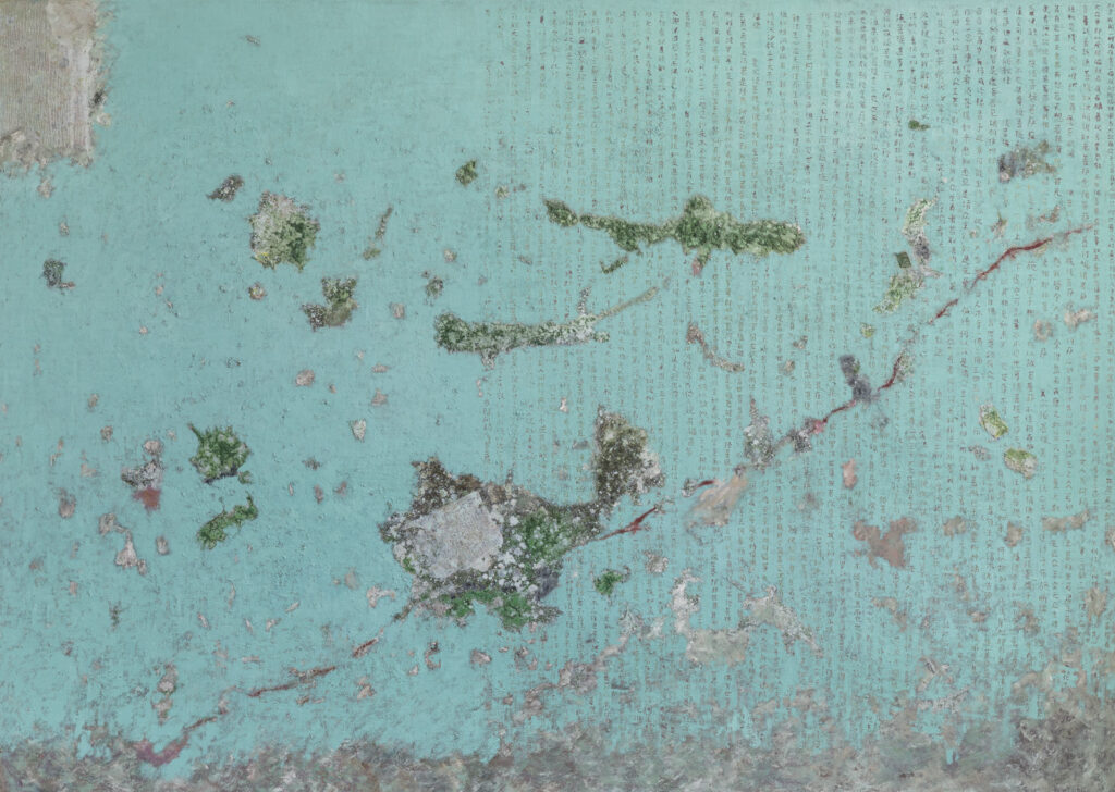
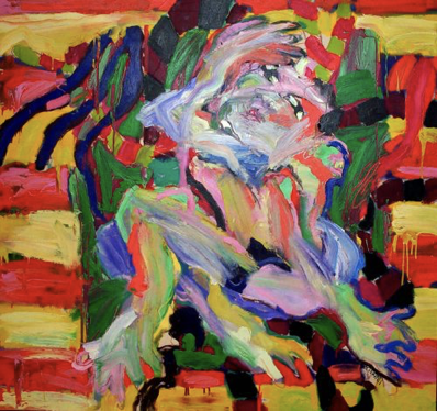
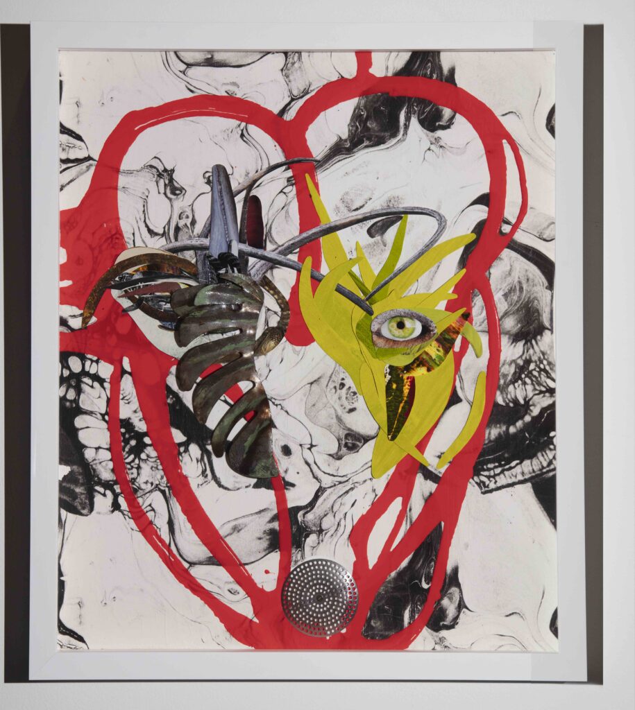
This cartographic quality continues through to the Heart Sutra series. In these paintings, there are luminous pigments lurking beneath a calming overlay of earth colors. It is in the incising of the paint through this glowing patina that Loy Luo reveals the depth of the painting’s journey. Calligraphic symbols rain down the canvases in a constant torrent of memories evoking stories, songs and poems. Some artworks, such as Heart Sutra I, go so far as to play with the light. As the viewer moves in front of the painting, the colors shift magically from black to gold and back to black. This optical illusion reveals and obscures its own meaning, cajoling the viewer to come close and then to step away in a continual “back and forth” sensation. It is only by remaining engaged with the artworks over time does the understanding of the inscribed words, the space and the shifting colors become clear.
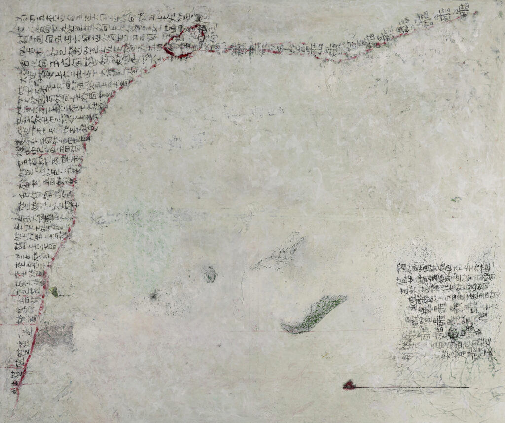
The most recent series of artworks, Guqin, refer to the horizontal slide guitar native to China with which Loy Luo performs her music. In Guqin I and II, Luo writes the notes of a traditional folk song on a white field. Sometimes the notes are cut off abruptly by a jagged sanguine border like an ancient wound that refuses to heal. In both paintings, the texts seem to have been incised into white marble that is at once solid yet poised to vaporize like a cloud- just as the memory of music disappears just after it is performed.
The uniting force behind all of Loy Luo’s artworks is the immense strength and space she describes with her large abstract paintings and smaller works on canvas. The alternating erasure and endurance of her mark making, the piercing luminosity of her colors and the power of implied telluric currents are all infused by Luo with a lightness of being. The inscriptions are manifested thoughts that rain down in the mind of the viewer like a half-forgotten melody as the artist presents an ancient tale, patinated with age and its accompanying palimpsests, conveying timeless instructions on how to love and live.
Loy Luo at Mazlish Gallery, 98 Mott Street, #600A, NYC N.Y. 10013 • 917-373-4550 • www.mazlishgallery.com