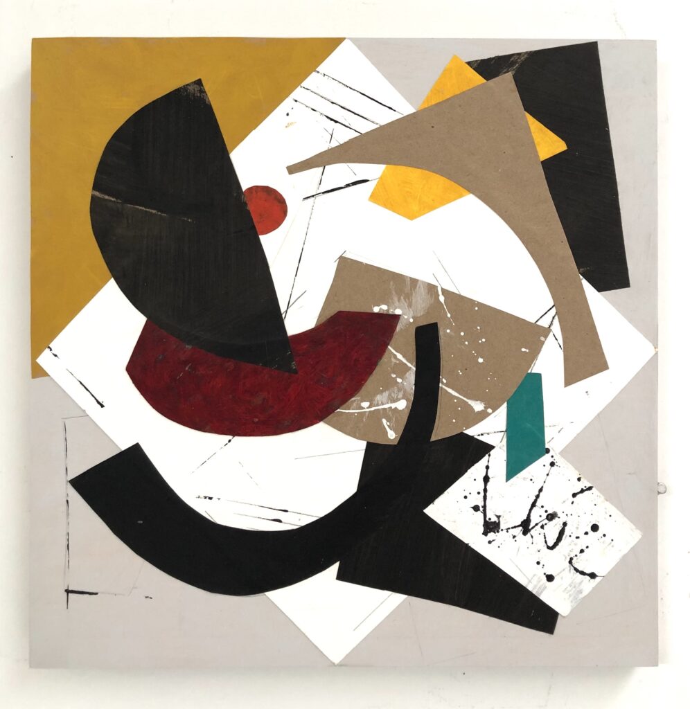
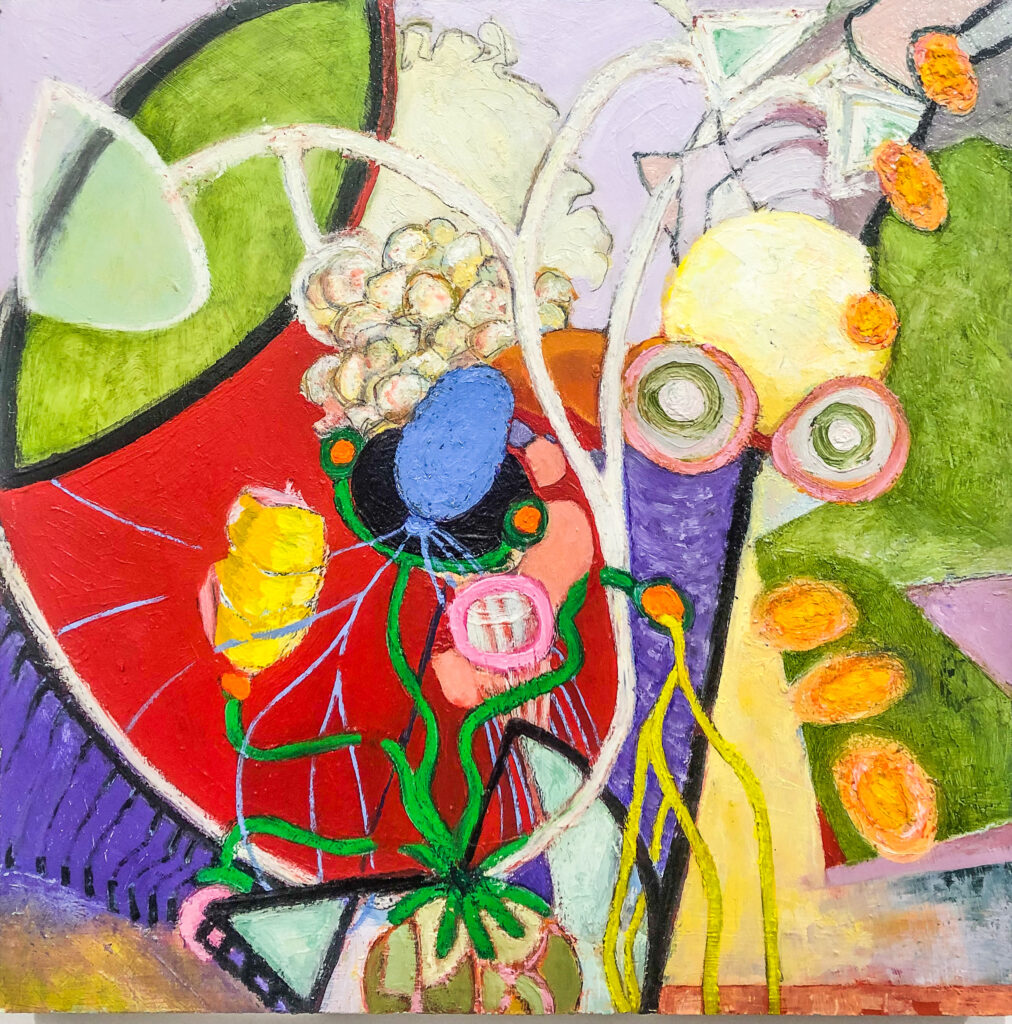
Jenne Currie, Feeling the Rhythm, 2023Feeling the Rhythm 16 x 16
By its nature, painting is a deceptive art; it seeks to present three dimensions with only two spatial planes. The perceptual shifts between these two and three dimensions create the optical illusion which in turn animates visual art. Two artists, Jenne Currie and Tracy Phillips present their paintings at the Associazione Culturale Castello 780 gallery venue in Venice, Italy. Although Currie works with collaged, sculptural shapes and Phillips paints nuanced, luminous forms, both artists confront the puzzle of the third dimension with comparable determination.
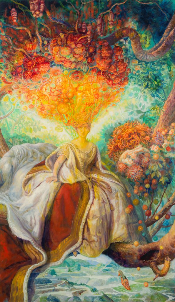
Jenne Currie, First Tango in Venice, 2023
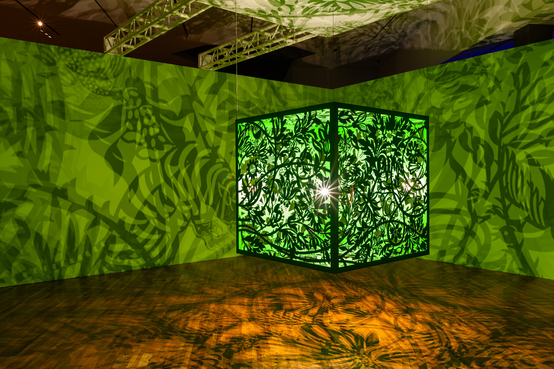
Jenne Currie’s paintings balance sculptural space against the limits of the flat substrate. The shadows made by the suspended forms are influenced by the shifting ambient light. These ever-changing silhouettes allow the passage of time and its accompanying penumbra to serve as painterly components alongside with her pigments and mediums. The artworks all share an intense musicality as they collectively invoke the rhythm of dance, the convergent harmonies of sound and the suggested contours of instruments. The restricted palette and exuberant forms make for paintings that demand multiple viewings to determine the constantly shifting space.
Tracy Phillips, This Way Please, 2023
In contrast, Tracy Phillips’ complex and vibrant oil paintings straddle a universe that sways between within and without. Naturalistic light effects illuminate Intricate passageways while chromatic configurations balance on the cusp of the known and unknowable. The sensation is of an oneiric world originating somewhere deep inside the viewer and traversing beyond the self into more obscure realms populated by sensations. There is a familiarity with some edges and textures: a feather, a velvet cloth, a jewel or a shell; however, on closer inspection, recognition rapidly melts away and the viewer is left with visual memories. In Phillips’ hallucinogenic environment, we see the possibilities of an alternate biology that is neither inside of us nor outside but rather in the realm of the senses.
Tracy Phillips, The Heart of the Matter, 2023, 12 x 12 in, 30.5 x 30.5 cm
With paint and wood, Jenne Currie and Tracy Phillips unite as they harness the power of an intuited third dimension: Currie, by forging the forms and shadows of her sculptured paintings and Phillips, with intricate brushwork that animates fantastical worlds. Together, these painters make dynamic paintings that invite space and being.
Jenne Currie + Tracy Phillips. Castello Spaces, Castello 780 Gallery, Fondamenta San Giuseppe, Sestiere Castello 780, 30122 Venice, VE Italy. Gallery Hours: Thurs – Sun 3-7pm or by appointment Exhibition through September 10, 2023
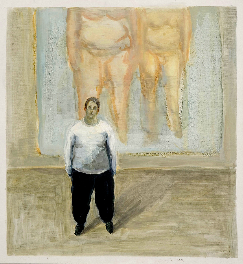
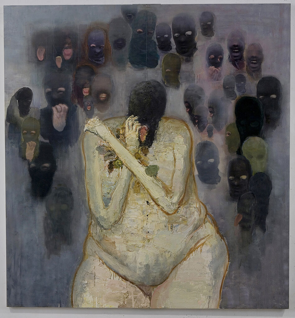
Brenda Goodman, Self Portrait No. 5, 2004 Courtesy: Sikkema Jenkins & Co. and the Artist
Self: Portraits + Places is a three-woman exhibition of paintings recently at the Kleinert/James Center for the Arts in Woodstock, N.Y. The artists in this exhibit, Brenda Goodman, Julie Heffernan, and Elisa Jensen, consider the myriad senses of being within the confines of the painted portrait.
Brenda Goodman, Self Portrait No. 1, 2003 Courtesy: Sikkema Jenkins & Co. and the Artist
For Brenda Goodman, the notion of Self is mirrored by the unflinching gaze of the canvas as the artist paints herself naked and standing alone in her studio. These artworks predate the abstract paintings she is now known for yet underline the very personal foundation of all her work. In these Self Portraits in the Studio, the crushing space evokes a loneliness and vulnerability that is almost unbearable as haunted masked figures surround a terrorized woman (No. 1) while other paintings feature the artist gazing at herself or at the viewer in clothed curiosity (No.5).
Julie Heffernan, Self-Portrait as Lacoön, 2022 Courtesy: Hirschl & Adler Modern and the ArtistJulie Heffernan, Self-Portrait as Mad Queen, 2021 Courtesy: Hirschl & Adler Modern and the Artist
Julie Heffernan weaves a different version of selfhood from the chaotic skeins of dreams and visions. The fluidity of the female form merges with the botany of the natural world, presenting an allegorical tableau vivant. In Self Portrait as the Mad Queen, the subject possesses a strength that controls telluric currents while funneling a white-hot intensity that can bend destiny. All of Heffernan’s paintings merge artifice with nature ; what is supposed to be wild and savage (the woodlands) are intricately ordered while the protagonists present as inscrutable actors posing as timeless archetypes.
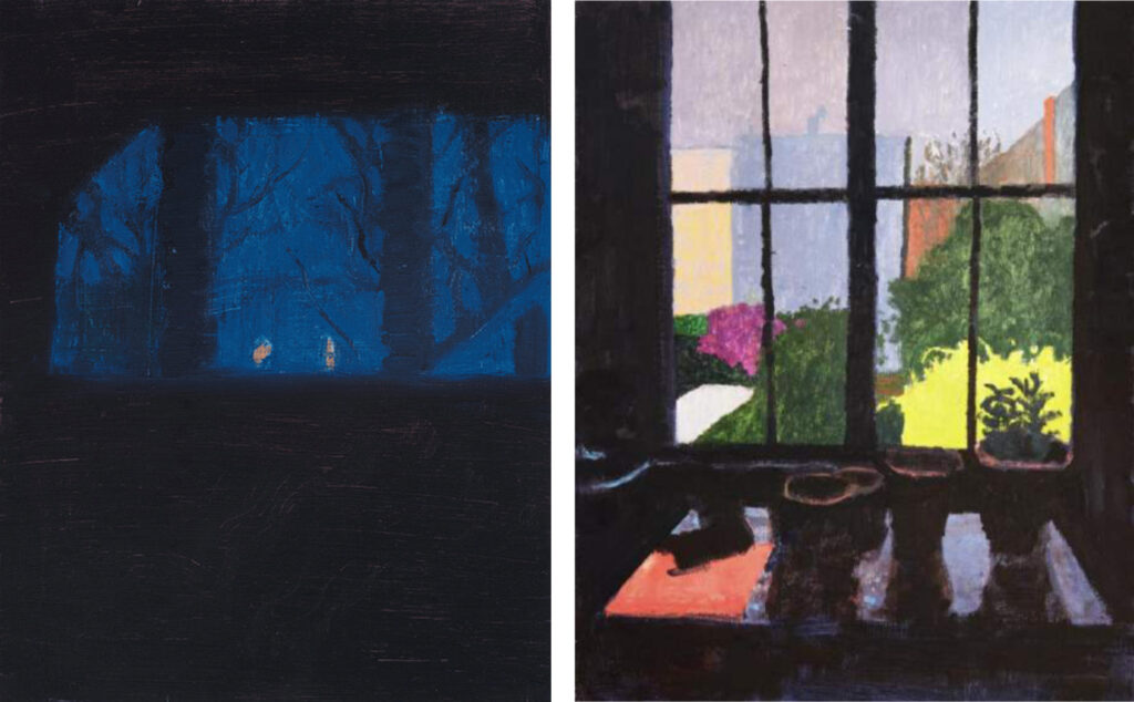
Elisa Jensen, Lights Across the River, Night (left), 2022 and Dawn, 7:45 AM (right), 2023 Courtesy: Pamela Salisbury Gallery and the Artist
Elisa Jensen turns away from both figure and fantasy as she places the Self squarely in the geography of light and object. Her subject matter is the serenity of interior space and the intimate connection to the forms that shape our world. Jensen depicts humble domestic objects and phenomena, such as a beam of light through a window, as a stage setting for an internal drama. Her dark interiors parallel the depths of the mind’s eye while the views out the windows become the portals that link the inside experience to the vast world beyond.
As three Fates, these artists present separate visions of Selfhood as an embodied physical emotion, a mystical mythology, or a subject-less experience bound by the very rooms we inhabit. These intangible self-portraits eclipse the subject in meaning as the paintings in SELF: Portraits + Places capture the paradox of individuality and the reality of a universal human experience.
Carol Bruns, Fringe Elements, 2023. Photos by Marc Tatti, with permission from White Columns and Carol Bruns
Carol Bruns’s work first caught my attention in 2018 at SRO gallery in Crown Heights. Her exhibition showcased a mix of sculpture and works on paper. Her figurative sculptures conveyed the presence of human bodies in space, twisting, straining to emerge from their own materiality. Despite the rough construction and exaggerated physicality of those figures, one could still discern vestiges of humanist dynamics or perhaps a loose tether to drawing or sculpting directly from a nude model.
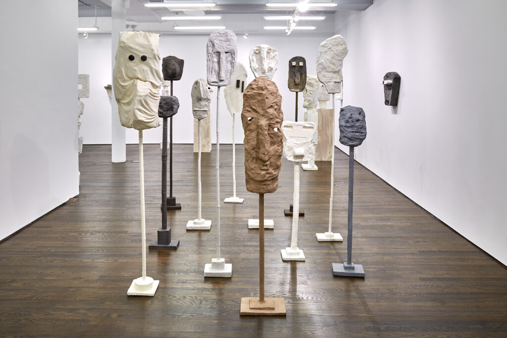
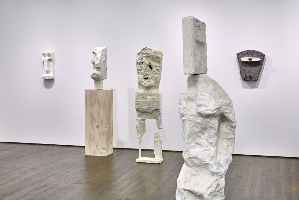
In her new, expansive show at White Columns, Bruns has departed entirely from the figurative tradition and embraced a kind of archaic, mythic approach. The gallery is filled with oversized masks, slender stacked totems, and distorted effigies. While these figures and heads still seem to struggle to emerge from the process of their making, once emerged they say less about the figure and more about the psyche.
As is true for many sculptors, materiality and process cannot be taken for granted, and Bruns has developed a unique process over several years. Her approach produces a papier mâché-like material that is thinner, lighter, and more malleable. It’s flexible enough for her to incorporate other materials such as hair, fibers, plant matter, and Styrofoam. The pieces are predominately painted in monochrome black or white, adding to their stark, confrontational presence while unifying the disparate elements. The final effect is disarmingly fresh, unpretentious, and incredibly present.
A cursory viewing evokes the art of West Africa, Polynesia and other pre-industrial cultures, including archaic Greece. While those connections to the art of past are clear, these pieces go beyond homage or derivation, for the clear influence of psychology and contemporary ideas about the self that are immanent in the work. Bruns cites early twentieth century modernists as an inspiration, in addition to the original, unnamed artists that inspired them, but her work is firmly rooted in the twenty-first century.
Every artist begins with intentions, and for Bruns I suspect the intention is to evoke mythos, to mine the archetypal psyche, to connect with the root forces and human experience that unites us simultaneously to pre-industrial, tribal artists as well as the early twentieth century modernists who referenced them. But, despite all intentions, none of us can help but be mediums for the zeitgeist, and the same is true for Bruns, whose work channels our contemporary state of being, clinging to individuality, polluted by industrialization, and disenfranchised by the post-industrial economy.
Carol Bruns, Archaic Man, 2023. Photos by Marc Tatti, with permission from White Columns and Carol Bruns
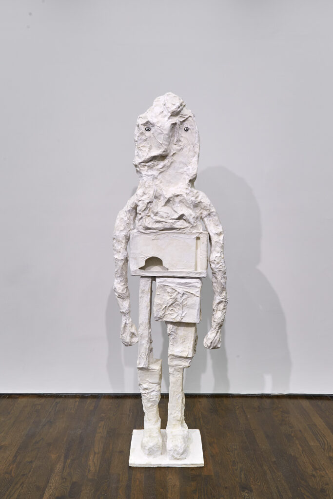
Consider Archaic Man, whose title and direct advancing aspect forces us to consider it relative to the Greek Kouros. We can take this to be a representation of a God in human form but unlike the ancient ones, this is one infiltrated by industrial elements. The classic forward stride of the Kouros is replaced by found objects stacked to an absurd approximation of an articulate leg, rendering a figure that one would more likely associate with having survived a terrible accident than a God descending from Mount Olympus.
Or Seeing in the Dark, which speaks to subjective, interior truth dissociated from shared sensory perception. Here’s a figure that is so totally inwardly focused that their sensory organs have essentially been swallowed back into the head, a totally modern idea that assigns priority to individual, subjective experience over shared truth.
Carol Bruns, istallation view. Photos by Marc Tatti, with permission from White Columns and Carol Bruns
The White Columns’ exhibition alternates free-standing totems, wall-hung objects, and pedestal-mounted head-like figures. This installation approach emphasizes variety and contrast among Bruns’s work and highlights subtleties among the pieces. This enables us to read the emotional and mental states depicted: Faces that appear crushed, silenced, or occluded, reduced to a mere gash for a mouth or two small holes for eyes. In these pieces the subject is always the interior self while the form is the distorted, tortured body.
Bruns selectively employs a non-transformative approach to materials, often incorporating recognizable found objects like Styrofoam packing into her work. This suggests a fluid connection between cultural vocabularies and expectations. Unlike her earlier work that maintained ties to traditional representation of the human body, Bruns’s new creations invest in the ability of myth and cultic power to transform materials as opposed to representation. Bruns is tapping into the realm of expression that flirts with primordial and introspective emotional states that don’t easily translate into language, evoking at once a sense of ancient mysticism, ritualistic power and contemporary psychology. Her pieces resonate with traditional objects from the distant past, yet they remain palpably contemporary and enigmatic.
Carol Bruns’s exhibition at White Columns serves as an invitation to explore the intersection of ancient symbolism with contemporary concepts of self. Her pieces remind us of the enduring potency of myth and ritual, while mining the contradictions of the contemporary psyche.
Carol Bruns at White Columns from July 13 – August 26, 2023. White Columns, 91 Horatio Street, New York, NY 10014. Tuesday–Saturday, 11AM–6 PM.
Victor Ekpuk, Portraits # 5 & 1 (Portrait Series), 2015, acrylic on canvas. Image courtesy of Princeton University Art Museum- photo Joseph Hu
Nigerian-American artist Victor Ekpuk sees himself as an indigene of the West African culture which engendered Nsibidi, an ancient ideographic communication system that is both textual and performative. Native to the Ejagham peoples of the Cross River region shared by Nigeria and Cameroon, Nsibidi likely originated around 400 C.E., spreading to the neighboring Ibibo, Efik, and Igbo peoples. During the Age of Slavery, it also crossed the Atlantic, taking root in Cuba and Haiti. Ekpuk draws inspiration from Nsibidi to create dense sign-and-symbol networks that dominate his art, giving it evocative, expressive power. These networks also include signs and symbols arising from his own memory and imagination, as well as ideas from other cultures. Utilizing all these resources, Ekpuk has developed a unique, personal vocabulary that embeds in his art a symbiotic, rhythmic interplay between art and writing. He has gone far beyond the Nigerian artists who preceded him in utilizing Nsibidi as part of a merging of Western modernism with Nigerian and African ways of art-making.
Love of drawing has also pervaded Ekpuk’s journey as an artist. “I am almost always painting on my drawings or drawing on my paintings,” he says, revealing that, at core, it is drawing that drives the force of his art. This fuse manifests itself even in his sculpture, which he sees as his passion for line finding three-dimensional incarnation. When Ekpuk creates his enormous site-specific ephemeral murals for which he is well-known, his command of line is such his creation virtually flows out of him as a stream of consciousness.
Victor Ekpuk, Mask, 2022. Handpainted steel. Image Courtesy of Princeton University Art Museum/photo Joseph Hu
His drawing fluency made Ekpuk a successful illustrator and cartoonist at The Daily Times, a Nigerian newspaper where he worked from 1990-1998 upon graduating from the University of Ife (now Obafemi Awolowo University). Owing to the authoritarian military rule that Nigeria continued to endure during these years, the illustrations and caricatures he drew for the newspaper to enliven its articles and news reports were so constructed they spoke to their readers “between the lines.” In an illuminating article on Ekpuk, art historian Amanda B. Carlson suggests that his work as a journalist-draughtsman imparted experiential depth to his artistic exploration of Nsibidi’s graphic attributes. Referencing Julia Kristeva, she also draws attention to the intertextuality informing his works – an attribute that surely drew formative sustenance from the subtle dialogic relationship between text and image that he created for the newspaper’s readers.
With the Princeton University Art Museum’s main premises currently closed for a complete rebuild, Victor Ekpuk: Language and Lineage is on view at Art@Bainbridge, a gallery project of the Museum located in downtown Princeton. Four available rooms show seventeen selections from a thirty-year career. Embedded on the museum’s website is a downloadable brochure, which is also available in hard copy at the show. This document contains a biographical statement on Ekpuk, brief introductions by the curator, Annabelle Priestley, to the artworks in each room, and comments by the artist on specific works and his practice in general. Using the hyperlink given above, readers of this review-essay might like to download the brochure or pick up a copy at the show.
An impression that you might take from the exhibition as a whole is that Ekpuk’s muti-media artworks are at once abstract and figurative. A twenty-first century artist, he has internalized the lessons of the previous century’s art. You might also note that, within his hybrid style, the impulse of his practice is to grow the abstraction without detaching himself entirely from its figurative attributes. Take a look at Prisoner of Conscience, 2002 in gallery 4 in conjunction with the brochure’s Figure 1, House with Crouched Figure Inside, which the artist made circa 1994. In the more recent image, Ekpuk has so stylized his depiction of the prisoner’s plight you feel their physical confinement and psychological pain in a direct, visceral way, and the more you look at the picture, the more its semantic value unfolds in you, including the message of the light streaming in though the tiny window. He has also substituted the hatching of the earlier picture’s substrate with his Nsibidi-based script forming a new substrate. Here he depicts symbolically the violence attending the prisoner’s capture even as it shows a solar eclipse promising hope through time’s passage. On a broader and deeper plane, it also alludes to a universe of endless signification clouded by ambiguity. The artist has said that it is not necessary for the viewer of his script-based art to read it in granular fashion but rather to sense its meaning through feeling – that is, in an oceanic, abstract way.
Most artworks on display depict the human head, in full or part. Referencing his art as a whole, Ekpuk says, “All portraits in general, whether I call them portraits, masks, or heads, bear the idea of the human head as the center of human consciousness. Through the years, I have devised ways to portray the head, to stylize the form and make it abstract, looking for the essence of the form of the head.” This is not the pursuit of abstraction for its own sake. The aim rather is universal signification.
VictorEkpuk, In Deep Water, ca. 2012, printed 2023, digital drawing printed on canvas + two other works. Image courtesy of Princeton University Art Museum-photo Joseph Hu
The head in In Deep Water (gallery 2) contains a dense agglomeration of signs, symbols, and scribblings, so dense that the density may itself be a key message of the drawing. Ekpuk explains in the exhibition brochure that his drawing “pictures the head of a Black person” in America so weighed down by life’s circumstances they are “still struggling for air.” At the top of the head, however, is a sun-like spiral that may signify hope. And this, indeed, is intertextuality in action in the context of abstraction, sun-like spirals being a recognizable Nsibidi symbol.
For a striking example of the power that Ekpuk conjures through both abstraction and intertextuality, linger, please, when in gallery 3 you reach the acrylic painting Royals and Goddesses. The scarlet of the striations modelling a king’s head as well as coloring the dots that form his crown is set off by the underlying dark green background, which in turn is made more intense by the grey-green Nsibidi-like symbols providing affective depth to the painting. The overall effect is one of spectacular beauty. Then when you consider that, through his imagery, Ekpuk is recalling for you the Ife bronze heads of Nigeria, the fruit of a sophisticated cultural and artistic tradition that flowered more than half a millennium ago, you might say, “This is truly awesome.”
Ekpuk often listens to music when he makes art. It’s even important to him intertextually, as the soundtrack in gallery 4 shows. Featured there is the music of Nigerian musician Fela Kuti (1938-1997), whose culturally hybrid output, especially his lyrics, augments the semiotic power of Ekpuk’s drawings, such as the work Still I Rise displayed in the gallery, as the exhibition brochure affirms.
So proud is Ekpuk of his West African cultural and musical heritage he says that in his art-making, he is realizing an inheritance that is partly genetic. We have previously noted the stream-of-consciousness mode of much of his artistic practice. So primal and fluent is his drawing, he often gives you the feeling that his art originates in a bodily drive, akin to something emerging from his unconscious. In essence, his art exemplifies Julia Kristeva’s thinking not only with reference to intertextuality, as discussed above, but also in respect of the semiotic mode of the signifying process, the mode she thought found expression in music, dance, poetry, and visual art, the very things that animate Ekpuk’s creativity. Kristeva spoke of bodily energy and affects driving language use. In similar vein, art and writing dance together in his oeuvre impelled by the personal Nsibidi-based vocabulary that he has developed.
For Kristeva, the signifying process continues to have a second mode, namely, the symbolic, which uses language as a stable sign system that includes grammar and syntax. The semiotic and symbolic are also intertwined, with each vitalizing the other. What we see at Art@Bainbridge testifies that in Ekpuk we have an artist whose work illuminates the continuum that unites the two modes. Back in 2017, when the Morgan Library and Museum organized the exhibition Drawn to Greatness: Master Drawings from the Thaw Collection, Jay A. Clarke of the Art Institute of Chicago suggested in a catalogue essay that “there is still a great deal to uncover in terms of the relationship between drawing and writing.” She then said that “the formal semiotics of drawing are ripe to be explored in new ways.” The wonderfully-curated Princeton University Art Museum show on Victor Ekpuk says to us: For a distinctive, cross-cultural contribution to such exploration, look to Ekpuk’s artistic achievement.
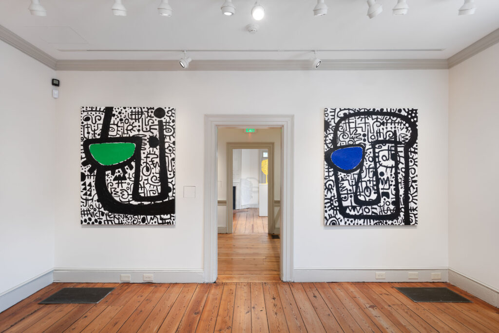
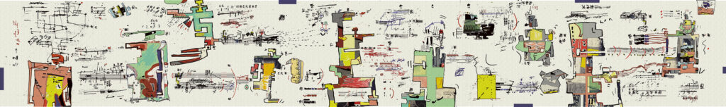
Rosaire Appel, Belligerent Madrigal, 2022, pigment print with ink and crayon, 13 x 74 1/2 in
You’ve heard it a thousand times, “The true encounter with art is beyond words.” We are left with the experience and that should be enough. But we also have the feeling that the “true encounter” includes our wondering awareness of what is happening to us as we look.
In the case of Rosaire Appel’s art now at Steven Harvey Fine Art Projects, we have the encounter and the self-enquiry, in spades. The pieces are in two formats: long panoramas, and vertical scrolls. They have in common a plethora of visual incidents, and an intimation of an acutely inventive mind at work. That consciousness invites us into an antic world of fragments, a broken graphic reality that evokes comics in their broadest scope.
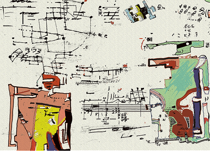
Rosaire Appel, Detail, Belligerent Madrigal, 2022 pigment print with ink and crayon, 13 x 74 1/2 in
There are echoes of the anarchic energy of Krazy Kat and other classic comic strips, underground comix from the 1960s and 1970s, graphic novels, and more. The hint of these sources lies in the benday dots, the shards of outlined figures, the panel structure, and the rapidly shifting scenarios. Even more telling is the frantic humor – the sense of the tragic of the everyday, seen as a kind of situation comedy that is always falling apart.
That feeling is most clearly present in Belligerent Madrigal, with its parade of blocky, abstract personages standing their ground and facing off against each other. They communicate via the musical notations that they direct at each other, and are arrayed in an atmosphere of markings that suggest their thoughts and obsessions. Costumed in individualized, multi-colored outfits, they seem like robotic fashionistas. They are mysterious presences, and as in these works overall, the cryptic rules, with no story to decipher. We are left with the intuition that like Talking Heads, we must “Stop Making Sense”, when existential reality is so sharply apparent as otherwise.
Part of the mystery of this work is how it is made – not much information has been provided. But it seems to be both hand-drawn and composed via digital graphics, printed out, and then enhanced with color and ink. Beyond the comic sources, we can speculate on some other antecedents for Appel’s Comic Abstraction of the exhibition’s title: the imaginal dream characters of Paul Klee, and the imagistic Pop overload of Öyvind Fahlström, the Swedish artist who lived in New York in the 1960s and 70s. He wrote of his desire to “create a world of situations and actions in a contradictory and disconcerting time-space”.
In Rosaire Appel’s work in drawings, prints, and books, we have the template of her taking a graphic structure, such as writing or musical scores, and creating an abstract language of movement and oblique emotion. In this exhibition, which features a number of her intriguing artist’s books, and throughout her extensive oeuvre, the touch of the artist translates fugitive awareness into visual actuality.
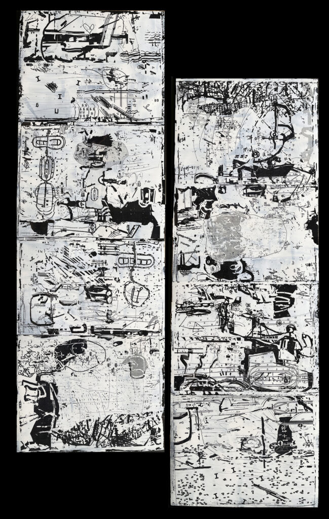
Rosaire Appel, Backtalk, 2023, laser print on acetate with acrylic backing, 2 panels, 32.5 x 11 in. each
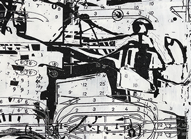
This is particularly evident in the vertical works in the show, with their myriad graphical devices that define an enigmatic scenography. As in Backtalk, with its two paired sheets, these pieces are replete with gestures, diagrams, partial images, all suspended in white space. The effect is by turn spare, dense, and explosive, as if the library of the comprehensible has been blown to smithereens. In Backtalk, dark dividing lines suggest the panels of a comic strip, and the scrolling frames of a film. There are layered passages that look like animated language, recalling the artist’s involvement with asemic writing, and writhing silhouettes – once viable images that have been stripped down for parts.
Rosaire Appel, Detail, Backtalk, 2023, laser print on acetate with acrylic backing, 2 panels, 32.5 x 11 in. each
One quality to note in Appel’s work, in the exhibition and over many decades, is its continuous flow of creating in many mediums, including photography, over 30 visual books, and recently, pieces that responds to sound. This is a model of ever-expanding exploration, continually discovering new territories of sensation and realization.
Abstract Comics: Rosaire Appel at Steven Harvey Fine Art Projects, 208 Forsyth St., New York, NY from July 5 to August 4, 2023